GButton
A customizable button widget with hover and press animations, configurable colors, cursor behavior, and text properties.
Example
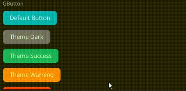
#![allow(unused)]
fn main() {
use makepad_widgets::*;

live_design! {
    import makepad_widgets::base::*;
    import makepad_widgets::theme_desktop_dark::*;
    import gen_components::components::*;

    GButtonExample = <ScrollYView>{
        height: 200.0,
        width: Fill,
        flow: Down,
        spacing: 10.0,
        <Label>{
            text: "GButton"
        }
        <GButton>{
            text: "Default Button"
        }
        <GButton>{
            theme: Dark,
            text: "Theme Dark"
        }
        <GButton>{
            theme: Success,
            text: "Theme Success"
        }
        <GButton>{
            theme: Warning,
            text: "Theme Warning"
        }
        <GButton>{
            theme: Error,
            text: "Theme Error",
        }
        <GButton>{
            theme: Error,
            text: "unvisible button!",
            visible: false,
        }
        <GButton>{
            round: true,
            text: "Round Button",
        }
        <GButton>{
            height: 46,
            width: 160,
            theme: Success,
            border_width: 1.4,
            border_color: #FFF,
            border_radius: 11.0,
            text: "Rounded Button!",
        }
        <GButton>{
            theme: Dark,
            border_width: 1.2,
            hover_color: #FF0000,
            pressed_color: #00FF00,
            text: "GButton!",
            font_family: dep("E:/Rust/try/makepad/Gen-UI/examples/gen_widget_example/resources/GoNotoKurrent-Bold.ttf"),
            font_size: 12.0,
            color: #000,
        }
    }
}
}
Props
| decorate | name | type | description |
|---|---|---|---|
| live | theme | Themes | The theme applied to the button. |
| live | background_color | Option<Vec4> | The background color of the button. |
| live | hover_color | Option<Vec4> | The color of the button when hovered. |
| live | pressed_color | Option<Vec4> | The color of the button when pressed. |
| live | border_color | Option<Vec4> | The border color of the button. |
| live | border_width | f32 | The width of the button's border. |
| live | border_radius | f32 | The radius of the button's border. |
| live | round | bool | Whether the button has rounded corners. |
| live | text | RcStringMut | The text displayed on the button. |
| live | font_size | f64 | The font size of the button text. |
| live | color | Option<Vec4> | The color of the button text. |
| live | font_family | LiveDependency | The font family used for the button text. |
| live | cursor | Option<MouseCursor> | The cursor type when hovering over the button. |
| live | visible | bool | Whether the button is visible. |
| live | draw_text | DrawText | The component used for drawing the button text. |
| live | text_walk | Walk | The positioning properties for the button text. |
| live | grab_key_focus | bool | Whether the button grabs key focus when clicked. |
| animator | animator | Animator | The animation properties for the button. |
| redraw | draw_button | DrawCard | The component used for drawing the button. |
| walk | walk | Walk | The positioning properties for the button. |
| layout | layout | Layout | The layout properties for the button. |
Event
| name | description |
|---|---|
| Hovered | Triggered when the button is hovered. |
| Clicked | Triggered when the button is clicked. |
| Released | Triggered when the button is released. |
| Pressed | Triggered when the button is pressed. |