GImage
A versatile image widget that supports various visual properties, layout, and interactions.
Example
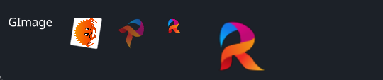
#![allow(unused)]
fn main() {
use makepad_widgets::*;

live_design! {
    import makepad_widgets::base::*;
    import makepad_widgets::theme_desktop_dark::*;
    import gen_components::components::*;
    import makepad_draw::shader::std::*;
    GImageExample = <ScrollYView>{
        height: 100.0,
        width: Fill,
        spacing: 20.0,
        <GLabel>{
            text: "GImage",
        }
        <GImage>{
            height: 32.0,
            width: 36.0,
            src: dep("crate://self/resources/rust.png"),
            rotation:30.0,
        }
        <GImage>{
            rotation: 1.0,
            opacity: 0.6,
            src: dep("crate://self/resources/robius.png"),
        }
        <GImage>{
            scale: 0.6,
            src: dep("crate://self/resources/robius.png"),
        }
        <GImage>{
            scale: 2.0,
            src: dep("crate://self/resources/robius.png"),
        }


    }
}
}
Props
| decorate | name | type | description |
|---|---|---|---|
| live | visible | bool | Visibility of the image. |
| live | opacity | f32 | The opacity of the image. |
| live | cursor | Option<MouseCursor> | The cursor type when hovering over the image. |
| live | scale | f64 | The scale of the image. |
| live | rotation | f32 | The rotation angle of the image. |
| walk | walk | Walk | The positioning properties for the image. |
| layout | layout | Layout | The layout properties for the image. |
| redraw | draw_image | DrawCard | The component used for drawing the image. |
| live | src | LiveDependency | The source dependency for the image's content. |
| rust | texture | Option<Texture> | The texture used for the image. |
Event
No events specified for this widget.