DropDown
一个下拉菜单小部件,允许用户从列表中选择一个项目。下拉列表可以显示标签和相关值,其外观和行为由各种属性和动画控制。
在Makepad中DropDown就是我们使用的Select下拉选项框组件,它允许我们在一个选项组中选择需要的选项
A dropdown menu widget that allows users to select an item from a list. The dropdown can display labels and associated values, and its appearance and behavior are controlled by various properties and animations.
In Makepad, DropDown is the Select dropdown option box component we use, which allows us to select the desired options in a group of options
Example
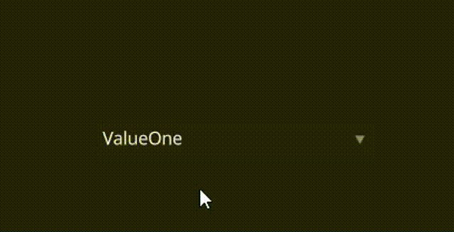
#![allow(unused)]
fn main() {
<DropDown>{
    draw_text: {
        fn get_color(self) -> vec4 {
            return #FFFFFF
        }
    },
    line_spacing: 1.5,
    height: 24,
    width: 200
    labels: ["ValueOne", "ValueTwo","Thrice","FourthValue","OptionE","Hexagons"],
    values: [ ValueOne,ValueTwo,Thrice,FourthValue,OptionE,Hexagons]
}
}
Default
#![allow(unused)]
fn main() {
    DropDown = <DropDownBase> {
        draw_text: {
            text_style: <THEME_FONT_DATA> {}

            fn get_color(self) -> vec4 {
                return mix(
                    mix(
                        mix(
                            9,
                            b,
                            self.focus
                        ),
                        c,
                        self.hover
                    ),
                    9,
                    self.pressed
                )
            }
        }

        draw_bg: {
            instance hover: 0.0
            instance pressed: 0.0
            instance focus: 0.0,
            instance open: 0.0,
            uniform border_radius: 0.5

            fn get_bg(self, inout sdf: Sdf2d) {
                sdf.box(
                    0.,
                    0.,
                    self.rect_size.x,
                    self.rect_size.y,
                    self.border_radius
                )
                sdf.fill(mix(#2, #3, self.hover));
            }

            fn pixel(self) -> vec4 {
                let sdf = Sdf2d::viewport(self.pos * self.rect_size);
                self.get_bg(sdf);
                // lets draw a little triangle in the corner
                let c = vec2(self.rect_size.x - 10.0, self.rect_size.y * 0.5)
                let sz = 2.5;

                sdf.move_to(c.x - sz, c.y - sz);
                sdf.line_to(c.x + sz, c.y - sz);
                sdf.line_to(c.x, c.y + sz * 0.75);
                sdf.close_path();

                sdf.fill(mix(#8, #c, self.hover));

                return sdf.result
            }
        }

        width: Fill,
        height: Fit,
        margin: {left: 1.0, right: 1.0, top: 1.0, bottom: 1.0}
        align: {x: 0., y: 0.}
        padding: {left: 5.0, top: 5.0, right: 4.0, bottom: 5.0}

        popup_menu: <PopupMenu> {}

        selected_item: 0
        animator: {
            hover = {
                default: off,
                off = {
                    from: {all: Forward {duration: 0.1}}
                    apply: {
                        draw_bg: {pressed: 0.0, hover: 0.0}
                        draw_text: {pressed: 0.0, hover: 0.0}
                    }
                }

                on = {
                    from: {
                        all: Forward {duration: 0.1}
                        pressed: Forward {duration: 0.01}
                    }
                    apply: {
                        draw_bg: {pressed: 0.0, hover: [{time: 0.0, value: 1.0}],}
                        draw_text: {pressed: 0.0, hover: [{time: 0.0, value: 1.0}],}
                    }
                }

                pressed = {
                    from: {all: Forward {duration: 0.2}}
                    apply: {
                        draw_bg: {pressed: [{time: 0.0, value: 1.0}], hover: 1.0,}
                        draw_text: {pressed: [{time: 0.0, value: 1.0}], hover: 1.0,}
                    }
                }
            }
            focus = {
                default: off
                off = {
                    from: {all: Snap}
                    apply: {
                        draw_bg: {focus: 0.0},
                        draw_text: {focus: 0.0}
                    }
                }
                on = {
                    from: {all: Snap}
                    apply: {
                        draw_bg: {focus: 1.0},
                        draw_text: {focus: 1.0}
                    }
                }
            }
        }
    }
}