     _/_/_/  _/_/_/_/  _/      _/  _/    _/  _/_/_/
  _/        _/        _/_/    _/  _/    _/    _/
 _/  _/_/  _/_/_/    _/  _/  _/  _/    _/    _/
_/    _/  _/        _/    _/_/  _/    _/    _/
 _/_/_/  _/_/_/_/  _/      _/    _/_/    _/_/_/
Introduction
GenUI是一个创新的SFP前端框架,使用Rust语言开发,最初受到Vue3和Makepad的启发。旨在帮助用户更有效地使用Rust编写前端项目。
Why SFP
GenUI的SFP功能是指其可插拔设计,可以根据开发者的需求调整和使用不同的底层技术或框架,如Makepad或Slint。这种设计允许GenUI通过专门为这些底层框架设计的插件来扩展和自定义其功能,从而更好地适应各种开发场景。
- 通过插件提供强大的能力
- 不受固有底层限制
- 同时也是一种挑战
Advantage
- 多框架兼容性
- 灵活
- 可扩展
- 社区助力
- 尊重用户
Target Group
- 前端开发人员和全栈开发人员
- 创新和实验项目的开发人员
- 开源社区
- 独立开发人员
- 中小型项目开发(现在)
Example
Support Plugin
以下是当前GenUI支持的以及未来极有可能支持的底层
- Makepad
- Zed
- Dioxus
QuickStart
这个示例将向你展示如何使用GenUI框架结合Makepad作为转换底层
Step1: Create a new WorkSpace Rust Project
Step1.1 创建项目
使用cargo new {{project_name}}创建一个简单Rust项目
cargo new gen_makepad_simple
Step1.2 清理项目并改为WorkSpace
接下来删除项目中的src目录并修改Cargo.toml文件
[workspace]
members = ["ui"] # ui表示GenUI的代码编写目录
Step1.3 创建GenUI项目目录
cd ./gen_makepad_simple
cargo new ui
Step1.3 在ui目录中创建UI根文件
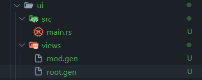
在ui目录中创建views目录,在views中创建root.gen和mod.gen文件
--- ui
|------ views
|-------------- mod.gen
|-------------- root.gen
|------ src
|-------------- main.rs
Step2: 创建root.gen
- template: widget结构部分(我称这三个widget为root铁三角)
- root: makepad UI root根
- window: 主窗口
- view: 主视图
- window: 主窗口
- root: makepad UI root根
- style: 嵌套编写widget的props(你也可以称之为styles)
<template>
<root id="ui">
<window id="main_window">
<view flow="Down" height="All" align="0.5 0.5">
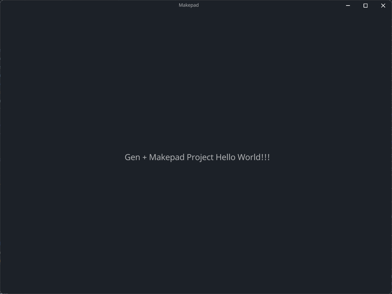
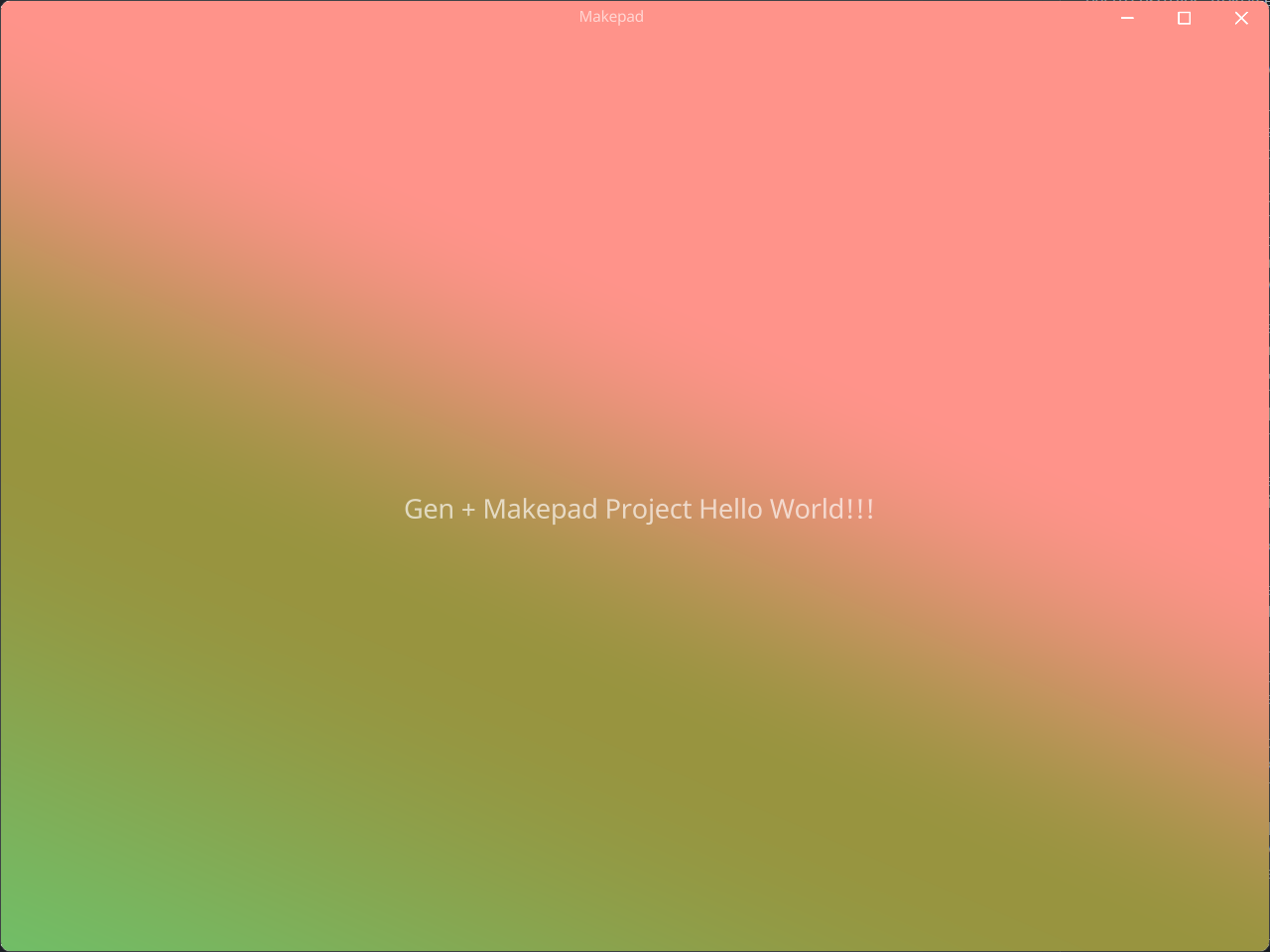
<label text="Gen + Makepad Project Hello World!!!" font_size="16.0"></label>
</view>
</window>
</root>
</template>
<style>
#ui{
#main_window{
width: Fill;
height: Fill;
background_visible: true;
background_color: #1C2128;
flow: Down;
window_size: 1024.0 820.0;
window_position: 300.0;
}
}
</style>
Step3: 编写mod.gen导出root
在.gen文件中如果直接编写Rust代码需要使用<script>标签进行包裹
#![allow(unused)]
fn main() {
<script>
pub mod root;
</script>
}
Step4: main.rs
是GenUI的编译入口,提供编译指向的能力
- 使用
Target::makepad()构建了一个Makepad Plugin Config Builder,这最终指定编译底层目标为Makepad平台- 使用
entry方法设置makepad的App入口文件为app.rs - 使用
root方法指定E:/Rust/try/makepad/Gen-UI/examples/gen_makepad_simple/ui/views/root.gen这个文件作为UI的根文件(通过这种方式,来切换多个UI根) add_dep()方法将依赖添加到编译器中,local指定了makepad-widgets这个库依赖本地的位置- 最终调用
build方法返回一个最终构建完成的compiler
- 使用
- 使用
app()函数创建一个App编译器实例并借助上方构建的compiler作为编译插件 - 调用
run()方法启动编译器
use gen_compiler::{app, Target, Builder};

fn main() {
    let compiler = Target::makepad()
        .entry("app")
        .root("E:/Rust/try/makepad/Gen-UI/examples/gen_makepad_simple/ui/views/root.gen")
        .add_dep("makepad-widgets")
        .local("E:/Rust/try/makepad/makepad/rik/makepad/widgets")
        .build()
        .build();

    // set app and specify target
    let mut app = app(Some(Box::new(compiler))).build();

    let _ = app.run();
}
Video
The following video can be used as a reference for learning
GenUI With Makepad QuickStart
2024-07
Sheng (2024-06-28)
2024-08
GenUI With Makepad Full Features Display 2024-08
Sheng (2024-07-31)
GenUI Structure
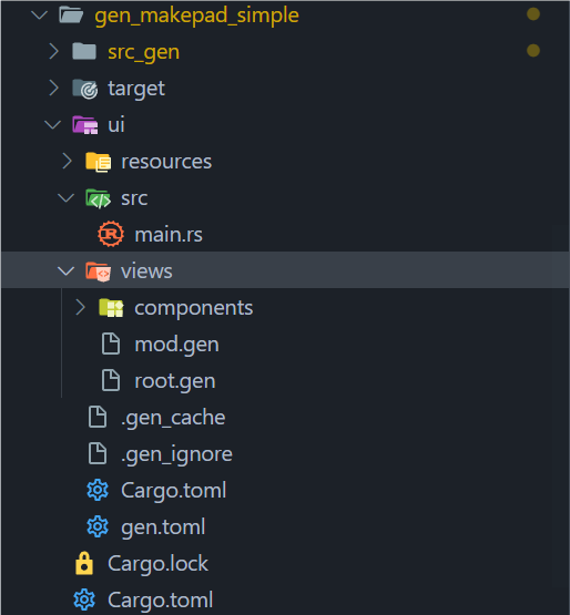
src_gen: 编译后makepad原始代码目录ui: GenUI代码目录src/main.rs: 主入口文件resources: 静态文件目录views: .gen文件目录(当然这个名字可以是任意的)
.gen_cache: GenUI缓存文件.gen_ignore: GenUI忽略的编译文件gen.toml: GenUI项目配置文件
GenUI Env
Environment variables used by the compiler.
GENUI_TARGET: Set GenUI Compiler targetGENUI_LOGO: Set Logo is print or notGENUI_LOG_LEVEL: Set GenUI Log Level
Details
| Env Name | Default Value | Type | Option Values |
|---|---|---|---|
GENUI_TARGET | makepad | String | 1. makepad |
GENUI_LOGO | true | Bool | 1. true2. false |
GENUI_LOG_LEVEL | info | String | 1. error2. warn3. info4. debug5. trace |
How to Set Env Variable
Windows
setx GENUI_TARGET makepad
Mac/Linux
export GENUI_TARGET=makepad
Use Place
GenUI Config Toml
Priority
Compiler > Env > Conf
Although Conf Toml has lowest level, it is the most recommended!
Toml Description
[compiler]
target = "makepad"
log_level = "info"
logo = true

[makepad]
entry = "app"
root = "E:/Rust/try/makepad/Gen-UI/examples/gen_makepad_simple/ui/views/root.gen"
[makepad.dependencies]
makepad-widgets = { path = "E:/Rust/try/makepad/makepad/rik/makepad/widgets" }
[makepad.wasm]
check = false
fresh = true
port = 8016
[compiler] Args
| Name | Type | Options | Default Value |
|---|---|---|---|
| target | String | 1. "makepad" | "makepad" |
| log_level | String | 1. error2. warn3. info4. debug5. trace | "info" |
| logo | bool | 1. true 2. false | true |
target: Set GenUI Compiler targetlogo: Set Logo is print or notlogo_level: Set GenUI Log Level
[makepad] Args
| Name | Type | Options | Default Value |
|---|---|---|---|
| entry | String | - | "app" |
| root | PathBuf | - | - |
entry: makepad entry app rs fileroot: your ui dir root gen file
[makepad.dependencies]
required now!
format: makepad-widgets = { path = "the/latest/makepad-widget/package/path" }
recommand: makepad-widgets = { git = "https://github.com/makepad/makepad", branch = "rik" }
[makepad.wasm]
not required
| Name | Type | Options | Default Value |
|---|---|---|---|
| check | bool | 1. true 2. false | false |
| fresh | bool | 1. true 2. false | false |
| port | u16 | 0~65535 | 8010 |
GenUI Compiler
GenUI Compiler is used to compile the current UI project into the underlying target project code
Attention
you should write from project root path as relative path
Example No gen.toml
we can create a compiler without gen.toml file, but we need to specify the target and other configurations
compiler use builder pattern, so you can chain the method to build the compiler,
and finally call build method to get the compiler.
use gen_compiler::{app, Target, Builder};

fn main() {
    let compiler = Target::makepad()
        .entry("app")
        .root("E:/Rust/try/makepad/Gen-UI/examples/gen_makepad_simple/ui/views/root.gen")
        .add_dep("makepad-widgets")
        .local("E:/Rust/try/makepad/makepad/rik/makepad/widgets")
        .build()
        .wasm() // do not use if you don't need wasm
        .build()
        .build();

    // set app and specify target
    let mut app = app(Some(Box::new(compiler))).build();

    let _ = app.run();
}
Example With gen.toml
if you have a gen.toml file, you can create a compiler without specifying the target and other configurations
the gen.toml file should be in the project root path, such as:
hello
├── src_gen
├────── // ....
├── ui
├────── src
├────── gen.toml
gen.toml
[compiler]
target = "makepad"
log_level = "info"
logo = true

[makepad]
entry = "app"
root = "E:/Rust/try/makepad/Gen-UI/examples/gen_makepad_simple/ui/views/root.gen"
[makepad.dependencies]
makepad-widgets = { path = "E:/Rust/try/makepad/makepad/rik/makepad/widgets" }
main.rs
gen compiler will read the gen.toml file and create, so you do not need to pass the compiler
If you pass the compiler, the compiler will be used instead of the gen.toml file
use gen_compiler::{app, Builder};

fn main() {
    let mut app = app(None).build();
    let _ = app.run();
}
GenUI Logger
Logo
You can control whether the logo is printed using the system environment variable GENUI_LOGO or through the configuration file in TOML format.
- For more details, see GenUI Environment Setup.
- For configuration, see GenUI Config TOML.
Example:
#![allow(unused)]
fn main() {
GenUI-Compiler :: [2024-06-29T08:53:57Z] :: INFO >>>

     _/_/_/  _/_/_/_/  _/      _/  _/    _/  _/_/_/
  _/        _/        _/_/    _/  _/    _/    _/
 _/  _/_/  _/_/_/    _/  _/  _/  _/    _/    _/
_/    _/  _/        _/    _/_/  _/    _/    _/
 _/_/_/  _/_/_/_/  _/      _/    _/_/    _/_/_/

}
Services
The GenUI Logger provides detailed information about the state of various services. Here are some log examples:
#![allow(unused)]
fn main() {
GenUI-Compiler :: [2024-06-29T08:53:57Z] :: INFO >>> 🔧 Log Service is starting... Log entries will be available after the `app event::Change` occurs!
GenUI-Compiler :: [2024-06-29T08:53:57Z] :: INFO >>> 🔧 Source Generator Service started successfully!
GenUI-Compiler :: [2024-06-29T08:53:57Z] :: INFO >>> ✅ Cache Service: Cache file written successfully!
GenUI-Compiler :: [2024-06-29T08:53:57Z] :: INFO >>> 🔧 App is running...
GenUI-Compiler :: [2024-06-29T08:53:57Z] :: INFO >>> 🔧 Watcher Service started successfully!
}
Compile Timing
The logger also tracks and displays compile timings, helping you monitor the compilation process:
#![allow(unused)]
fn main() {
GenUI-Compiler :: [2024-06-28T19:09:24Z] :: INFO >>> File "E:\\Rust\\try\\makepad\\Gen-UI\\examples\\gen_makepad_simple\\ui\\views\\root.gen" compiled successfully.
GenUI-Compiler :: [2024-06-28T19:09:24Z] :: INFO >>> ✅ Cache Service: Cache file written successfully!
GenUI-Compiler :: [2024-06-28T19:09:24Z] :: INFO >>> File "E:\\Rust\\try\\makepad\\Gen-UI\\examples\\gen_makepad_simple\\ui\\views\\root.gen" compiled successfully.
}
GenUI Ignore
在.gen_ignore中是GenUI项目需要忽略监视的文件或目录
- 使用相对路径,相对于当前的GenUI项目目录而言
- 精确到某个文件,请不要使用类似
**/*.xxx的方式进行忽略 - 使用换行进行分割
- 当你不添加时默认使用下方默认忽略内容
默认的忽略文件如下所示:
Cargo.toml
src/main.rs
.gitignore
Cargo.lock
target
.gen_cache
.gen_ignore
Props Manual (Comming Soon)
GWPM(GenUI Widget Props Manual)的用途是为了帮助开发者正确使用GenUI属性,并提供各个属性的详细描述和使用示例。
GWPM是GenUI Widgte设计中用于描述Widget的属性的方式。为了确保开发时能正确使用这些属性,我们需要这本手册进行规范。
该手册分为以下几个部分:
- Font(字体)
- Text(文字)
- Background(背景)
- Border(边框)
- Spacing(间距)
- Size(尺寸)
- Position(位置)
- Others(其他)
Note
- ⛔: 当前并不支持或未开放功能
- ✅: 已经支持
- 👍: 推荐使用
- 👎: 不推荐使用
- ⚠️: 需要注意, 可能存在隐患, 暂时不要使用或将移除废弃
Type
类型说明文档, 在GenUI中声明值的类型仅限于文档中所示
基础类型
usize: 无符号整型isize: 有符号整型f32: 单精度浮点数f64: 双精度浮点数bool: 布尔值String: 字符串- ⚠️
Void
特殊类型
Dep: 静态资源引用Vec: 动态数组Bind: 值绑定类型Function: 方法闭包Struct: 结构体Enum: 枚举UnKnown: 未知推测, 该类型会自动对值类型进行推测处理Animation: 动画类型
组件库内置类型
组件库内置类型指的是在组件库中直接构建的枚举和结构体类型
See Buitin Type (Comming Soon, about 09-24)
Font
文字字体相关属性
Overview
| Prop | Description | Type | Default |
|---|---|---|---|
font_family | 字体类型 | Dep | |
font_size | 字体大小 | f32 | 9.0 |
⚠️font_weight | 字体粗细 | GFontWeight | 500 |
font_scale | 字体缩放 | f32 | 1.0 |
⚠️brightness | 文字亮度 | f32 | 1.0 |
⚠️curve | 字体曲线 | f32 | 0.0 |
top_drop | 起始字符高度 | f32 | 0.0 |
height_factor | 高度因子 | f32 | 1.0 |
Font Family
字体类型, 来源于字体包, 一般使用字体包的地址或字体包名作为指向, 格式为:
- ✅ ttf (当前makepad plugin支持)
- ⛔ woff
- ⛔ otf
- ⛔ ttc
Example
in line
<label
    text="hello world"
    font_family="crate://self/resources/GoNotoKurrent-Bold.ttf">
</label>
in style
<template>
    <label id="label1" text="hello world"></label>
</template>

<style>
#label1{
    font_family: "crate://self/resources/GoNotoKurrent-Bold.ttf";
}
</style>
Font Size
字体大小, 在Web端默认基础字体大小为16px, 但在GenUI中为9.0
Example
<label text="hello world" font_size="32.0"></label>
Font Scale
字体缩放倍数, 默认情况下缩放倍数为1.0, 即不缩放
Example
<label text="hello world" font_scale="1.2"></label>
Top Drop
起始字符高度
Example
<label text="hello world" top_drop="10.0"></label>
Height Factor
Example
<label text="hello world" height_factor="1.5"></label>
Text
文字相关属性
Overview
| Prop | Description | Type | Default |
|---|---|---|---|
text | 文本内容 | String | "" |
draw_depth | 文本深度 | f32 | |
ignore_newlines | 忽略换行 | ||
combine_spaces | 合并空格 | ||
text_wrap | 文本换行行为 | ||
color | 文本颜色 | ||
text_align | 文本对齐 | ||
placeholder | 默认文本 | ||
line_spacing | 行间距 |
Background
Size
Border
Position
Animation
GenUI Syntex
本章将介绍GenUI中的各类语法
Color
当前GenUI支持以下几种类型的颜色书写方式:
- Hex: 16进制颜色
- Rgb: rgb类型
- Rgba: rgba带有透明度的rgb类型
- LinearGradient: 线性渐变
- RadialGradient: 径向渐变
- Shader(
#cfg(feature="makepad"), 专属于Makepad的绘制写法)
Hex
16进制数字表示法 RGB颜色可以使用以井号开头的6位(或8位)16进制数字(0-F)表示,相当于3个或者4个字节,每个字节相当于10进制数的0至255。 三个字节分别表示红色、绿色和蓝色,第四个字节是可选的,表示Alpha通道。
语法
- 1位16进制:
#1, 最终这会转换为#111111FF - 3位16进制:
#a1f, 最终这会转换为#AA11FFFF - 6位16进制:
#FF00AA, 最终这会转换为#FF00AAFF - 8位16进制:
#AAFF0020, 这是完整的写法
Example
<style>
#ui{
  #main_window{
    //...
    background_color: #1C2128;
  }
}
</style>
Rgb
三原色光模式(RGB color model,又称RGB表色系统、RGB颜色模型、红绿蓝颜色模型,是一种加色模型,将红(Red)、绿(Green)、蓝(Blue)三原色的色光以不同的比例相加混色,以合成产生各种色彩光。
语法
rgb(r, g, b)
其中r, g, b 各为0~255的颜色表示
Example
<style>
#ui{
#main_window{
//...
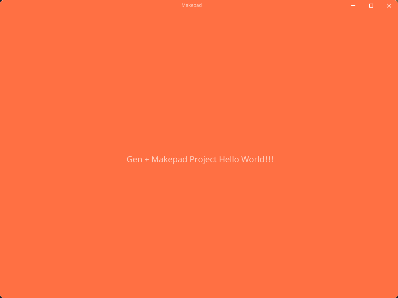
background_color: rgb(255, 112, 67);
}
}
</style>
Rgba
带有Alpha通道的三原色光模式,其中R,指的是红色值(Red);G,指的是绿色值(Green);B,指的是蓝色值(Blue);A,指的是透明度(Alpha)。 R、G、B这三个可以为整数,取值范围为0~255。A的取值为0~1。
语法
rgba(r, g, b, a)
其中r, g, b 各为0~255的颜色表示, a表示alpha通道百分比值,取值0~1
Example
<style>
#ui{
  #main_window{
    //...
    background_color: rgba(255, 112, 67, 0.3);
  }
}
</style>
Linear
创建一个由两种或多种颜色沿一条直线进行线性过渡的图像
语法
linear_gradient(angle, color [proportion], ...)
angle: 角度color: 16进制颜色值[proportion]: 颜色占比
Example
<style>
#ui{
  #main_window{
    //...
    background_color: linear_gradient(120deg, #FF938A, #98943F 40%, #6BC46D);
  }
}
</style>
Radial
创建一个图像,该图像由从原点辐射的两种或多种颜色之间的渐进过渡组成,其形状可以是圆形或椭圆形
语法
radial_gradient(color [proportion], ...)
color: 16进制颜色值[proportion]: 颜色占比
Example
<style>
#ui{
  #main_window{
    //...
    background_color: radial_gradient(#FF938A, #98943F, #6BC46D);
  }
}
</style>
Shader
专属于Makepad的shader绘制写法,采用Makepad支持的glsl写法来绘制背景,这是可扩展的,灵活的自由的绘制方式,它不仅限于能绘制简单的颜色背景。
语法
不要在语句中添加;作为语句的结束,而是使用换行
shader(|self|{
  fn fn_name(self) -> vec4{
    return #009688
  }
})
fn_name: shader函数的名字,这取决于组件绘制函数的函数名
Example
<style>
#ui{
  #main_window{
    //...
    background_color: shader(|self|{
      fn pixel(self) -> vec4{
        return #009688
      }
    });
  }
}
</style>
Import
在<script>标签中,带有内置的import!宏可以导入我们需要引入的组件
#![allow(unused)]
fn main() {
<template>
  <root id="ui">
    <window id="main_window">
      <view flow="Down" height="All" id="main_view">
        <checkbox_view />
        <header_view />
        <image_view></image_view>
        <icon_view></icon_view>
        <button_view></button_view>
      </view>
    </window>
  </root>
</template>

<script>
import!{
  crate::views::checkbox::*;
  crate::views::header::header::*;
  crate::views::icon::*;
  crate::views::button_view::*;
  crate::views::image_view::*;
}
</script>

<style>
ui{
  main_window{
    width: Fill;
    height: Fill;
    background_visible: true;
    background_color: #1C2128;
    flow: Down;
    window_size: 600.0 800.0;
    window_position: 300.0;
    main_view{
      background_color: #FFF,
    }
  }
}
</style>
}
Static Page
静态页面指的是不带有脚本的纯静态组件组成的页面,通常仅由<template>和<style>两个部分组成,但这不代表<script>标签不能使用,而是不在<script>中编写带有逻辑的脚本语句,在<script>标签中使用内置import!宏引入组件和use来引入库都不被视为违反静态原则。
Example1
#![allow(unused)]
fn main() {
<template>
  <root id="ui">
    <window id="main_window">
      <view flow="Down" height="All" id="main_view">
      </view>
    </window>
  </root>
</template>

<style>
ui{
  main_window{
    width: Fill;
    height: Fill;
    background_visible: true;
    background_color: #1C2128;
    flow: Down;
    window_size: 600.0 800.0;
    window_position: 300.0;
    main_view{
      background_color: #FFF,
    }
  }
}
</style>
}
Example2 ⛔
#![allow(unused)]
fn main() {
<template>
  <view id="checkbox_view">
    <checkbox class="checkbox1" check_type="Radio"></checkbox>
    <checkbox class="checkbox1"></checkbox>
    <checkbox id="checkbox2"></checkbox>
    <radio_button id="radio1"></radio_button>
    <radio_button id="radio2"></radio_button>
    <checkbox class="checkbox1" check_type="None"></checkbox>

    <button text="click" @click="change"></button>
    <label :text="label_text" margin="16.0"></label>
  </view>
</template>

// 这是错误的,因为script只能在非static模板中使用(除了内置`import!`)
// 非static模板: `<template><component inherits="view"></component></template>`
<script>
let mut label_text = String::from("this is a test label!");

let change = ||{
  label_text = String::from("I have been clicked");
};
</script>

<style>
checkbox_view{
  width: 300;
  height: 300;
  flow: Down;
  .checkbox1{
    text: "CheckBox1";
    margin: 10;
    label_margin: 0 0 0 10;
  }
  checkbox2{
    text: "Checkbox Toggle";
    label_margin: 0 0 0 16.0;
    font_brightness: 1.5;
    check_type: Toggle;
  }
  radio1{
    text: "Radio1";
    margin: 16.0;
    font_size: 16.0;
  }
  radio2{
    radio_type: Tab;
    text: "Radio Tab";
    margin: 0 16.0;
    padding: 12.0;
    height: 32.0;
    label_align: 0.5;
    label_margin: 0 0 0 0;

  }
}
</style>
}
以下是优化后的文档内容:
动态 Widget
动态 Widget 类型分类
动态 Widget 根据使用方式可分为以下三类:
- A 类:未使用
gen_macros::Prop标注,且未声明id属性。 - B 类:未使用
gen_macros::Prop标注,但声明了id属性。 - C 类:使用了
gen_macros::Prop标注,但未声明id属性。
注意:
- 如果同时使用了
gen_macros::Prop并且声明了id属性,而${prop_struct_name} == ${id},则该组件属于 C 类。- 但如果
${prop_struct_name} != ${id},程序将会 panic。
A 类
当组件既没有使用 Prop 标注,也没有在 <component></component> 标签中声明 id 属性时:
#![allow(unused)]
fn main() {
<template>
    <component inherits="view"></component>
</template>
}
此时,动态 Widget 的结构体名为:${source_name}_${inherits}。
B 类
当组件未使用 Prop 标注,但在 <component></component> 标签中声明了 id 属性时:
#![allow(unused)]
fn main() {
<template>
    <component id="MyView" inherits="view"></component>
</template>
}
此时,动态 Widget 的结构体名为 ${id},在这个例子中就是 MyView。
C 类
当组件使用了 Prop 标注,但未声明 id 属性时:
#![allow(unused)]
fn main() {
<template>
    <component inherits="view"></component>
</template>

<script>
use gen_macros::Prop; // 可省略

#[derive(Prop)]
pub struct MyView {}
</script>
}
此时,动态 Widget 的结构体名为 ${prop_struct_name},在这个例子中就是 MyView。
脚本使用原则
生命周期管理
- before: 最早调用,用于初始化
PropStruct。 - after: 在
before之后调用,用于声明式地修改PropStruct的值。
示例
#![allow(unused)]
fn main() {
<script>
use gen_macros::{Prop} // 可以省略

#[derive(Prop)]
pub struct MyView{
    pub label_value1: String
}
---------------------------------------------------------------|
impl Default for MyView{                                       |
    fn default() -> Self {                                     |
        Self{                                                  |
            label_value1: "Click The Button".to_string()       |
        }                                                    before
    }                                                          |
}                                                              |
                                                               |
let mut prop = MyView::default();                              |
---------------------------------------------------------------|

---------------------------------------------------------------|
prop.label_value1 = "Click Here!".to_string();               after
---------------------------------------------------------------|
</script>
}
编译后的代码
#![allow(unused)]
fn main() {
impl LiveHook for MyView {
    fn before_apply(&mut self, _cx: &mut Cx, _apply: &mut Apply, _index: usize, _nodes: &[LiveNode]) {
        self.label_value1 = "Click The Button".to_string();
    }
    fn after_apply(&mut self, _cx: &mut Cx, _apply: &mut Apply, _index: usize, _nodes: &[LiveNode]) {
        self.label_value1 = "Click Here!".to_string();
    }
}
}
示例
动态 Widget 采用 <component> 标签作为唯一根标签,使用 inherits 属性指定要继承的 Widget 类型,通常推荐继承 view。
use gen_macros::{Event, Prop};这行代码可以省略,Event和Prop都是 GenUI 内置的宏。Prop: 用于声明 Widget 的属性。Event: 用于声明 Widget 的事件。
- Widget 的回调函数使用 Rust 闭包语法:
let mut event_callback = ||{...}。 active!: 内置宏,用于触发 Widget 的事件。
#![allow(unused)]
fn main() {
<template>
    <component inherits="view">
        <label id="first_lb" class="t_label" font_size="32" :text="props.label1"/>
        <label id="second_lb" class="t_label" :font_size="fs" text="label 2"/>
        <button id="bb" text="text btn" @clicked="btn_click" />
    </component>
</template>

<script>
use gen_macros::{Event, Prop};

#[derive(Event, Clone, Debug)]
pub enum Events {
    Clicked(String),
}

#[derive(Prop)]
pub struct ButtonView {
    pub label1: String,
}

impl Default for ButtonView {
    fn default() -> Self {
        Self {
            label1: "Click The Button".to_string(),
        }
    }
}

let mut props = ButtonView::default();
props.label1 = String::from("sss");
let fs: f64 = 18.0;

let mut btn_click = || {
    props.label1 = String::from("I have been clicked");
    println!("Button bb Clicked");
    active!(Events::Clicked("Hello".to_string()));
};
</script>

<style>
.t_label {
    brightness: 1.1;
    color: #fff;
    wrap: Word;
    font: dep("crate://makepad-widgets/resources/IBMPlexSans-SemiBold.ttf");
}
</style>
}
For
在GenUI中类似于Vue的for循环控制语法,不同的是你无需设置:key,GenUI会帮你自动绑定,for并不像js采用dom复制的方式生成,在makepad中采用自定义组件结合ComponentMap与数据结合进行生成元素节点并渲染,并且在GenUI中采用迭代器绑定,也就是说,任何Rust中的内置的实现了迭代器trait的类型都可以被解析,其中以下语法都被允许:
:for="(index, item) in iter_ident":for="item in iter_ident":for="(index, (item1, item2, ...)) in iter_ident"flexible iter:for="(index, ()) in iter_ident":for="(index, _) in iter_ident"GenUI会将其处理为虚拟widget并自动生成Makepad的ForWidget(含有ComponentMap来处理子组件循环渲染的自定义Widget),并最终进行绑定替换
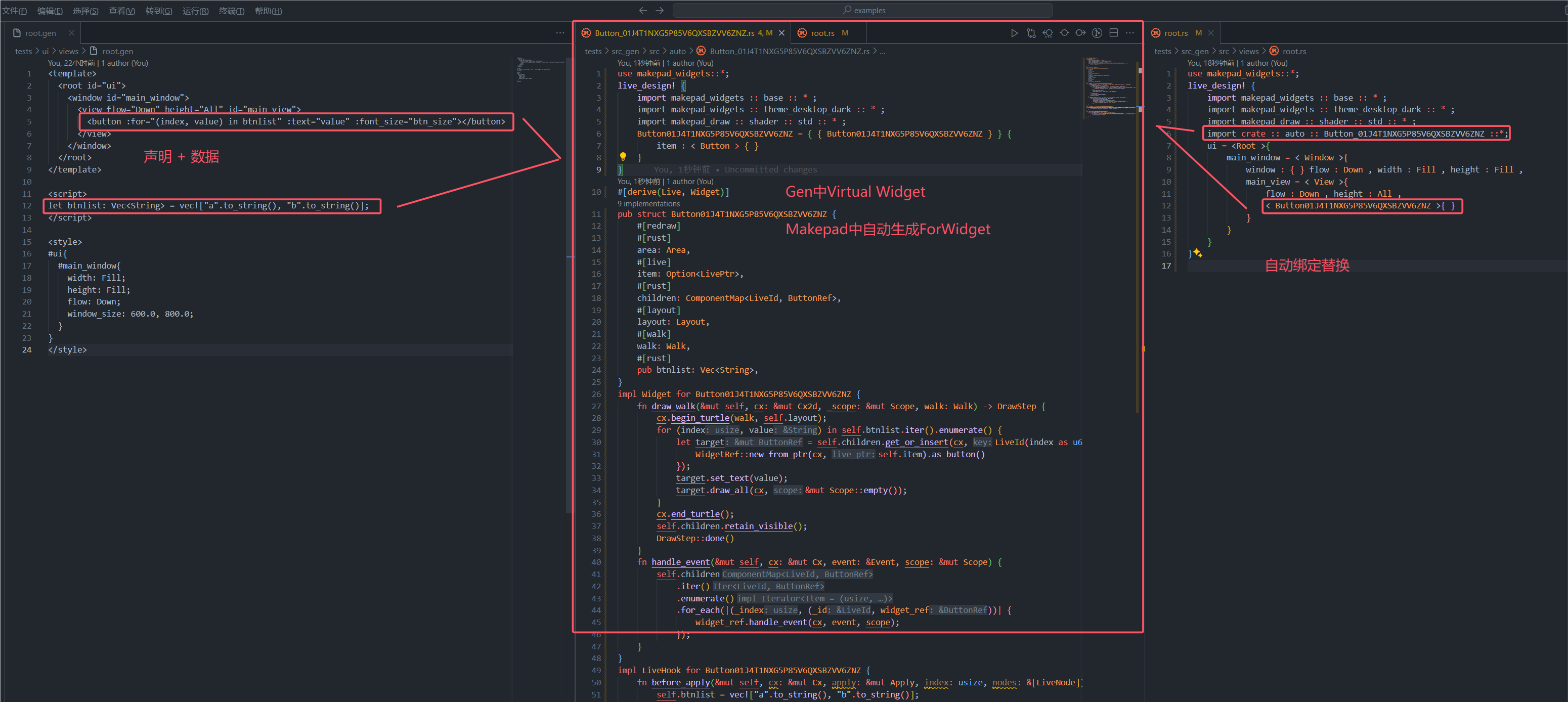
Example1
#![allow(unused)]
fn main() {
<template>
  <component id="RootComponent" inherits="root">
    <window id="main_window">
        <view flow="Down" height="All" id="main_view">
          <label :for="(index, value) in list" :text="value" font_size="16.0"></label>
        </view>
      </window>
  </component>
</template>

<script>
let list: Vec<String> = vec!["Hello".to_string(), "GenUI".to_string()];
</script>

<style>
ui{
  main_window{
    width: Fill;
    height: Fill;
    flow: Down;
    window_size: 600.0, 800.0;
  }
}
</style>
}
Example2
#![allow(unused)]
fn main() {
<template>
  <component id="RootComponent" inherits="root">
    <window id="main_window">
        <view flow="Down" height="All" id="main_view">
          <label :for="(index, value) in list" :text="value" font_size="16.0"></label>
        </view>
      </window>
  </component>
</template>

<script>
let list: [String; 2] = ["Hello".to_string(), "GenUI".to_string()];
</script>

<style>
ui{
  main_window{
    width: Fill;
    height: Fill;
    flow: Down;
    window_size: 600.0, 800.0;
  }
}
</style>
}
If
GenUI中if_else同样由数据控制元素节点是否渲染,采用虚拟Widget的方式从模板提取if_else标记的组件,并自动生成Makepad Widget,所以你无需关注如何生成,无需手写自定义组件
Example
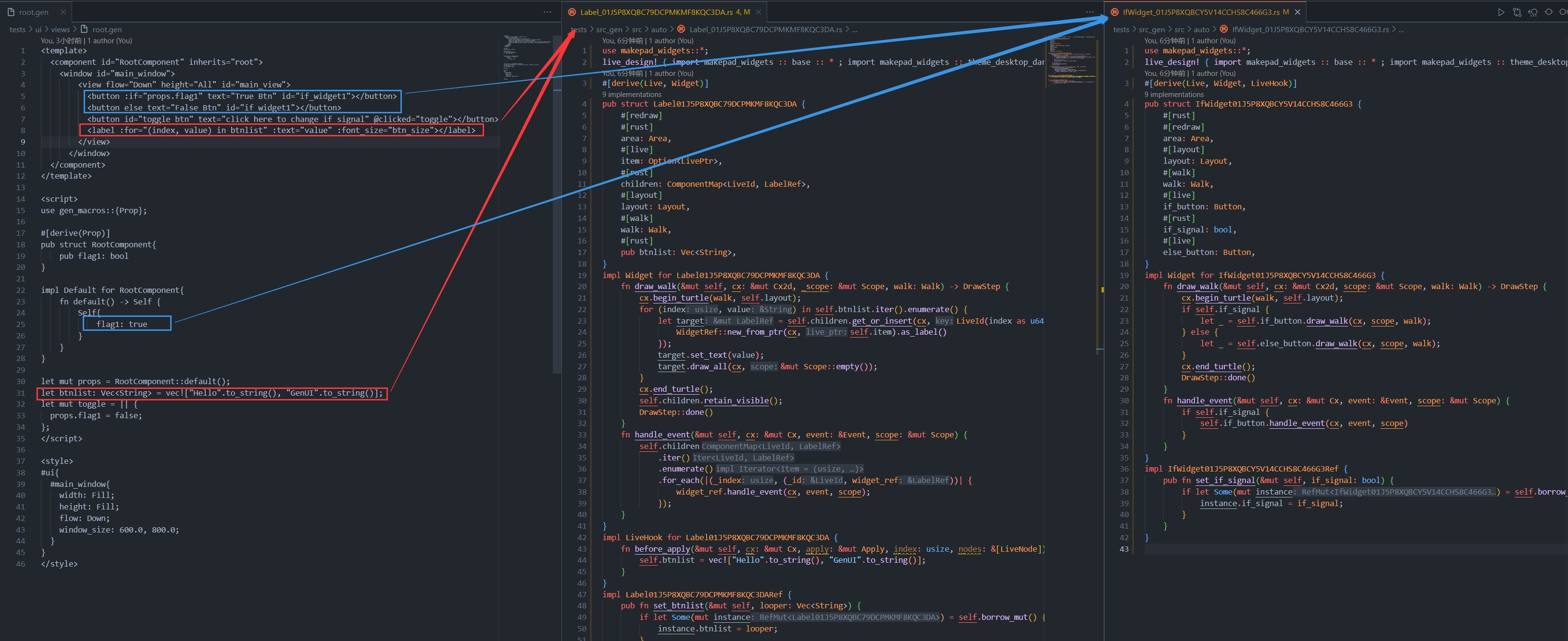
#![allow(unused)]
fn main() {
<template>
  <component id="RootComponent" inherits="root">
    <window id="main_window">
        <view flow="Down" height="All" id="main_view">
          <button :if="props.flag1" text="True Btn" id="if_widget1"></button>
          <button else text="False Btn" id="if_widget1"></button>
          <button id="toggle_btn" text="click here to change if signal" @clicked="toggle"></button>
        </view>
      </window>
  </component>
</template>

<script>
use gen_macros::{Prop};

#[derive(Prop)]
pub struct RootComponent{
    pub flag1: bool
}

impl Default for RootComponent{
    fn default() -> Self {
        Self{
            flag1: true
        }
    }
}

let mut props = RootComponent::default();
let mut toggle = || {
  props.flag1 = false;
};
</script>

<style>
ui{
  main_window{
    width: Fill;
    height: Fill;
    flow: Down;
    window_size: 600.0, 800.0;
  }
}
</style>
}
Icon Lib v0.1.0
当前GenUI的内置图标库共有75个图标,分为以下几种类别:
- Base
- Arrow
- Code
- Emoji
- Fs
- Person
- Relation
- State
- Time
- Tool
- UI
当前该图标库只是一个实验功能
优点
- 无版权, 完全商用免费
- 体积小
- 无需联网下载进行引入
- 直接使用Shader进行绘制
后续更新方案
- 去除None类型改用属性标记方式
- 增加图标到约150个常用图标
- 优化图标体验
Base
Min
|
Max
|
FullScreen
|
FullScreenExpand
|
More
|
Upload
|
Download
|
Add
|
Delete
|
DeleteKey
|
Correct
|
Fresh
|
Play
|
Stop
|
GoOn
|
Setting
|
Setting2
|
Setting3
|
Home
|
System
|
Picture
|
Close
|
Eye
|
EyeClose
|
Phone
|
Light
|
Menu
|
Arrow
Left
|
Right
|
Up
|
Down
|
Switch
|
Code
Code
|
Test
|
Debug
|
Emoji
Emoji
|
Hot
|
Heart
|
HeartBroken
|
Dislike
|
Fs
Note
|
Person
Male
|
Female
|
Relation
Connect
|
DisConnect
|
State
Info
|
Help
|
Warn
|
Wifi
|
WifiNone
|
Time
Clock
|
Tool
Search
|
ZoomIn
|
ZoomOut
|
Share
|
Rss
|
AI
|
VR
|
Notice
|
NoticeNone
|
Bind
|
UI
Exit
|
Expand
|
ExpandRight
|
ExpandLeft
|
ExpandTop
|
ExpandBottom
|
Open
|
OpenLeft
|
OpenRight
|
OpenTop
|
OpenBottom
|
Split
|
Split2
|
PowerOff
|
Makepad-Plugin
Dev Manual
Enum
❗Note:
Makepad属性Enum常有以下两种用途
- Event
- Types
Types
Types常用于live系统切换选项用途,必须遵守以下原则
原则1: 宏标记
当作为Types进行使用时该Enum必须被标注:
#[derive(Live)]#[derive(LiveHook)]#[live_ignore]
可选择添加#[repr(u32)]
原则2: 无嵌套
即不可使用嵌套方式嵌套多个枚举或结构
原则3: shader_enum
首个枚举项必须使用shader_enum(1)注明以确保顺序
Example
#![allow(unused)]
fn main() {
use makepad_widgets::*;

#[derive(Live, LiveHook, Clone, Debug, Copy)]
#[live_ignore]
#[repr(u32)]
pub enum Base {
    #[pick]
    Min = shader_enum(1),
    Max,
    FullScreen,
    FullScreenExpand,
}
}
Event
BuiltIn-UI Lib
Github Address: gen makepad component lib
| Version | Date |
|---|---|
| v0.0.1 | 2024-06-28 |
Feature
- More diverse props(styles)
- A simpler way of writing (more similar to CSS)
- With default style, can be switched through themes
- As a built-in component of GenUI, it can also be independently applied in Makepad projects
- Continuous high-speed updates (currently updated approximately once a week)
Import
Toml
gen_components ={ git="https://github.com/palpus-rs/Gen-UI/tree/main/gen/components" }
lib.rs
#![allow(unused)]
fn main() {
pub use gen_components;
}
Live Design
#![allow(unused)]
fn main() {
live_design! {
    import gen_components::components::*;
}
}
GenUI Builtin Lib
Themes
each theme color has [25, 50, 100, 200, 300, 400, 500, 600, 700, 800, 900]
| Color Category | 25 | 50 | 100 | 200 | 300 | 400 | 500 | 600 | 700 | 800 | 900 |
|---|---|---|---|---|---|---|---|---|---|---|---|
| Dark | #FCFCFD | #F9FAFB | #F2F4F7 | #EAECF0 | #D0D5DD | #95A2D3 | #667085 | #475467 | #344054 | #1D2939 | #101828 |
| Primary | #F5FEFF | #ECFDFF | #CFF9FE | #A5F0FC | #67E3F9 | #22CCEE | #06AED4 | #088AB2 | #0E6F90 | #155B75 | #164C63 |
| Error | #FFFBFA | #FEF3F2 | #FEE4E2 | #FECDCA | #FDA29B | #F97066 | #F04438 | #D92D2D | #B42318 | #912018 | #7A271A |
| Warning | #FFFCF5 | #FFFAEB | #FEF0C7 | #FEDF89 | #FEC84B | #FDB022 | #F79009 | #DC6803 | #B54708 | #93370D | #7A2E0E |
| Success | #F6FEF9 | #ECFDF3 | #D1FADF | #A6F4C5 | #6CE9A6 | #32D583 | #12B76A | #039855 | #027A48 | #05603A | #054F31 |
Origins
Root
See Window
Window
Props
| name | description | example |
|---|
View
Label
Props
| name | description | example |
|---|---|---|
| font_family | 文字字体 | font_family: dep(crate://self/resources/A.ttf); |
| font_size | 文字大小 | font_size: 12.0; |
| brightness | 文字亮度 | brightness: 1.5; |
| curve | 曲率 | curve: 1.5; |
| line_spacing | 文字行间距 | line_spacing: 1.5; |
| top_drop | 文字起止高度 | top_drop: 1.5; |
| height_factor | 因子 | |
| text_wrap | 文字换行方式 | text_wrap: Wrap; |
| ignore_newlines | 忽略新行 | ignore_newlines: true; |
| combine_spaces | 合并空格 | combine_spaces: true; |
| font_scale | 文字缩放 | font_scale: 1.26; |
| draw_depth | 文本深度 | draw_depth: 1.5; |
| color | 文字颜色 | color: #FFF; |
| height | 高度 | height: 16.0; |
| width | 宽度 | width: 16.0; |
| abs_pos | 定位 | abs_pos: 0.5; |
| margin | 外边距 | margin: 8.0; |
| padding | 内边距 | padding: 10.0; |
| align | 子元素定位 | align: 0.5 0.65; |
| text | 文字 | text: "Hello"; |
Components
- Label
- Link
- Button
-
Card
- VLayout
- HLayout
- Radio
- CheckBox
- Icon
- Image
- Input
- Popup
- Badge
- DropDown
- Toggle
- Avatar
- ToolTip
- Progress
- Slider
- Tab
- Table
- Dialog
- Select
- FileUpload
- Divide
- Loading
- EmptyState
- BreadCrumb
- Pagination
- Metric
- Menu
- ScrollBar(s)
GLabel
A custom label widget with various configurable properties such as color, font size, brightness, line spacing, and more.
Example
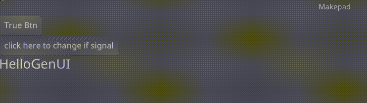
#![allow(unused)]
fn main() {
use makepad_widgets::*;

live_design! {
    import makepad_widgets::base::*;
    import makepad_widgets::theme_desktop_dark::*;
    import gen_components::components::*;

    GLabelExample = <ScrollYView>{
        height: 100.0,
        width: Fill,
        spacing: 10.0,
        <Label>{
            text: "GLabel"
        }
        <GLabel>{
            text: "Hello, world! This is a long message, but I use wrap Word to wrap it!",
            height: 48.0,
            width: 120.0,
            wrap: Word,
            brightness: 1.5,
            margin: {left: 12.0},
        }
        <GLabel>{
            text: "bold, test bold!!",
            font_size: 12.0,
            padding: 16.0,
            color: #FF0000,
            font_family: dep("E:/Rust/try/makepad/Gen-UI/examples/gen_widget_example/resources/GoNotoKurrent-Bold.ttf"),
        }
    }
}
}
Props
| decorate | name | type | description |
|---|---|---|---|
| live | color | Vec4 | The color of the label. |
| live | font_size | f64 | The size of the font used in the label. |
| live | brightness | f32 | The brightness level of the text. |
| live | curve | f32 | The curve factor of the text. |
| live | line_spacing | f64 | The line spacing of the text. |
| live | top_drop | f64 | The top drop of the text. |
| live | height_factor | f64 | The height factor of the text. |
| live | wrap | TextWrap | The text wrapping mode. |
| live | font_family | LiveDependency | The font family of the text. |
| live | visible | bool | Whether the label is visible. |
| deref | draw_text | DrawText | The DrawText component used for drawing the text. |
| walk | walk | Walk | The Walk component for positioning. |
| live | align | Align | The alignment of the text. |
| live | padding | Padding | The padding around the text. |
| live | text | RcStringMut | The content of the label. |
Event
| name | description |
|---|---|
| None | No events are specified for this widget. |
GLink
A customizable hyperlink widget with hover and press animations, configurable colors, text properties, and cursor behavior.
Example
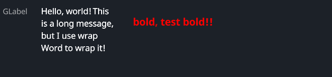
#![allow(unused)]
fn main() {
use makepad_widgets::*;

live_design! {
    import makepad_widgets::base::*;
    import makepad_widgets::theme_desktop_dark::*;
    import gen_components::components::*;

    GLinkExample = <ScrollYView>{
        height: 200.0,
        width: Fill,
        spacing: 10.0,
        flow: Down,
        <GLabel>{
            text: "GLink"
        }
        <GLink>{
            text: "Link",
        }
        <GLink>{
            theme: Dark,
            text: "Theme Dark",
        }
        <GLink>{
            theme: Error,
            text: "Define hover color and pressed color",
            hover_color: #FF00FF,
            pressed_color: #00FF00,
        }
        <GLink>{
            theme: Success,
            text: "No underline",
            underline: false,
        }
        <GLink>{
            theme: Warning,
            text: "Custom More",
            font_size: 14.0,
            hover_color: #FF00FF,
            background_color: #00FF00,
            margin: 10.0,
            padding: 10.0,
            color: #FF0000,
            underline_width: 2.0,
            font_family: dep("E:/Rust/try/makepad/Gen-UI/examples/gen_widget_example/resources/GoNotoKurrent-Bold.ttf"),
        }

    }
}
}
Props
| decorate | name | type | description |
|---|---|---|---|
| live | theme | Themes | The theme applied to the link. |
| live | background_color | Option<Vec4> | The background color of the link. |
| live | hover_color | Option<Vec4> | The color of the link when hovered. |
| live | pressed_color | Option<Vec4> | The color of the link when pressed. |
| live | border_color | Option<Vec4> | The border color of the link. |
| live | underline | bool | Whether the link has an underline. |
| live | underline_color | Option<Vec4> | The color of the underline. |
| live | underline_width | f32 | The width of the underline. |
| live | border_radius | f32 | The radius of the link's border. |
| live | round | bool | Whether the link has rounded borders. |
| live | transparent | bool | Whether the link background is transparent. |
| live | text | RcStringMut | The text content of the link. |
| live | font_size | f64 | The size of the font used in the link. |
| live | color | Option<Vec4> | The color of the text. |
| live | font_family | LiveDependency | The font family of the text. |
| live | cursor | Option<MouseCursor> | The cursor type when hovering over the link. |
| live | href | Option<String> | The URL that the link points to. |
| live | link_type | LinkType | The type of the link (NewTab or SameTab). |
| live | visible | bool | Whether the link is visible. |
| live | draw_text | DrawGText | The component used for drawing the text. |
| live | text_walk | Walk | The positioning properties for the text. |
| live | grab_key_focus | bool | Whether the link grabs key focus when clicked. |
| animator | animator | Animator | The animation properties for the link. |
| redraw | draw_link | DrawGLink | The component used for drawing the link. |
| walk | walk | Walk | The positioning properties for the link. |
| layout | layout | Layout | The layout properties for the link. |
Event
| name | description |
|---|---|
| Hovered | Triggered when the link is hovered. |
| Clicked | Triggered when the link is clicked. |
| Released | Triggered when the link is released. |
| Pressed | Triggered when the link is pressed. |
Card
A customizable card widget with hover and press animations, configurable colors, cursor behavior, and optional scroll bars.
Example
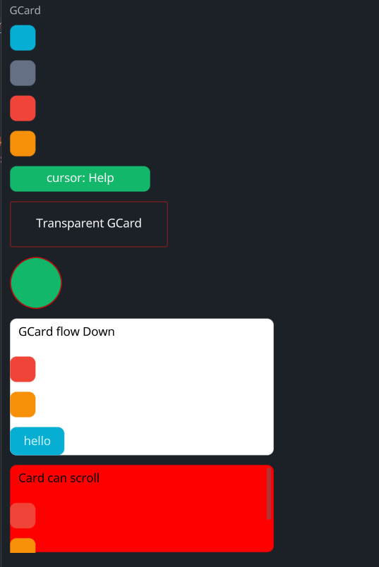
#![allow(unused)]
fn main() {
use makepad_widgets::*;

live_design! {
    import makepad_widgets::base::*;
    import makepad_widgets::theme_desktop_dark::*;
    import gen_components::components::*;

    GCardExample = <ScrollYView>{
        height: 660.0,
        width: Fill,
        flow: Down,
        spacing: 10.0,
        <Label>{
            text: "GCard",
        }
        <GCard>{
            height: 30.0,
            width: 30.0,
        }
        <GCard>{
            theme: Dark,
            height: 30.0,
            width: 30.0,
        }
        <GCard>{
            theme: Error,
            height: 30.0,
            width: 30.0,
        }
        <GCard>{
            theme: Warning,
            height: 30.0,
            width: 30.0,
            animator_key: true,
        }
        <GCard>{
            theme: Success,
            height: 30.0,
            width: 160.0,
            cursor: Help,
            align: {x: 0.5, y: 0.5},
            <GLabel>{
                text: "cursor: Help",
            }
        }
        <GCard>{
            theme: Error,
            height: Fit,
            width: 180.0,
            transparent: true,
            border_width: 1.0,
            border_radius: 0.0,
            align: {x: 0.5, y: 0.5},
            <GLabel>{
                margin: 20.0,
                text: "Transparent GCard",
            }
        }
        <GCard>{
            theme: Success,
            height: 60.0,
            width: 60.0,
            border_color: #FF0000,
            border_width: 1.0,
            border_radius: 15.0,
        }
        <GCard>{
            height: Fit,
            width: 300,
            flow: Down,
            background_color: #FFFFFF,
            spacing: 10.0,
            <GLabel>{
                text: "GCard flow Down",
                color: #0,
                margin: 10.0,
            }
            <GCard>{
                theme: Error,
                height: 30.0,
                width: 30.0,
            }
            <GCard>{
                theme: Warning,
                height: 30.0,
                width: 30.0,
            }
            <GButton>{
                text: "hello"
            }
        }

        <GCard>{
            height: 100.0,
            width: 300,
            flow: Down,
            background_color: #FF0000,
            spacing: 10.0,
            // transparent: true,
            scroll_bars: <GScrollBars> {}
            <GLabel>{
                text: "Card can scroll",
                color: #0,
                margin: 10.0,
            }
            <GCard>{
                theme: Error,
                height: 30.0,
                width: 30.0,
            }
            <GCard>{
                theme: Warning,
                height: 30.0,
                width: 30.0,
            }
            <GButton>{
                text: "hello"
            }
        }
    }
}
}
Props
| decorate | name | type | description |
|---|---|---|---|
| live | theme | Themes | The theme applied to the card. |
| live | background_color | Option<Vec4> | The background color of the card. |
| live | hover_color | Option<Vec4> | The color of the card when hovered. |
| live | pressed_color | Option<Vec4> | The color of the card when pressed. |
| live | border_color | Option<Vec4> | The border color of the card. |
| live | border_width | f32 | The width of the card's border. |
| live | border_radius | f32 | The radius of the card's border. |
| live | visible | bool | Whether the card is visible. |
| live | transparent | bool | Whether the card background is transparent. |
| live | cursor | Option<MouseCursor> | The cursor type when hovering over the card. |
| live | animator_key | bool | Whether the card uses an animation key. |
| live | scroll_bars | Option<LivePtr> | The optional scroll bars for the card. |
| rust | scroll_bars_obj | Option<Box<ScrollBars>> | The scroll bars object. |
| live | grab_key_focus | bool | Whether the card grabs key focus when clicked. |
| live | block_signal_event | bool | Whether the card blocks signal events. |
| live | draw_card | DrawCard | The component used for drawing the card. |
| walk | walk | Walk | The positioning properties for the card. |
| layout | layout | Layout | The layout properties for the card. |
| rust | draw_state | DrawStateWrap<DrawState> | The draw state of the card. |
| rust | children | ComponentMap<LiveId, WidgetRef> | The children components of the card. |
| rust | draw_order | Vec<LiveId> | The draw order of the card's children. |
| live | event_order | EventOrder | The event order for the card. |
| rust | defer_walks | Vec<(LiveId, DeferWalk)> | The deferred walks for the card. |
| animator | animator | Animator | The animation properties for the card. |
Event
| name | description |
|---|---|
| KeyDown | Triggered when a key is pressed down. |
| KeyUp | Triggered when a key is released. |
| FingerDown | Triggered when a finger touches the card. |
| FingerMove | Triggered when a finger moves over the card. |
| FingerHoverIn | Triggered when a finger hovers over the card. |
| FingerHoverOver | Triggered when a finger moves while hovering over the card. |
| FingerHoverOut | Triggered when a finger stops hovering over the card. |
| FingerUp | Triggered when a finger is lifted from the card. |
GVLayout
A vertical layout component use CardBase
Example
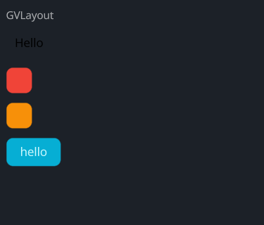
#![allow(unused)]
fn main() {
use makepad_widgets::*;

live_design! {
    import makepad_widgets::base::*;
    import makepad_widgets::theme_desktop_dark::*;
    import gen_components::components::*;

    GVLayoutExample = <ScrollYView>{
        height: 260.0,
        width: Fill,
        flow: Down,
        spacing: 10.0,
        <Label>{
            text: "GVLayout",
        }
        <GVLayout>{
            height: Fit,
            width: 300,
            background_color: #FFFFFF,
            spacing: 10.0,
            <GLabel>{
                text: "Hello",
                color: #0,
                margin: 10.0,
            }
            <GCard>{
                theme: Error,
                height: 30.0,
                width: 30.0,
            }
            <GCard>{
                theme: Warning,
                height: 30.0,
                width: 30.0,
            }
            <GButton>{
                text: "hello"
            }
        }
    }
}
}
GHLayout
A horizontal layout component use CardBase
layout don't have border, background color, border-radius, ... (but you can add if you want)
Example
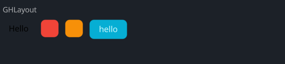
#![allow(unused)]
fn main() {
use makepad_widgets::*;

live_design! {
    import makepad_widgets::base::*;
    import makepad_widgets::theme_desktop_dark::*;
    import gen_components::components::*;

    GHLayoutExample = <ScrollYView>{
        height: 100.0,
        width: Fill,
        flow: Down,
        spacing: 10.0,
        <Label>{
            text: "GHLayout",
        }
        <GHLayout>{
            height: Fit,
            width: 300,
            background_color: #FFFFFF,
            spacing: 10.0,
            <GLabel>{
                text: "Hello",
                color: #0,
                margin: 10.0,
            }
            <GCard>{
                theme: Error,
                height: 30.0,
                width: 30.0,
            }
            <GCard>{
                theme: Warning,
                height: 30.0,
                width: 30.0,
            }
            <GButton>{
                text: "hello"
            }
        }
    }
}
}
GButton
A customizable button widget with hover and press animations, configurable colors, cursor behavior, and text properties.
Example
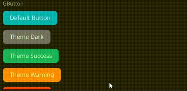
#![allow(unused)]
fn main() {
use makepad_widgets::*;

live_design! {
    import makepad_widgets::base::*;
    import makepad_widgets::theme_desktop_dark::*;
    import gen_components::components::*;

    GButtonExample = <ScrollYView>{
        height: 200.0,
        width: Fill,
        flow: Down,
        spacing: 10.0,
        <Label>{
            text: "GButton"
        }
        <GButton>{
            text: "Default Button"
        }
        <GButton>{
            theme: Dark,
            text: "Theme Dark"
        }
        <GButton>{
            theme: Success,
            text: "Theme Success"
        }
        <GButton>{
            theme: Warning,
            text: "Theme Warning"
        }
        <GButton>{
            theme: Error,
            text: "Theme Error",
        }
        <GButton>{
            theme: Error,
            text: "unvisible button!",
            visible: false,
        }
        <GButton>{
            round: true,
            text: "Round Button",
        }
        <GButton>{
            height: 46,
            width: 160,
            theme: Success,
            border_width: 1.4,
            border_color: #FFF,
            border_radius: 11.0,
            text: "Rounded Button!",
        }
        <GButton>{
            theme: Dark,
            border_width: 1.2,
            hover_color: #FF0000,
            pressed_color: #00FF00,
            text: "GButton!",
            font_family: dep("E:/Rust/try/makepad/Gen-UI/examples/gen_widget_example/resources/GoNotoKurrent-Bold.ttf"),
            font_size: 12.0,
            color: #000,
        }
    }
}
}
Props
| decorate | name | type | description |
|---|---|---|---|
| live | theme | Themes | The theme applied to the button. |
| live | background_color | Option<Vec4> | The background color of the button. |
| live | hover_color | Option<Vec4> | The color of the button when hovered. |
| live | pressed_color | Option<Vec4> | The color of the button when pressed. |
| live | border_color | Option<Vec4> | The border color of the button. |
| live | border_width | f32 | The width of the button's border. |
| live | border_radius | f32 | The radius of the button's border. |
| live | round | bool | Whether the button has rounded corners. |
| live | text | RcStringMut | The text displayed on the button. |
| live | font_size | f64 | The font size of the button text. |
| live | color | Option<Vec4> | The color of the button text. |
| live | font_family | LiveDependency | The font family used for the button text. |
| live | cursor | Option<MouseCursor> | The cursor type when hovering over the button. |
| live | visible | bool | Whether the button is visible. |
| live | draw_text | DrawText | The component used for drawing the button text. |
| live | text_walk | Walk | The positioning properties for the button text. |
| live | grab_key_focus | bool | Whether the button grabs key focus when clicked. |
| animator | animator | Animator | The animation properties for the button. |
| redraw | draw_button | DrawCard | The component used for drawing the button. |
| walk | walk | Walk | The positioning properties for the button. |
| layout | layout | Layout | The layout properties for the button. |
Event
| name | description |
|---|---|
| Hovered | Triggered when the button is hovered. |
| Clicked | Triggered when the button is clicked. |
| Released | Triggered when the button is released. |
| Pressed | Triggered when the button is pressed. |
GRadio
A radio button widget with customizable colors, cursor behavior, and animations for hover and selection states.
Example
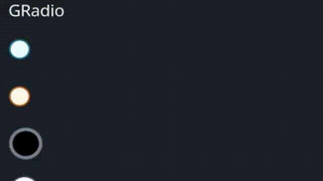
#![allow(unused)]
fn main() {
use makepad_widgets::*;

live_design! {
    import makepad_widgets::base::*;
    import makepad_widgets::theme_desktop_dark::*;
    import gen_components::components::*;

    GRadioExample = <ScrollYView>{
        height: 150.0,
        width: Fill,
        spacing: 10.0,
        flow: Down,
        <GLabel>{
            text: "GRadio"
        }
        <GRadio>{
            height: 30.0,
            width: 60.0,
        }
        <GRadio>{
            theme: Warning,
            height: 30.0,
            width: 60.0,
            radio_type: Tick,
        }
        <GRadio>{
            theme: Success,
            height: 30.0,
            width: 60.0,
            size: 12.0,
            scale: 0.6,
            border_width: 2.0,
            radio_type: Round,
            background_color: #000,
            selected_color: #42A5F5,
            hover_color: #FF7043,
            border_color: #76828F,
        }
        <GRadio>{
            theme: Dark,
            height: 30.0,
            width: 60.0,
            size: 12.0,
            radio_type: Tick,
        }
        <GRadio>{
            theme: Error,
            height: 30.0,
            width: 60.0,

            radio_type: Cross,
        }
    }
}
}
Props
| decorate | name | type | description |
|---|---|---|---|
| live | theme | Themes | The theme applied to the radio button. |
| live | size | f32 | The size of the radio button. |
| live | background_color | Option<Vec4> | The background color of the radio button. |
| live | hover_color | Option<Vec4> | The color of the radio button when hovered. |
| live | focus_color | Option<Vec4> | The color of the radio button when focused. |
| live | selected_color | Option<Vec4> | The color of the radio button when selected. |
| live | border_color | Option<Vec4> | The border color of the radio button. |
| live | border_width | f32 | The width of the radio button's border. |
| live | scale | f32 | The scale of the radio button. |
| live | cursor | Option<MouseCursor> | The cursor type when hovering over the radio button. |
| live | value | String | The value associated with the radio button. |
| live | radio_type | GChooseType | The type of the radio button. |
| redraw | draw_radio | DrawGRadio | The component used for drawing the radio button. |
| walk | walk | Walk | The positioning properties for the radio button. |
| layout | layout | Layout | The layout properties for the radio button. |
| animator | animator | Animator | The animation properties for the radio button. |
Event
| name | description |
|---|---|
| Clicked | Triggered when the radio button is clicked, carrying the associated value. |
| Hover | Triggered when the radio button is hovered. |
Note: Events with None are omitted.
GCheckBox
A customizable checkbox widget with various properties for appearance, cursor behavior, and animations for different states.
Example
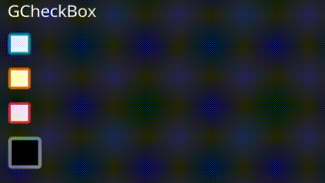
#![allow(unused)]
fn main() {
use makepad_widgets::*;

live_design! {
    import makepad_widgets::base::*;
    import makepad_widgets::theme_desktop_dark::*;
    import gen_components::components::*;

    GCheckBoxExample = <ScrollYView>{
        height: 150.0,
        width: Fill,
        spacing: 10.0,
        flow: Down,
        <GLabel>{
            text: "GCheckBox"
        }
        <GCheckBox>{

        }
        <GCheckBox>{
            theme: Warning,
            check_type: Tick,
        }
        <GCheckBox>{
            theme: Error,
            check_type: Cross,
        }
        <GCheckBox>{
            theme: Success,
            height: 30.0,
            width: 60.0,
            size: 12.0,
            scale: 0.6,
            border_width: 2.0,
            check_type: Round,
            background_color: #000,
            selected_color: #42A5F5,
            hover_color: #FF7043,
            border_color: #76828F,
        }
        <GCheckBox>{
            theme: Dark,
            height: 30.0,
            width: 60.0,
            size: 12.0,
            check_type: Tick,
        }

    }
}
}
Props
| decorate | name | type | description |
|---|---|---|---|
| live | theme | Themes | The theme applied to the checkbox. |
| live | size | f32 | The size of the checkbox. |
| live | background_color | Option<Vec4> | The background color of the checkbox. |
| live | hover_color | Option<Vec4> | The color of the checkbox when hovered. |
| live | focus_color | Option<Vec4> | The color of the checkbox when focused. |
| live | selected_color | Option<Vec4> | The color of the checkbox when selected. |
| live | border_color | Option<Vec4> | The border color of the checkbox. |
| live | border_width | f32 | The width of the checkbox's border. |
| live | scale | f32 | The scale of the checkbox. |
| live | cursor | Option<MouseCursor> | The cursor type when hovering over the checkbox. |
| live | value | String | The value associated with the checkbox. |
| live | check_type | GChooseType | The type of the checkbox. |
| redraw | draw_check | DrawGCheckBox | The component used for drawing the checkbox. |
| walk | walk | Walk | The positioning properties for the checkbox. |
| layout | layout | Layout | The layout properties for the checkbox. |
| animator | animator | Animator | The animation properties for the checkbox. |
Event
| name | description |
|---|---|
| Changed | Triggered when the checkbox state changes, carrying the new state and associated value. |
| Hover | Triggered when the checkbox is hovered. |
Note: Events with None are omitted.
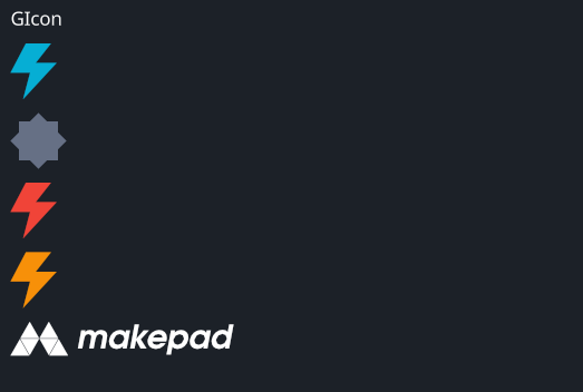
GIcon
A customizable icon widget that supports various visual properties and animation states.
Example
#![allow(unused)]
fn main() {
use makepad_widgets::*;

live_design! {
    import makepad_widgets::base::*;
    import makepad_widgets::theme_desktop_dark::*;
    import gen_components::components::*;

    GIconExample = <ScrollYView>{
        height: 200.0,
        width: Fill,
        spacing: 10.0,
        flow: Down,
        <GLabel>{
            text: "GIcon",
        }
        <GIcon>{
            cursor: Help,
            src: dep("crate://self/resources/lightning.svg"),
        }
        <GIcon>{
            theme: Dark,
            src: dep("crate://self/resources/config.svg"),
        }
        <GIcon>{
            theme: Error,
            src: dep("crate://self/resources/lightning.svg"),
        }
        <GIcon>{
            theme: Warning,
            src: dep("crate://self/resources/lightning.svg"),
        }
        <GIcon>{
            height: 60,
            width: 160,
            cursor: Help,
            color: #fff,
            src: dep("crate://self/resources/logo_makepad.svg"),
        }

    }
}
}
Props
| decorate | name | type | description |
|---|---|---|---|
| live | theme | Themes | The theme applied to the icon. |
| live | brightness | f32 | The brightness of the icon. |
| live | curve | f32 | The curve effect applied to the icon. |
| live | linearize | f32 | The linearization factor of the icon. |
| live | src | LiveDependency | The source dependency for the icon's image. |
| live | command | Option<String> | The SVG path command (TODO). |
| live | scale | f64 | The scale of the icon. |
| live | color | Option<Vec4> | The color of the icon. |
| live | draw_depth | f32 | The drawing depth of the icon. |
| live | hover_color | Option<Vec4> | The color of the icon when hovered. |
| live | cursor | Option<MouseCursor> | The cursor type when hovering over the icon. |
| live | visible | bool | Visibility of the icon. |
| animator | animator | Animator | The animation properties for the icon. |
| redraw | draw_icon | DrawGIcon | The component used for drawing the icon. |
| walk | walk | Walk | The positioning properties for the icon. |
| layout | layout | Layout | The layout properties for the icon. |
Event
| name | description |
|---|---|
| Clicked | Triggered when the icon is clicked. |
| Hover | Triggered when the icon is hovered. |
Note: Events with None are omitted.
GImage
A versatile image widget that supports various visual properties, layout, and interactions.
Example
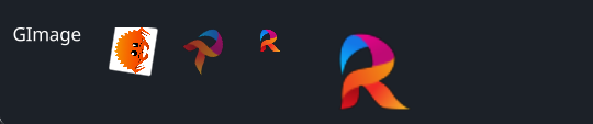
#![allow(unused)]
fn main() {
use makepad_widgets::*;

live_design! {
    import makepad_widgets::base::*;
    import makepad_widgets::theme_desktop_dark::*;
    import gen_components::components::*;
    import makepad_draw::shader::std::*;
    GImageExample = <ScrollYView>{
        height: 100.0,
        width: Fill,
        spacing: 20.0,
        <GLabel>{
            text: "GImage",
        }
        <GImage>{
            height: 32.0,
            width: 36.0,
            src: dep("crate://self/resources/rust.png"),
            rotation:30.0,
        }
        <GImage>{
            rotation: 1.0,
            opacity: 0.6,
            src: dep("crate://self/resources/robius.png"),
        }
        <GImage>{
            scale: 0.6,
            src: dep("crate://self/resources/robius.png"),
        }
        <GImage>{
            scale: 2.0,
            src: dep("crate://self/resources/robius.png"),
        }


    }
}
}
Props
| decorate | name | type | description |
|---|---|---|---|
| live | visible | bool | Visibility of the image. |
| live | opacity | f32 | The opacity of the image. |
| live | cursor | Option<MouseCursor> | The cursor type when hovering over the image. |
| live | scale | f64 | The scale of the image. |
| live | rotation | f32 | The rotation angle of the image. |
| walk | walk | Walk | The positioning properties for the image. |
| layout | layout | Layout | The layout properties for the image. |
| redraw | draw_image | DrawCard | The component used for drawing the image. |
| live | src | LiveDependency | The source dependency for the image's content. |
| rust | texture | Option<Texture> | The texture used for the image. |
Event
No events specified for this widget.
GInput
The GInput widget is a versatile text input field with various visual and interactive properties. It supports themes, customization of colors, borders, text properties, cursor styles, and more.
Example
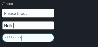
#![allow(unused)]
fn main() {
use makepad_widgets::*;

live_design! {
    import makepad_widgets::base::*;
    import makepad_widgets::theme_desktop_dark::*;
    import gen_components::components::*;

    GInputExample = <ScrollYView>{
        height: 160.0,
        width: Fill,
        spacing: 10.0,
        flow:Down,
        <Label>{
            text: "GInput"
        }
        <GInput>{
            theme: Dark,
        }
        <GInput>{
            theme: Dark,
            border_width: 2.0,
            // border_radius: 4.0,
            value: "Hello",
            placeholder: "please",

        }
        <GInput>{
            border_radius: 8.0,
            border_width: 2.0,
            input_type: Pwd,
        }
    }
}
}
Props
| decorate | name | type | description |
|---|---|---|---|
| live | theme | Themes | The theme of the input field. |
| live | color | Option<Vec4> | The color of the text. |
| live | background_color | Option<Vec4> | The background color of the input field. |
| live | hover_color | Option<Vec4> | The color when the input field is hovered over. |
| live | pressed_color | Option<Vec4> | The color when the input field is pressed. |
| live | border_color | Option<Vec4> | The color of the border. |
| live | border_width | f32 | The width of the border. |
| live | border_radius | f32 | The radius of the border's corners. |
| live | round | bool | Whether the border is rounded. |
| live | value | String | The current value of the input field. |
| live | placeholder | String | The placeholder text for the input field. |
| live | input_type | GInputType | The type of input (e.g., text, password). |
| live | disabled | bool | Whether the input field is disabled. |
| live | font_size | f64 | The size of the font. |
| live | brightness | f32 | The brightness of the text. |
| live | curve | f32 | The curve property for text rendering. |
| live | top_drop | f64 | The top drop property for text positioning. |
| live | height_factor | f64 | The height factor for text rendering. |
| live | wrap | TextWrap | The text wrapping mode. |
| live | font_family | LiveDependency | The font family used for the text. |
| live | cursor_width | f64 | The width of the cursor. |
| live | cursor_border_radius | f64 | The border radius of the cursor. |
| live | cursor_margin_bottom | f64 | The bottom margin of the cursor. |
| live | cursor_margin_top | f64 | The top margin of the cursor. |
| live | on_focus_select_all | bool | Whether to select all text on focus. |
| rust | cursor_tail | usize | The tail position of the cursor. |
| rust | cursor_head | usize | The head position of the cursor. |
| redraw | draw_input | DrawCard | The component used for drawing the input field. |
| live | draw_select | DrawCard | The component used for drawing the selection. |
| live | draw_cursor | DrawCard | The component used for drawing the cursor. |
| live | draw_text | DrawGText | The component used for drawing the text. |
| rust | undo_id | u64 | The ID for the undo action. |
| rust | last_undo | Option<UndoItem> | The last undo item. |
| rust | undo_stack | Vec<UndoItem> | The stack of undo actions. |
| rust | redo_stack | Vec<UndoItem> | The stack of redo actions. |
| rust | double_tap_start | Option<(usize, usize)> | The start positions for a double tap. |
| walk | walk | Walk | The positioning properties for the input field. |
| layout | layout | Layout | The layout properties for the input field. |
| animator | animator | Animator | The animator for handling animations. |
Event
| name | description |
|---|---|
| Changed | Triggered when the text changes. |
| Return | Triggered when the return key is pressed. |
| Escape | Triggered when the escape key is pressed. |
| KeyFocus | Triggered when the input field gains focus. |
| KeyFocusLost | Triggered when the input field loses focus. |
Test-Plan
测试计划,该计划会在GenUI框架基本完成前重复执行,并在每个阶段进行修正和增加相应的
[!IMPORTANT]
当前包括以下测试:
- 静态组件
- Color
- 动画
- For
- If
- 动态组件
- 示例与属性
- 示例事件
- 生命周期
- 脚本混入
Static
Makepad 基础组件测试
该测试当前位置: GenUI/examples/gen_makepad_simple
| 测试版本 | Makepad | GenUI | 更新时间 |
|---|---|---|---|
| 0.1.0 | 0.6.0 | 0.1.0_unpub | 2024-08-22 |
- Window
- View
- Button
- Icon
- Label
- Image
- RotatedImage
- Radio
- Checkbox
- ScrollXYView
- ScrollXView
- ScrollYView
- SolidView
- RectView
- RectShadowView
- RoundedView
- RoundedShadowView
- TextInput
- DropDown
- LinkLabel
- FoldButton
- Slider
- SliderBig
-
Slide
- SlidesView
- SlideBody
- SlideChapter
- FoldHeader
- Html
- Markdown
- ScrollBar
- ScrollBars
- DesktopButton
- Splitter
内置GenUI库测试
该测试当前位置: GenUI/examples/gen_widget_simple
| 测试版本 | Makepad | GenUI | 更新时间 |
|---|---|---|---|
| 0.1.0 | 0.6.0 | 0.1.0_unpub | 2024-08-14 |
- Label
- Link
- Button
-
Card
- VLayout
- HLayout
- Radio
- CheckBox
- Icon
- Image
- Input
- Popup
- Progress
- Loading
- Badge
- DropDown
- Toggle
- Avatar
- ToolTip
- Progress
- Slider
- Tab
- Table
- Dialog
- Select
- FileUpload
- Divide
- Loading
- EmptyState
- BreadCrumb
- Pagination
- Metric
- Menu
- ScrollBar(s)
内置库集成GenUI (未开始)
该测试当前位置: GenUI/examples/
| 测试版本 | Makepad | GenUI | 更新时间 |
|---|
Color
该测试当前位置: GenUI/examples/tests
| 测试版本 | Makepad | GenUI | 更新时间 |
|---|---|---|---|
| 0.1.0 | 0.6.0 | 0.1.0_unpub | 2024-08-22 |
- Hex
- Rgb
- Rgba
- Linear
- Radial
- Shader
Animation
该测试当前位置: GenUI/examples/tests
| 测试版本 | Makepad | GenUI | 更新时间 |
|---|---|---|---|
| 0.1.0 | 0.6.0 | 0.1.0_unpub | 2024-08-22 |
- Window
- View
- Button
- Icon
- Label
- Image
- RotatedImage
- Radio
- Checkbox
- ScrollXYView
- ScrollXView
- ScrollYView
- SolidView
- RectView
- RectShadowView
- RoundedView
- RoundedShadowView
- TextInput
- DropDown
- LinkLabel
- FoldButton
- Slider
- SliderBig
-
Slide
- SlidesView
- SlideBody
- SlideChapter
- FoldHeader
- Html
- Markdown
- ScrollBar
- ScrollBars
- DesktopButton
- Splitter
For
该测试当前位置: GenUI/examples/gen_makepad_simple
| 测试版本 | Makepad | GenUI | 更新时间 |
|---|---|---|---|
| 0.1.0 | 0.6.0 | 0.1.0_unpub | 2024-08-22 |
-
[$Type; n] -
Vec<$Type>
- 单层For
- 嵌套For
- 数值绑定
If
该测试当前位置: GenUI/examples/gen_makepad_simple
| 测试版本 | Makepad | GenUI | 更新时间 |
|---|---|---|---|
| 0.1.0 | 0.6.0 | 0.1.0_unpub | 2024-08-22 |
- 简单bool
- 其他类型
- 闭包方法
- 数值绑定
Dyn
Prop
Event
LifeTime
Inject-Script
GenUI-Design Documentation
Template Section
HTML-LIKE Syntax:
The syntax is reminiscent of HTML but has been enhanced for more structured processing.
Key considerations for maintaining a clear and focused template:
- Direct string literals are not permitted.
- Template syntax is prohibited; use Rust's
format!for value bindings instead. - Declare basic attributes on tags using primitive types only; complex types should be bound separately.
- Function bodies must not be directly written within attributes; instead, employ function bindings.
- Attributes are strongly-typed, ensuring clear and explicit type associations.
Script Section
- Full support for Rust syntax is provided, allowing for powerful scripting capabilities.
- Integration with Special Frameworks is permitted, expanding the possibilities for functionality and customization.
Style Section
- Styles are bound to tags by their names, enabling easy and intuitive styling.
- Nesting of styles is allowed, offering a hierarchical approach to styling that mirrors traditional CSS.
- Functions and bindings are supported within styles, allowing for dynamic styling based on logic and conditions.
Parser
Convert RSX DSL to AST
                                                   Real AST
-----------       ---------------   Strategy   ---------------
| RSX DSL |  -->  | ParseTarget |  ----------> | ParseResult |
-----------       ---------------              ---------------
Convert To Makead
                                   ---------------------------
                                   |                         |
------------------------           |   MakepadConvertResult  |
| AST (in ParseResult) | --------> |                         |
------------------------           |   --------------------  |
------------------------           |   | MakepadConverter |  |
| File Meta Data       | --------> |   --------------------  |
------------------------           |                         |
                                   ---------------------------
                                                |
                           |------------------→ |
                           |                    ↓
------------               |              ----------------
| Strategy | --------------|              | Makepad Code |
------------                              ----------------
Parse RSX File to AST
Parse Plan
- parse the outer :
&str to Vec<Targets> to ParseTarget - parse the inner :
ParseTarget to AST
parse outer
外层采用 nom 进行直接转换
outer use nom to parse directly
The aim of outer parsing is to divide the entire file into three main(Ⓜ️) parts:
- template (optional) Ⓜ️
- script (optional) Ⓜ️
- style (optional) Ⓜ️
- comment (optional)
parse result
normal
target
#![allow(unused)]
fn main() {
let input = r#"
        //! This is a comment1
        //! This is a comment2
        //! This is a comment3
        <template>
            <window class="ui">
            </window>
        </template>

        // This is line comment
        /// This is a doc comment
        /// hello
        <script>
        let mut counter:usize = 0

        let handle_actions:FnOnce()->() = || {
            counter += 1;
        }
        </script>

        // This is line comment2
        <style>
        .ui{
            height : fill;
            width : fill;
            show-bg : true;
        }
        </style>
        // end of line comment
        "#;
}
result
#![allow(unused)]
fn main() {
[parser/src/ast/mod.rs:310] target = Ok(
    ParseTarget {
        template: Some(
            "<window class=\"ui\">\n            </window>\n        ",
        ),
        script: Some(
            "let mut counter:usize = 0\n\n        let handle_actions:FnOnce()->() = || {\n            counter += 1;\n        }\n        ",
        ),
        style: Some(
            ".ui{\n            height : fill;\n            width : fill;\n            show-bg : true;\n        }\n        ",
        ),
        comment: Some(
            [
                OfflineComment {
                    value: [
                        File(
                            "This is a comment1",
                        ),
                        File(
                            "This is a comment2",
                        ),
                        File(
                            "This is a comment3",
                        ),
                    ],
                    position: AboveTemplate,
                },
                OfflineComment {
                    value: [
                        Normal(
                            "This is line comment",
                        ),
                        Document(
                            "This is a doc comment",
                        ),
                        Document(
                            "hello",
                        ),
                    ],
                    position: AboveScript,
                },
                OfflineComment {
                    value: [
                        Normal(
                            "This is line comment2",
                        ),
                    ],
                    position: AboveStyle,
                },
                OfflineComment {
                    value: [
                        Normal(
                            "end of line comment",
                        ),
                    ],
                    position: End,
                },
            ],
        ),
    },
)
}
empty
#![allow(unused)]
fn main() {
[parser/src/ast/mod.rs:318] target = Err(
    ParseError(
        "The current file has no content. It should be removed to ensure your program has clean file tree!",
    ),
)
}
only code
#![allow(unused)]
fn main() {
        let input = r#"
        let a:&str = "trest";
        "#;
}
#![allow(unused)]
fn main() {
[parser/src/ast/mod.rs:328] target = Err(
    ParseError(
        "Parsing file exception. The current file contains content that is not covered by processed tags. If it is a rust script, please wrap it in a `<script>` tag",
    ),
)
}
parse inner
Block parsing
- no
<template>tag and no<style>tag --> parse as rust script (1 thread) - no
<template>tag and no rust script has<style>tag --> parse as style (1 thread) - no
<style>tag and no rust script has<template>tag --> parse as template (1 thread) - has
<template>tag and rust script no<style>tag --> parse as template_script (2 thread) - has 3 tag --> parse as whole rsx (3 thread)
parse template
see parse_template.md
parse_style
see parse_style.md
parse_script
see parse_script.md
Parse Result
test machine 1
cpu: 2.2 GHz 四核 Intel Core i7
rsx:
- 1.332564ms
- 1.203039ms
- 1.496007ms
- 1.229173ms
- 1.207143ms
- 1.125941ms
vue:
- 6.839ms
- 7.19ms
- 6.804ms
- 7.978ms
- 6.977ms
- 7.046ms
test machine 2
cpu: Intel(R) Core(TM) i5-10200H CPU @ 2.40GHz 2.40 GHz
rsx:
- 1.4491ms
- 1.2271ms
- 1.6149ms
- 1.6475ms
- 1.4695ms
vue:
- 6.196ms
- 6.012ms
- 6.209ms
- 6.319ms
- 6.447ms
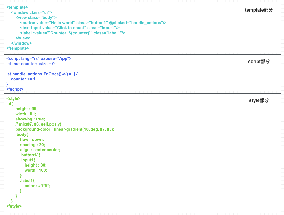
rsx
<template>
  <window class="ui">
    <view class="body">
      /// button componet
      <button value="Hello world" class="button1" @clicked="handle_click" />
      <text-input value="Click to count" class="input1" />
      <label :value="counter" class="label1" />
    </view>
  </window>
</template>

<script>
let mut counter:usize = 0_usize;

let mut handle_click = ||{
    counter += 1;
};
</script>

<style>
.app {
  .ui {
    height: fill;
    width: fill;
    show_bg: true;
    background_color: linear_gradient(180deg, #7, #3);
    .body {
      flow: down;
      spacing: 20;
      align: 0.5 0.5;
      .button1 {
      }
      .input1 {
        height: 30;
        width: 100;
      }
      .label1 {
        color: #ffffff;
      }
    }
  }
}
</style>
result
#![allow(unused)] fn main() { [parser/src/ast/result.rs:291] res = ParseResult { template: Some( [ Tag( Tag { name: "window", ty: Normal, props: Some( { PropsKey { name: "class", is_style: false, ty: Normal, }: UnKnown( "ui", ), }, ), children: Some( [ Tag( Tag { name: "view", ty: Normal, props: Some( { PropsKey { name: "class", is_style: false, ty: Normal, }: UnKnown( "body", ), }, ), children: Some( [ Comment( Document( "button componet", ), ), Tag( Tag { name: "button", ty: SelfClosed, props: Some( { PropsKey { name: "value", is_style: false, ty: Normal, }: UnKnown( "Hello world", ), PropsKey { name: "clicked", is_style: false, ty: Function, }: Function( Function { name: "handle_actions", params: None, is_style: false, }, ), PropsKey { name: "class", is_style: false, ty: Normal, }: UnKnown( "button1", ), }, ), children: None, parent: Some( Tag( Tag { name: "view", ty: Normal, props: Some( { PropsKey { name: "class", is_style: false, ty: Normal, }: UnKnown( "body", ), }, ), children: None, parent: None, }, ), ), }, ), Tag( Tag { name: "text-input", ty: SelfClosed, props: Some( { PropsKey { name: "value", is_style: false, ty: Normal, }: UnKnown( "Click to count", ), PropsKey { name: "class", is_style: false, ty: Normal, }: UnKnown( "input1", ), }, ), children: None, parent: Some( Tag( Tag { name: "view", ty: Normal, props: Some( { PropsKey { name: "class", is_style: false, ty: Normal, }: UnKnown( "body", ), }, ), children: None, parent: None, }, ), ), }, ), Tag( Tag { name: "label", ty: SelfClosed, props: Some( { PropsKey { name: "value", is_style: false, ty: Bind, }: Bind( "counter", ), PropsKey { name: "class", is_style: false, ty: Normal, }: UnKnown( "label1", ), }, ), children: None, parent: Some( Tag( Tag { name: "view", ty: Normal, props: Some( { PropsKey { name: "class", is_style: false, ty: Normal, }: UnKnown( "body", ), }, ), children: None, parent: None, }, ), ), }, ), ], ), parent: Some( Tag( Tag { name: "window", ty: Normal, props: Some( { PropsKey { name: "class", is_style: false, ty: Normal, }: UnKnown( "ui", ), }, ), children: None, parent: None, }, ), ), }, ), ], ), parent: None, }, ), ], ), style: Some( [ Style( Style { name: "ui", ty: Class, props: Some( { PropsKey { name: "background_color", is_style: true, ty: Function, }: Function( Function { name: "linear_gradient", params: Some( [ "180deg", "#7", "#3", ], ), is_style: true, }, ), PropsKey { name: "show_bg", is_style: true, ty: Normal, }: UnKnown( "true", ), PropsKey { name: "width", is_style: true, ty: Normal, }: UnKnown( "fill", ), PropsKey { name: "height", is_style: true, ty: Normal, }: UnKnown( "fill", ), }, ), children: Some( [ Style( Style { name: "body", ty: Class, props: Some( { PropsKey { name: "align", is_style: true, ty: Normal, }: UnKnown( "0.5 0.5", ), PropsKey { name: "flow", is_style: true, ty: Normal, }: UnKnown( "down", ), PropsKey { name: "spacing", is_style: true, ty: Normal, }: UnKnown( "20", ), }, ), children: Some( [ Style( Style { name: "button1", ty: Class, props: None, children: None, parent: Some( Style( Style { name: "body", ty: Class, props: None, children: None, parent: None, }, ), ), }, ), Style( Style { name: "input1", ty: Class, props: Some( { PropsKey { name: "height", is_style: true, ty: Normal, }: UnKnown( "30", ), PropsKey { name: "width", is_style: true, ty: Normal, }: UnKnown( "100", ), }, ), children: Some( [], ), parent: Some( Style( Style { name: "body", ty: Class, props: None, children: None, parent: None, }, ), ), }, ), Style( Style { name: "label1", ty: Class, props: Some( { PropsKey { name: "color", is_style: true, ty: Normal, }: UnKnown( "#ffffff", ), }, ), children: Some( [], ), parent: Some( Style( Style { name: "body", ty: Class, props: None, children: None, parent: None, }, ), ), }, ), ], ), parent: Some( Style( Style { name: "ui", ty: Class, props: None, children: None, parent: None, }, ), ), }, ), ], ), parent: None, }, ), ], ), script: Some( Script( Block { brace_token: Brace, stmts: [ Stmt::Local { attrs: [], let_token: Let, pat: Pat::Type { attrs: [], pat: Pat::Ident { attrs: [], by_ref: None, mutability: Some( Mut, ), ident: Ident( counter, ), subpat: None, }, colon_token: Colon, ty: Type::Path { qself: None, path: Path { leading_colon: None, segments: [ PathSegment { ident: Ident( usize, ), arguments: PathArguments::None, }, ], }, }, }, init: Some( LocalInit { eq_token: Eq, expr: Expr::Lit { attrs: [], lit: Lit::Int { token: 0_usize, }, }, diverge: None, }, ), semi_token: Semi, }, Stmt::Local { attrs: [], let_token: Let, pat: Pat::Ident { attrs: [], by_ref: None, mutability: Some( Mut, ), ident: Ident( click, ), subpat: None, }, init: Some( LocalInit { eq_token: Eq, expr: Expr::Closure { attrs: [], lifetimes: None, constness: None, movability: None, asyncness: None, capture: None, or1_token: Or, inputs: [], or2_token: Or, output: ReturnType::Default, body: Expr::Block { attrs: [], label: None, block: Block { brace_token: Brace, stmts: [ Stmt::Expr( Expr::Binary { attrs: [], left: Expr::Path { attrs: [], qself: None, path: Path { leading_colon: None, segments: [ PathSegment { ident: Ident( counter, ), arguments: PathArguments::None, }, ], }, }, op: BinOp::AddAssign( PlusEq, ), right: Expr::Lit { attrs: [], lit: Lit::Int { token: 1, }, }, }, Some( Semi, ), ), ], }, }, }, diverge: None, }, ), semi_token: Semi, }, ], }, ), ), } }
Converter
The purpose of my framework is to allow users to write the necessary code without learning other GUI libraries.
For example, you don't need to learn Makepad to use this framework directly. Use the most basic Rust STD library to convert this framework into Makepad's DSL and other code for handling events and property binding.
I think it is very user-friendly for users.
Of course, I believe that my framework is not a replacement for Makepad, but rather simplifies the difficulty of writing Makepad code.
For most people, they may not need very fancy special effects, but rather quickly start to implement a product.
For those who pursue higher goals, Makepad can be directly used in DSL
Makepad Generate Documentation
Utilizing Only Rust Std
GenUI empowers users to create Makepad code using only the Rust standard library, offering a streamlined and beginner-friendly approach.
This method necessitates indicating the use of the standard library within the <script> tag either by specifying <script lang="std"> or by employing a tag without the lang prop.
#![allow(unused)]
fn main() {
<template>
    <window id="ui" background_visible="true">
        <view id="body" :spacing="view_space" :flow="view_flow">
            <button id="btn1" :text="btn_text" @clicked="change_text"></button>
            <label id="t_label" :text="label_text" :font_size="label_size" />
        </view>
    </window>
</template>

<script>
let view_space: f64 = 20.0;
let mut view_flow = String::from("Down");
let mut label_text = String::from("This is a Hello, World! The emoji failed to display.");
let label_size = 24.0;
let btn_text = String::from("Click Me");

let mut change_text = || {
    label_text = String::from("I have been clicked!");
};
</script>

<style>
ui {
    width: Fill;
    height: Fill;
    background_color: #96CEF8;
    body {
        align: 0.5;
        t_label {
            brightness: 1.1;
            color: #fff;
            wrap: Word;
            font: "crate://makepad-widgets/resources/IBMPlexSans-SemiBold.ttf";
        }
    }
}
</style>
}
Crafting Makepad Code
GenUI also supports direct code creation using Makepad. However, this approach means that direct property and method bindings are not permitted.
To directly write Makepad code, you need to add the lang prop to the <script> tag and set it to makepad, <script lang="makepad">.
Thanks to GenUI's conversion mechanism, some nested properties in Makepad can still be written directly in the <style> section without the need for nesting.
#![allow(unused)]
fn main() {
<template>
    <window id="ui" background_visible="true">
        <view id="body">
            <button id="btn1" />
            <label id="t_label" />
        </view>
    </window>
</template>

<script lang="makepad">
#[derive(Live, LiveHook)]
pub struct MyApp {
    #[live]
    ui: WidgetRef,
    #[rust]
    instance: Instance,
}
#[derive(Debug, Clone, Default)]
struct Instance {
    pub view_flow: Flow,
    pub label_text: String,
}
impl Instance {
    pub fn new() -> Self {
        Self {
            view_flow: Flow::Down,
            label_text: String::from("this is a Hello, World!! emoji failed"),
        }
    }
    pub fn get_view_flow(&self) -> &Flow {
        &self.view_flow
    }
    pub fn set_view_flow(&mut self, view_flow: Flow) {
        self.view_flow = view_flow
    }
    pub fn get_label_text(&self) -> &String {
        &self.label_text
    }
    pub fn set_label_text(&mut self, label_text: String) {
        self.label_text = label_text
    }
}
impl MatchEvent for MyApp {
    fn handle_startup(&mut self, cx: &mut Cx) {
        self.instance = Instance::new();
        let label_t_label = self.ui.label(id!(t_label));
        label_t_label.apply_over_and_redraw(
            cx,
            live! { text: "this is a Hello, World!! emoji failed",  draw_text: {  } },
        );
        let view_body = self.ui.view(id!(body));
        view_body.apply_over_and_redraw(cx, live! { flow: Down,  });
        let view_body = self.ui.view(id!(body));
        view_body.apply_over_and_redraw(cx, live! { spacing: 20,  });
        let label_t_label = self.ui.label(id!(t_label));
        label_t_label.apply_over_and_redraw(
            cx,
            live! {  draw_text: { text_style: { font_size: 24,  } } },
        );
        let button_btn1 = self.ui.button(id!(btn1));
        button_btn1.apply_over_and_redraw(cx, live! { text: "Click Me",  });
    }
    fn handle_actions(&mut self, cx: &mut Cx, actions: &Actions) {
        if self.ui.button(id!(btn1)).clicked(&actions) {
            let mut change_text = || {
                self.instance.label_text = String::from("I have been clicked!");
            };
            change_text();
            let label_t_label = self.ui.label(id!(t_label));
            label_t_label
                .apply_over_and_redraw(cx, live! { text: (self.instance.get_label_text()), });
        }
    }
}
impl LiveRegister for MyApp {
    fn live_register(cx: &mut Cx) {
        crate::makepad_widgets::live_design(cx);
    }
}
impl AppMain for MyApp {
    fn handle_event(&mut self, cx: &mut Cx, event: &Event) {
        match event {
            Event::Startup => self.handle_startup(cx),
            _ => (),
        };
        self.match_event(cx, event);
        self.ui.handle_event(cx, event, &mut Scope::empty());
    }
}
app_main!(MyApp);
</script>

<style>
ui {
    width: Fill;
    height: Fill;
    background_color: #96CEF8;
    body {
        spacing: 20.0;
        align: 0.5;
        flow: Down;
        btn1 {
            text: "Click Me";
        }
        t_label {
            brightness: 1.1;
            color: #fff;
            wrap: Word;
            font: "crate://makepad-widgets/resources/IBMPlexSans-SemiBold.ttf";
            font_size: 24.0;
            text: "This is a Hello, World! The emoji failed to display.";
        }
    }
}
</style>
}
Makepad Code
#![allow(unused)]
fn main() {
use makepad_widgets::*;
live_design! {
    import makepad_widgets::base::*;
    import makepad_widgets::theme_desktop_dark::*;
    MyApp = {{MyApp}}{
        ui: <Window>{
            show_bg: true,
            draw_bg: { color: #96CEF8 },
            height: Fill,
            width: Fill,
            body = <View>{
                align: {x: 0.5, y: 0.5},
                btn1 = <Button>{}
                t_label = <Label>{
                    draw_text: {
                        wrap: Word,
                        color: #ffffff,
                        text_style: { brightness: 1.1, font: {path: dep("crate://makepad-widgets/resources/IBMPlexSans-SemiBold.ttf")},  }
                    }
                }
            }
        }
    }
}
#[derive(Live, LiveHook)]
pub struct MyApp {
    #[live]
    ui: WidgetRef,
    #[rust]
    instance: Instance,
}
#[derive(Debug, Clone, Default)]
struct Instance {
    pub view_flow: Flow,
    pub label_text: String,
}
impl Instance {
    pub fn new() -> Self {
        Self {
            view_flow: Flow::Down,
            label_text: String::from("this is a Hello, World!! emoji failed"),
        }
    }
    pub fn get_view_flow(&self) -> &Flow {
        &self.view_flow
    }
    pub fn set_view_flow(&mut self, view_flow: Flow) {
        self.view_flow = view_flow
    }
    pub fn get_label_text(&self) -> &String {
        &self.label_text
    }
    pub fn set_label_text(&mut self, label_text: String) {
        self.label_text = label_text
    }
}
impl MatchEvent for MyApp {
    fn handle_startup(&mut self, cx: &mut Cx) {
        self.instance = Instance::new();
        let label_t_label = self.ui.label(id!(t_label));
        label_t_label.apply_over_and_redraw(
            cx,
            live! { text: "this is a Hello, World!! emoji failed",  draw_text: {  } },
        );
        let view_body = self.ui.view(id!(body));
        view_body.apply_over_and_redraw(cx, live! { flow: Down,  });
        let view_body = self.ui.view(id!(body));
        view_body.apply_over_and_redraw(cx, live! { spacing: 20,  });
        let label_t_label = self.ui.label(id!(t_label));
        label_t_label.apply_over_and_redraw(
            cx,
            live! {  draw_text: { text_style: { font_size: 24,  } } },
        );
        let button_btn1 = self.ui.button(id!(btn1));
        button_btn1.apply_over_and_redraw(cx, live! { text: "Click Me",  });
    }
    fn handle_actions(&mut self, cx: &mut Cx, actions: &Actions) {
        if self.ui.button(id!(btn1)).clicked(&actions) {
            let mut change_text = || {
                self.instance.label_text = String::from("I have been clicked!");
            };
            change_text();
            let label_t_label = self.ui.label(id!(t_label));
            label_t_label
                .apply_over_and_redraw(cx, live! { text: (self.instance.get_label_text()), });
        }
    }
}
impl LiveRegister for MyApp {
    fn live_register(cx: &mut Cx) {
        crate::makepad_widgets::live_design(cx);
    }
}
impl AppMain for MyApp {
    fn handle_event(&mut self, cx: &mut Cx, event: &Event) {
        match event {
            Event::Startup => self.handle_startup(cx),
            _ => (),
        };
        self.match_event(cx, event);
        self.ui.handle_event(cx, event, &mut Scope::empty());
    }
}
app_main!(MyApp);
}
Issues
Style 内部属性注释需要处理(后续)
// this is ok (现在只能在上面写)
.ui{
  // this is height ❌(issue,这里应该允许这样写)
  height: 160;
}
Future
Stage 1 ✅
# Incremental compilation
通过将代码分成模板、脚本、和样式三个部分,已经为实现增量编译奠定了基础。增量编译的关键在于能够快速识别出自上次编译以来哪些部分发生了变化,并仅重新编译这些变化的部分,从而节省时间和资源。将代码预处理成几个独立的部分,并使用策略模式来处理这些部分,为增量编译提供了一个很好的起点。以下是一些可以考虑的方向来进一步实现和优化增量编译的功能:
## 1. 变更检测机制 ✅
为了实现增量编译,你需要一种机制来比较当前代码与上一次编译版本之间的差异。这涉及到对每个部分(模板、脚本、样式)进行某种形式的哈希或签名,以便快速识别出哪些部分发生了变化。Git这样的版本控制系统就是利用哈希来追踪文件变化的一个例子。
## 2. 独立部分的编译与缓存 ✅
在检测到特定部分(模板、脚本、样式)发生变化后,你的框架应该能够仅重新编译这些变化的部分,而不是整个应用。此外,对于没有变化的部分,如果能够缓存它们的编译结果,就可以在下一次编译时直接复用,进一步提高编译效率。
## 3. 策略模式的应用 ✅
使用了策略模式进行处理,这是一个很好的选择,因为它允许你为不同类型的变化定义不同的处理策略。例如,对于模板部分的变化,可能涉及到DOM结构的更新;而脚本部分的变化可能涉及到逻辑处理的更新;样式部分的变化则涉及到视觉表现的更新。通过为这些不同的变化类型定义具体的策略,你的框架可以更加灵活地处理各种变化情况。
## 4. 优化构建过程 half ✅
除了增量编译之外,还可以探索其他优化构建过程的方法。比如,是否可以并行处理某些任务?是否可以更智能地安排任务的执行顺序以减少依赖等待时间?这些都是值得考虑的优化方向。
总的来说,已经为实现增量编译设定了一个很好的基础。接下来的关键在于如何有效地实现变更检测机制,以及如何优化独立部分的编译与缓存策略。通过不断迭代和优化,你的框架将能够提供更加高效和响应快速的开发体验。
Stage 2 ⏱️
update
Introduction
- Makepad
 Dev Web
- Makepad Book
- Discord
- Rik Arends Twitter
- 📕Book Author Email: syf20020816@outlook.com
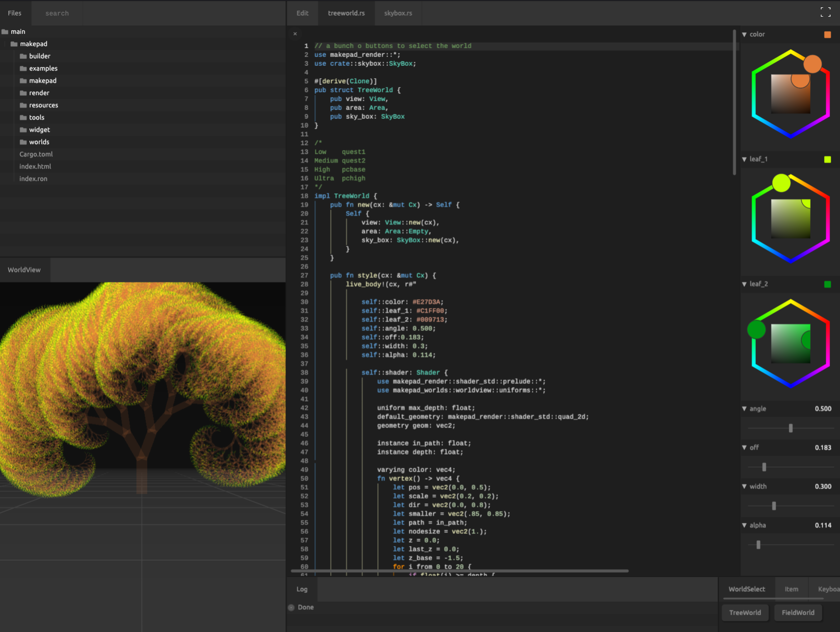
Makepad is a cross platform text editor and development environment developed using the Rust programming language. It emphasizes the advantages in performance and scalability, aiming to provide developers with an efficient and responsive coding experience. Makepad uses its own rendering engine, also written in Rust, which allows it to maintain smooth performance when rendering large projects.
Some features of Makepad include:
-
Cross platform support: Makepad can run on multiple operating systems, including Windows, macOS, and Linux, thanks to Rust and its cross platform compatibility.
-
Custom rendering engine: Makepad uses its own developed rendering engine, which means it can optimize rendering performance while also supporting complex visual effects and animations.
-
Develop using the Rust language: The security and performance of Rust enable Makepad to efficiently handle large files and complex projects while maintaining low memory usage and fast response.
-
Code Editing and Project Management: Makepad is not only a text editor, but also provides project management tools to help developers organize and manage their code repository.
-
Scalability: Makepad is designed to support plugins and extensions, allowing developers to customize editor functionality according to their own needs.
-
Future oriented design: The development team of Makepad is committed to exploring new programming paradigms and tools, such as using modern technologies such as WebGPU to push the boundaries between front-end and graphical programming.
Makepad is a relatively new project that is still actively being developed, which means it will continuously introduce new features and improve existing ones. For Rust developers and other programmers seeking modern, high-performance, and customizable development tools, Makepad may be an interesting choice.
Who is this book for?
- Rust GUI Developers
- Rust WebAssembly Developers
- Rust GUI Third Part Component Lib Developers
In this book, you can learn:
- How To Begin Makepad
- Makepad BuiltIn Basic Widgets
- Makepad BuiltIn Component (
theme_desktop_dark) - Makepad BuiltIn Types
- Makepad Example Analysis
- Makepad Defination Component Lib
‼️ Note
Help us improve!
If you find any mistakes or something that could be better wirtten, you can do these following:
- Create an issue or Discussion in Book Github Repository or make a discussion in Discord
- Share with Others then get some suggestions
- Fork and Update Lastest
- Optimize Book and Push
Installation🔽
Installation
Prerequisites
To build the Makepad crates you first need to install Rust. https://www.rust-lang.org/tools/install
Our native builds work on the stable Rust toolchain. However, some of the errors generated by Makepad at runtime (particulary those originating in our DSL) do not contain line information unless you use the nightly Rust toolchain. Moreover, our web builds only work on nightly for now. For this reason, we recommend that you build Makepad using the nightly Rust toolchain.
For the non standard build targets (apple ios, apple tvos, android, wasm) we have a buildtool called 'cargo-makepad' that you need to install.
Install it from the repo:
cargo install --path=./tools/cargo_makepad
Or install it from cargo (might be behind the repo)
cargo install cargo-makepad
Now this tool can be used to install toolchains per platform needed
cargo makepad wasm install-toolchain
cargo makepad apple ios install-toolchain
cargo makepad apple tvos install-toolchain
cargo makepad android --abi=all install-toolchain
Running makepad studio
Makepad studio allows you to easily build and view the examples, and it uses cargo-makepad internally so be sure to install cargo-makepad as shown above.
cargo run -p makepad-studio --release
Or install it from cargo (might be behind the repo)
cargo install makepad-studio
If you build the wasm applications, you can open it on:
Tutorials🔽
Learning Sequence
If you are new to Makepad, we recommend that you learn in the following order:
- introduction
- installation
- Tutorials
- QuickStart
- Project Structure
- Code Guide (Define Easy Component)
- Components
- Syntax
- Examples (Simple)
- Widgets
- Built-In
- Effect
Tutorials
QuickStart
Welcome to the Makepad QuickStart guide. This document is designed to help you set up a new Makepad project quickly and understand its basic structure and components. Makepad is a creative coding environment that leverages Rust and its ecosystem to build performant and beautiful UI applications.
Project Structure
A typical Makepad project has a structure similar to what you see below. Understanding this structure is crucial for navigating and managing your project effectively.
- hello                     # Your project directory
├── Cargo.toml              # Rust's package manifest file for managing dependencies
└── src                     # The main project directory containing Rust source files
    ├── app.rs              # The entry file for the Makepad application, defines UI and behavior
    ├── lib.rs              # The library file, used to expose modules to other parts of the application
    └── main.rs             # The standard Rust main entry point; here, it's used to launch the Makepad app
Initiate a Project
To start a new Makepad project, you'll first need to create a new Rust project and then add the necessary Makepad dependencies.
# Create a new Rust project named hello
cargo new hello

# Navigate into your project directory
cd hello

# Add Makepad dependencies to your project
cargo add makepad-widgets  # Adds Makepad's widget library for UI components
cargo add makepad          # Adds Makepad itself (note: this line is awaiting Makepad's update to be functional)
Add Library Module
To organize your code and make the Makepad widgets available throughout your project, you'll need to create a lib.rs file under the src directory.
- Create a file named
lib.rsin thesrcdirectory. - Add the following content to
lib.rs:
#![allow(unused)]
fn main() {
pub use makepad_widgets;  // Expose makepad_widgets to other parts of your application
pub mod app;              // Declare the app module, which will contain your application's logic
}
Create the Application Module
Now, let's focus on building your application. This involves using Makepad widgets, designing the application's UI, and defining its behavior.
Use Widgets
In your app.rs or equivalent file, start by importing the Makepad widgets:
#![allow(unused)]
fn main() {
use makepad_widgets::*; // Import all components from makepad_widgets
}
Add Live Design
Makepad supports live design through its macro system. This allows you to define UI components and their properties in a readable and concise manner.
#![allow(unused)]
fn main() {
use makepad_widgets::*; // Ensure makepad_widgets are imported

live_design!{
    import makepad_widgets::base::*;                  // Import base widgets and components
    import makepad_widgets::theme_desktop_dark::*;    // Use the dark theme for desktop applications
    App = {{App}} {                                   // Define the main App struct
        ui: <Root>{}                                // Use a Root widget as the root UI element
    }
}
}
Build the Application Struct
The main application structure, App, should contain a reference to the root UI element. This is marked with the #[live] macro to integrate with Makepad's live design system.
This is necessary even if no event logic is written
#![allow(unused)]
fn main() {
#[derive(Live, LiveHook)] // Derive macros to enable live reloading and hooks
pub struct App {
    #[live] ui: WidgetRef, // The root UI element reference
}
}
Register the Application Struct
To ensure Makepad recognizes your application structure, implement the LiveRegister trait for App.
#![allow(unused)]
fn main() {
impl LiveRegister for App {
    fn live_register(cx: &mut Cx) {
        crate::makepad_widgets::live_design(cx); // Register the live design for makepad_widgets
    }
}
}
Implement AppMain for Application
To handle events and integrate with the Makepad system, implement the AppMain trait for your App struct.
#![allow(unused)]
fn main() {
impl AppMain for App {
    fn handle_event(&mut self, cx: &mut Cx, event: &Event) {
        self.ui.handle_event(cx, event, &mut Scope::empty()); // Delegate event handling to the UI root
    }
}

app_main!(App); // Macro to designate App as the main application entry
}
The Main Function
Finally, define the main function in main.rs, which will launch your Makepad application.
fn main(){
    hello::app::app_main(); // Call the app_main function generated by the app_main! macro in app.rs
}
Congratulations, you've set up a basic Makepad project! This setup outlines how to structure your project, add dependencies, and create a simple UI application. As you become more familiar with Makepad and Rust, you can start exploring more complex UI designs and application logic.
Project Structure
Project Tree
src_gen
│  Cargo.toml
│
├─src
│  │  app.rs
│  │  lib.rs
│  │  main.rs
│  │
│  ├─src
│  │      app.rs
│  │
│  └─views
│          mod.rs
│          root.rs
│
├─static
│      231.png
lib.rs
#![allow(unused)]
fn main() {
pub use makepad_widgets;
pub use makepad_widgets::makepad_draw;
pub mod app;
pub mod views;
}
views/mod.rs
#![allow(unused)]
fn main() {
pub mod root;
}
app.rs
#![allow(unused)]
fn main() {
use makepad_widgets ::* ;
live_design ! {
    import makepad_widgets::base::*;
    import makepad_widgets::theme_desktop_dark::*;
    // ⚠️ look at here !!!
    // although the root mod is pub to super
    // you still need to write views::root
    // because here is path not rs mod structure
    import crate::views::root::*;


    App = {{ App }}{
       ui : <Root>{}
    }
}

// ....

impl LiveRegister for App {
    fn live_register (cx : & mut Cx) {
        crate :: makepad_widgets ::live_design (cx) ;
        // ⚠️ look at here !!! same as import
        crate::views::root::live_design(cx);
    }
}

app_main ! (App) ;
}
Code Guide
You can learn in this chapter:
- How to define an easy widget
- How to define a deref widget
- How to define a for loop widget
Static Page
A static page is composed of a large number of components, but does not contain any substantial code
#![allow(unused)]
fn main() {
use makepad_widgets::*;

live_design! {
    import makepad_widgets::base::*;
    import makepad_widgets::theme_desktop_dark::*;
    import gen_components::components::*;

    GLabelExample = <ScrollYView>{
        height: 100.0,
        width: Fill,
        spacing: 10.0,
        <Label>{
            text: "GLabel"
        }
        <GLabel>{
            text: "Hello, world! This is a long message, but I use wrap Word to wrap it!",
            height: 48.0,
            width: 120.0,
            wrap: Word,
            brightness: 1.5,
            margin: {left: 12.0},
        }
        <GLabel>{
            text: "bold, test bold!!",
            font_size: 12.0,
            padding: 16.0,
            color: #FF0000,
            font_family: dep("E:/Rust/try/makepad/Gen-UI/examples/gen_widget_example/resources/GoNotoKurrent-Bold.ttf"),
        }
    }
}
}
Define Easy Component
Defining a Widget in Makepad
In this chapter, we'll delve into the creation of a MyLabel Widget, which extends the capabilities of the built-in Label widget in Makepad.
Init a New Module
First, create a new module for our custom widget:
#![allow(unused)]
fn main() {
pub mod my_label;
}
Design Live Design
The live_design! macro allows for an effortless and succinct definition of custom widgets. Here, we define MyLabel with unique styling:
#![allow(unused)]
fn main() {
use makepad_widgets::*;

live_design!{
    import makepad_widgets::base::*;
    import makepad_widgets::theme_desktop_dark::*;

    MyLabel = {{MyLabel}}{
        draw_text:{
            color: #EF5350,
            text_style: {
                font: {
                    path: dep("crate://makepad-widgets/resources/IBMPlexSans-SemiBold.ttf")
                },
                brightness: 1.1,
                font_size: 32.0
            }
        }
    }
}
}
Define the Widget Structure
MyLabel will utilize the Widget trait and directly reference (deref) the Label widget:
#![allow(unused)]
fn main() {
#[derive(Live,Widget,LiveHook)]
pub struct MyLabel{
    #[redraw]
    #[deref]
    instance: Label
}
}
Impl the Widget Trait
Next, we implement the Widget trait for MyLabel to ensure it behaves as intended:
#![allow(unused)]
fn main() {
impl Widget for MyLabel {
    fn draw_walk(&mut self, cx: &mut Cx2d, scope: &mut Scope, walk: Walk) -> DrawStep {
        self.instance.draw_walk(cx, scope, walk)
    }
}
}
Register in the Application
It's crucial to register our custom widget in the application to make it available for use:
#![allow(unused)]
fn main() {
impl LiveRegister for App {
    fn live_register(cx: &mut Cx) {
        crate::my_label::live_design(cx);
        crate::makepad_widgets::live_design(cx);
    }
}
}
Use in the App's Live Design
Finally, incorporate MyLabel into the application's live design, setting it up for use:
#![allow(unused)]
fn main() {
live_design! {
    import makepad_widgets::base::*;
    import makepad_widgets::theme_desktop_dark::*;
    import makepad_example_simple::my_label::*;
    App = {{App}}{
        ui: <Window>{
            show_bg: true,
            width: Fill,
            draw_bg: { color: #96CEF8 },
            height: Fill,
            body = <View>{
                align: {x: 0.5, y: 0.5},
                <MyLabel>{
                    text: "this is my label widget"
                }
            }
        }
    }
}
}
Extending Widget Functionality with DerefLabel
Following our previous exploration where we introduced the MyLabel widget, extending the Label, this chapter ventures into more sophisticated use cases. While Label provides a robust foundation, there might be instances where its granular control over internal properties isn't necessary for your project's needs.
Init a New Module
Begin by creating a module specifically for our enhanced widget:
#![allow(unused)]
fn main() {
pub mod deref_label;
}
Design Live Design
In this step, we define DerefLabel, focusing on simplicity and reusability:
#![allow(unused)]
fn main() {
use makepad_widgets::*;

live_design!{
    import makepad_widgets::base::*;
    import makepad_widgets::theme_desktop_dark::*;

    DerefLabel = {{DerefLabel}}{
        instance = <Label>{
            draw_text:{
                text_style: {
                    font: {
                        path: dep("crate://makepad-widgets/resources/IBMPlexSans-SemiBold.ttf")
                    },
                }
            }
        }
    }
}
}
Define a Deref Structure
DerefLabel is designed with simplicity and flexibility in mind, allowing for easy customization of text, color, and font size:
#![allow(unused)]
fn main() {
#[derive(Live,Widget,LiveHook)]
pub struct DerefLabel{
    #[live]
    pub text: RcStringMut,
    #[live]
    pub color: Vec4,
    #[live(16.0)]
    pub font_size: f64,
    #[deref]
    view: View
}
}
Impl the Widget Trait
With the widget's structure defined, we implement the Widget trait to specify how DerefLabel behaves and is rendered:
#![allow(unused)]
fn main() {
impl Widget for DerefLabel {
    fn draw_walk(&mut self, cx: &mut Cx2d, scope: &mut Scope, walk: Walk) -> DrawStep {

        self.label(id!(instance)).apply_over_and_redraw(cx, live!{
            text: (self.text),
            draw_text:{
                color: (self.color),
                text_style:{
                    font_size: (self.font_size)
                },
            }
        });
        self.view.draw_walk(cx, scope, walk)
    }
    fn set_text(&mut self, v: &str) {
        self.label(id!(instance)).set_text(v);
    }
    fn text(&self) -> String {
       self.text.as_ref().to_string()
    }
}
}
Use Deref Label
#![allow(unused)]
fn main() {
use makepad_widgets::*;
live_design! {
    import makepad_widgets::base::*;
    import makepad_widgets::theme_desktop_dark::*;
    import makepad_example_simple::deref_label::*;
    App = {{App}}{
        ui: <Window>{
            show_bg: true,
            width: Fill,
            draw_bg: { color: #96CEF8 },
            height: Fill,
            body = <View>{
                align: {x: 0.5, y: 0.5},
                <DerefLabel>{
                    text: "this is deref label widget",
                    color: #6BC46D,
                    font_size: 32.0
                }
            }
        }
    }
}
}
For Loop Widget
This example demonstrates how to generate components from iterable data in Makepad.
Write Live Design
Note that we use btn: <Button> instead of btn = <Button>. This implies that the button is treated as a prop here.
#![allow(unused)]
fn main() {
use makepad_widgets::*;

live_design!{
    // Import the essential base and theme components from makepad_widgets
    import makepad_widgets::base::*;
    import makepad_widgets::theme_desktop_dark::*;

    // Define a new component named Footer
    Footer = {{Footer}}{
        // Set the height and width to fill their container
        height: Fill,
        width: Fill,
        // Define a button with a text prop
        btn: <Button>{
            text: "Click me",
        }
    }
}
}
Define the Widget Struct
Next, we implement a widget that conforms to the Widget trait. Here, we use Area + LivePtr + ComponentMap. You can roughly consider these as a standard combination (though that's not entirely accurate).
Area: Provides a renderable area.LivePtr: A special pointer type used to reference#[live]data or resources.ComponentMap: A container for managing widgets.
#![allow(unused)]
fn main() {
#[derive(Live, LiveHook, Widget)]
pub struct Footer {
    // The area property provides a specific region for rendering
    #[rust]
    #[redraw]
    area: Area,
    // Layout for arranging child widgets or components
    #[layout]
    layout: Layout,
    // Walk specifies how child components are positioned and sized
    #[walk]
    walk: Walk,
    // Optional property to hold a reference to the button's live data
    #[live]
    btn: Option<LivePtr>,
    // Maps button identifiers to their corresponding ButtonRef objects
    #[rust]
    btns: ComponentMap<LiveId, ButtonRef>
}
}
Draw the Widget
Implement the draw_walk method to render the widget.
#![allow(unused)]
fn main() {
impl Widget for Footer {
    fn draw_walk(&mut self, cx: &mut Cx2d, scope: &mut Scope, walk: Walk) -> DrawStep {
        // Start drawing the widget using the specified layout
        cx.begin_turtle(walk, self.layout);
        // Example data to iterate over
        let data = vec!["1","2","3"];
        for (d_id, name) in data.iter().enumerate() {
            let id = LiveId(d_id as u64);
            // Retrieve or insert a new button based on the id
            let c_btn = self.btns.get_or_insert(cx, id, |cx|{
                // Create a new button from the live pointer
                WidgetRef::new_from_ptr(cx, self.btn).as_button()
            });
            // Set the button's text
            c_btn.set_text(name);
            // Draw the button
            c_btn.draw_all(cx, scope);
        }

        // End the drawing process for the current widget
        cx.end_turtle();
        // Retain only the buttons that are visible
        self.btns.retain_visible();
        // Indicate that the drawing step is complete
        DrawStep::done()
    }
}
}
Impl handle_event
In order for all buttons to receive events, we need to implement the handle_event function
#![allow(unused)]
fn main() {
impl Widget for Footer{

    // ... draw_walk() fn

    fn handle_event(&mut self, cx: &mut Cx, event: &Event, scope: &mut Scope) {
        // Handle events for the current widget
        for btn in self.btns.values_mut(){
            // btn.handle_event(cx, event, scope);
            for action in cx.capture_actions(|cx| btn.handle_event(cx, event, scope)){
                match action.as_widget_action().cast() {
                    // Handle button actions
                    ButtonAction::Clicked => {
                        log!("Button clicked:{}", btn.text());
                    }
                    _ => {}
                }
            }
        }
    }
}
}
Pass Event
Now we need to implement event passing for the Footer widget, so that when any sub button is clicked, the Footer widget will trigger a Focus event
Define Footer Action
Define a Focus event which get LiveId(Button's LiveId)
#![allow(unused)]
fn main() {
#[derive(Clone, Debug, DefaultNone)]
pub enum FooterAction{
    None,
    // LiveId can specialize the clicked button
    Focus(LiveId),
}
}
Change handle_event
#![allow(unused)]
fn main() {
impl Widget for Footer{

    // ... draw_walk() fn

    fn handle_event(&mut self, cx: &mut Cx, event: &Event, scope: &mut Scope) {
        let uid = self.widget_uid();
        // Handle events for the current widget
        for (btn_id, btn) in self.btns.iter_mut(){
            // btn.handle_event(cx, event, scope);
            for action in cx.capture_actions(|cx| btn.handle_event(cx, event, scope)){
                match action.as_widget_action().cast() {
                    // Handle button actions
                    ButtonAction::Clicked => {
                        log!("Button clicked:{}", btn.text());
                        // pass event
                        cx.widget_action(uid, &scope.path, FooterAction::Focus(*btn_id))
                    }
                    _ => {}
                }
            }
        }
    }
}
}
Impl MatchEvent for Parent Widget
impl handle_actions function, match the action we need to do and then handle.
#![allow(unused)]
fn main() {
impl MatchEvent for App{
    fn handle_actions(&mut self, cx: &mut Cx, actions: &Actions) {
        for action in actions{
            match action.as_widget_action().cast(){
                FooterAction::Focus(btn_id) => {
                    log!("Button focused:{}", btn_id);
                }
                _ => {
                    log!("other");
                }
            };
        }
    }
}
}
Videos
 YouTube
Makepad: How to use Rust for fast UI – Rik Arends
Makepad: Designing modern UIs with Rust - Rik Arends - RustNL 2023
Makepad: How to use Rust for fast UI – Rik Arends
 Bilibili
‼️ Note
Contribute Video
We will update Videos Collection per 2 Week in YouTube and Bilibili
Or you can send email to remind us (syf20020816@outlook.com)
Email Format:
${{video_name}}
${{author}}
${{video_url}}
${{email}}
${{description}}
Examples
Simple Example
Todo Example
Built-In
Walk
The Walk struct is a fundamental part of layout management in Makepad, allowing for flexible and precise positioning and sizing of widgets. Here's a detailed breakdown of its properties:
| Property Name | Type |
|---|---|
| abs_pos | Option<DVec2> |
| margin | Margin |
| width | Size |
| height | Size |
See DVec2
See Margin
See Size
Example
#![allow(unused)]
fn main() {
{
    height: Fit,
    width: Fill,
    abs_pos: vec2(200. ,9.),
    margin: 16.0,
}
}
DVec2|Vec2 Struct
DVec2
The DVec2 struct represents a 2-dimensional vector, typically used for positions and dimensions in the layout system.
| Property Name | Type |
|---|---|
| x | f64 |
| y | f64 |
Vec2
| Property Name | Type |
|---|---|
| x | f32 |
| y | f32 |
Although struct is DVec2, you should write vec2 in live_design!
Example
#![allow(unused)]
fn main() {
abs_pos: None,
abs_pos: vec2(2.0 ,9.0),
}
Margin Struct
Defines the external padding around a widget, determining its offset from adjacent items or container edges.
| Property Name | Type |
|---|---|
| left | f64 |
| top | f64 |
| right | f64 |
| bottom | f64 |
Example
#![allow(unused)]
fn main() {
margin: 16.0,
margin: {left: 10.0},
margin: {left: 5.0, top: 6.0},
margin: {left: 10.0, right: 6.0, top: 10.0, bottom: 18.0},
}
Size Enum
Specifies the sizing behavior of a widget, allowing for flexible layout arrangements.
| Variant Name | Associated Data |
|---|---|
| Fill | None |
| Fixed | f64 |
| Fit | None |
| All | None |
The Size enum facilitates various sizing strategies, such as:
Fill: filling available spaceFixed: setting a fixed dimensionFit: adjusting to contentAll: a special mode that applies a unique sizing logic
Example
#![allow(unused)]
fn main() {
height: Fill,
width: Fit,
width: 64.0,
width: All,
}
Layout
Layout结构定义了用于管理布局的各种属性,包括滚动、剪切、填充、对齐、流和间距的参数。
The Layout struct defines various properties for managing layout, including parameters for scrolling, clipping, padding, alignment, flow, and spacing.
Properties
| decorate | name | type | description |
|---|---|---|---|
| live | scroll | DVec2 | Specifies the scrolling vector for the layout. |
| live | clip_x | bool | Determines whether the layout clips horizontally. Default is true. |
| live | clip_y | bool | Determines whether the layout clips vertically. Default is true. |
| live | padding | Padding | Sets the padding around the layout. |
| live | align | Align | Controls the alignment within the layout. |
| live | flow | Flow | Defines the flow direction of elements in the layout. |
| live | spacing | f64 | Specifies the spacing between elements in the layout. |
| live | line_spacing | f64 | Determines the line spacing for elements in the layout. |
See DVec2
See Padding
See Align
See Flow
Padding
The Padding struct defines padding values for all four sides (left, top, right, bottom) of a widget.
Properties
| decorate | name | type | description |
|---|---|---|---|
| live | left | f64 | The padding on the left side. |
| live | top | f64 | The padding on the top side. |
| live | right | f64 | The padding on the right side. |
| live | bottom | f64 | The padding on the bottom side. |
Example
#![allow(unused)]
fn main() {
padding: 16.0,
padding: {left: 10.0},
padding: {left: 5.0, top: 6.0},
padding: {left: 10.0, right: 6.0, top: 10.0, bottom: 18.0},
}
Align
The Align struct defines alignment values along the x and y axes.
Properties
| decorate | name | type | description |
|---|---|---|---|
| live | x | f64 | The alignment value along the x-axis. |
| live | y | f64 | The alignment value along the y-axis. |
Example
#![allow(unused)]
fn main() {
align: {x: 5, y: 6.0},
align: 0.5,
}
Flow
The Flow enum defines the direction and behavior of content flow within a layout in Makepad. It determines how child elements are arranged and wrapped.
Properties
| decorate | name | type | description |
|---|---|---|---|
| live | Right | Flow | Content flows from left to right. |
| live | Down | Flow | Content flows from top to bottom. |
| live | Overlay | Flow | Content is overlaid on top of each other. |
| live | RightWrap | Flow | Content flows from left to right and wraps to the next line when it reaches the end of the container. |
Example
#![allow(unused)]
fn main() {
flow: Down,
flow: Overlay,
flow: RightWrap,
flow: Right,
}
DrawText
The DrawText struct is used for rendering text with various styles and properties in Makepad. It includes options for geometry, text style, wrapping, and various rendering details.
Properties
| decorate | name | type | description |
|---|---|---|---|
| rust | many_instances | Option<ManyInstances> | Optional instance data for drawing many text objects. |
| live | geometry | GeometryQuad2D | The geometry used for rendering the text. |
| live | text_style | TextStyle | The style of the text, including font and size. |
| live | wrap | TextWrap | Specifies how text should wrap within its container. |
| live | ignore_newlines | bool | Determines whether newlines in the text should be ignored. |
| live | combine_spaces | bool | Specifies whether multiple consecutive spaces should be combined into one. |
| live | font_scale | f64 | The scale factor for the font size. Default is 1.0. |
| live | draw_depth | f32 | The drawing depth for layering text. Default is 1.0. |
| deref | draw_vars | DrawVars | Various variables used during the drawing process. |
| live | color | Vec4 | The color of the text. |
| calc | font_t1 | Vec2 | Calculated texture coordinate t1 for the font. |
| calc | font_t2 | Vec2 | Calculated texture coordinate t2 for the font. |
| calc | rect_pos | Vec2 | Calculated position of the text rectangle. |
| calc | rect_size | Vec2 | Calculated size of the text rectangle. |
| calc | draw_clip | Vec4 | Calculated clipping area for the text drawing. |
| calc | char_depth | f32 | Calculated depth for individual characters. |
| calc | delta | Vec2 | Calculated delta for text positioning. |
| calc | shader_font_size | f32 | Calculated font size for the shader. |
| calc | advance | f32 | Calculated advance value for text positioning. |
See Vec2
See TextStyle
See TextWrap
See DrawVars
Example
#![allow(unused)]
fn main() {
draw_text: {
    wrap: Word,
    // real font size = font size * font scale
    font_scale: 1.5,
    text_style: {
        // so here font size = 16 * 1.5 = 24
        font_size: 16,
        font: {path: dep("crate://makepad-widgets/resources/IBMPlexSans-SemiBold.ttf")},
        // brightness > 1.0 will make the text brighter
        // < 1.0 will make the text darker
        brightness: 1.0,
    },
    color: #FF0000,
}
}
TextStyle
TextStyle 是一个用于描述文本样式的结构体。
TextStyle is used for describe text style
Properties
| decorate | name | type | description |
|---|---|---|---|
| live | font | Font | 字体 font family |
| live(9.0) | font_size | f64 | 字体大小 define the size of the text |
| live(1.0) | brightness | f32 | 亮度 the brightness of text |
| live(0.5) | curve | f32 | 曲线 word curve |
| live(1.4) | line_spacing | f64 | 行间距 the spacing of word |
| live(1.1) | top_drop | f64 | 顶部偏移 top drop of the text |
| live(1.3) | height_factor | f64 | 高度因子 height factor of the text |
Example
#![allow(unused)]
fn main() {
text_style: {
    // so here font size = 16 * 1.5 = 24
    font_size: 16,
    font: {path: dep("crate://makepad-widgets/resources/IBMPlexSans-SemiBold.ttf")},
    // brightness > 1.0 will make the text brighter
    // < 1.0 will make the text darker
    brightness: 1.0,
},
}
TextWrap
TextWrap 是一个枚举类型,用于定义文本的换行方式。
TextWrap is a enum, used for define the wrap way of the text
Option Value
Ellipsis: if overflow the defined width, the end of the text display ellipsisWord: if it overflow the defined width, it will automatically wrapLine: no wrap
Example
#![allow(unused)]
fn main() {
wrap: Ellipsis,
wrap: Word,
wrap: Line,
}
DrawLabelText
Structure representing the drawing properties of label text.
Properties
| decorate | name | type | description |
|---|---|---|---|
| deref | draw_super | DrawText | Base drawing properties inherited from DrawText. |
| live | focus | f32 | Focus state for the label text. |
| live | hover | f32 | Hover state for the label text. |
| live | pressed | f32 | Pressed state for the label text. |
See DrawText
Example
#![allow(unused)]
fn main() {
{
    draw_super: {
        wrap: Word,
        // real font size = font size * font scale
        font_scale: 1.5,
        text_style: {
            // so here font size = 16 * 1.5 = 24
            font_size: 16,
            font: {path: dep("crate://makepad-widgets/resources/IBMPlexSans-SemiBold.ttf")},
            // brightness > 1.0 will make the text brighter
            // < 1.0 will make the text darker
            brightness: 1.0,
        },
        color: #FF0000,
    },
    // 0.0 is false
    focus: 0.0,
    hover: 1.0,
    pressed: 0.0,
}
}
DrawIcon
DrawIcon结构定义了绘制图标的各种属性,包括亮度、缩放和几何图形的参数,以及对SVG文件和路径的引用。
The DrawIcon struct defines various properties for drawing an icon, including parameters for brightness, scaling, and geometry, as well as references to SVG files and paths.
Properties
| decorate | name | type | description |
|---|---|---|---|
| live | brightness | f32 | Sets the brightness level of the icon. Default is 1.0. |
| live | curve | f32 | Controls the curve parameter for rendering. Default is 0.6. |
| live | linearize | f32 | Determines the linearization level of the icon. Default is 0.5. |
| live | svg_file | LiveDependency | Specifies the SVG file used for the icon. |
| live | svg_path | Rc<String> | Path to the SVG file for the icon. |
| live | translate | DVec2 | Translation vector for positioning the icon. |
| live | scale | f64 | Scale factor for the icon. Default is 1.0. |
| rust | many_instances | Option<ManyInstances> | Option for handling multiple instances. |
| live | geometry | GeometryQuad2D | Geometry definition for the icon. |
| deref | draw_vars | DrawVars | Variables used for drawing operations. |
| calc | rect_pos | Vec2 | Calculated position of the rectangle. |
| calc | rect_size | Vec2 | Calculated size of the rectangle. |
| calc | draw_clip | Vec4 | Calculated clipping rectangle for drawing. |
| live | draw_depth | f32 | Depth value for drawing the icon. Default is 1.0. |
| live | color | Vec4 | Color value for the icon. |
| calc | icon_t1 | Vec2 | Transformation vector 1 for the icon. |
| calc | icon_t2 | Vec2 | Transformation vector 2 for the icon. |
See LiveDependency
See DVec2
See DrawVars
See Vec2
See Vec4
ImageFit Enum
用于确定图像在显示时的尺寸和比例
Used to determine the size and scale of the image when displayed
Properties
| name | type | description |
|---|---|---|
| Stretch | 按照原始大小进行拉伸以填充整个容器 Stretch to the original size to fill the entire container | |
| Horizontal | 图像将水平填充容器 The image will horizontally fill the container | |
| Vertical | 图像将垂直填充容器 The image will vertically fill the container | |
| Smallest | 图像将被缩放到最小尺寸以满足容器的大小要求 The image will be scaled to the minimum size to meet the size requirements of the container | |
| Biggest | 图像将被缩放到最大尺寸以满足容器的大小要求 The image will be scaled to the maximum size to meet the size requirements of the container | |
| Size | 图像将被缩放到指定的宽度和高度值 The image will be scaled to the specified width and height values |
Example
#![allow(unused)]
fn main() {
fit: Stretch,
fit: Vertical,
}
LiveDependency
LiveDependency是一种引入资源的一种方式, 你可以用它来导入许多静态文件,使用关键字: dep()
LiveDependencyis a kind of way to import resource, you can use it to import many static files, use key word: dep()
See Import
Example
#![allow(unused)]
fn main() {
source: dep("crate://self/path/name.ty"),

font: {
    path: dep("crate://makepad-widgets/resources/GoNotoKurrent-Regular.ttf"),
},
}
SplitterAxis
定义拆分器沿其水平或垂直方向划分容器的轴。
Defines the axis along which the splitter divides its container, either horizontally or vertically.
Properties
| decorate | name | type | description |
|---|---|---|---|
| live | Horizontal | Splits the container horizontally. | |
| live | Vertical | Splits the container vertically. |
Example
#![allow(unused)]
fn main() {
axis: Vertical,
axis: Horizontal,
}
SplitterAlign
指定拆分器在其容器内的对齐或定位。
Specifies the alignment or positioning of the splitter within its container.
Properties
| decorate | name | type | description |
|---|---|---|---|
| live | FromA | f64 | Specifies the position of the splitter from the start of the first panel (A). |
| live | FromB | f64 | Specifies the position of the splitter from the end of the second panel (B). |
| live | Weighted | f64 | Specifies the position of the splitter based on a weight, with 0.0 being all the way to the start of panel A and 1.0 being all the way to the end of panel B. |
Weighted range: [0,1]
Example
#![allow(unused)]
fn main() {
align: FromA(100.0),
align: Weighted(0.5),
}
DrawCheckBox
Handles the drawing properties specific to the checkbox.
Properties
| decorate | name | type | description |
|---|---|---|---|
| deref | draw_super | DrawQuad | Inherits properties from DrawQuad. |
| live | check_type | CheckType | Specifies the type of checkbox (Check, Radio, Toggle, None). |
| live | hover | f32 | Represents the hover state. |
| live | focus | f32 | Represents the focus state. |
| live | selected | f32 | Represents the selected state. |
Example
#![allow(unused)]
fn main() {
draw_check: {
    check_type: Radio,
    selected: 1.0,
},
}
CheckType
定义不同类型复选框的枚举。
An enumeration defining different types of checkboxes.
Properties
| decorate | name | type | description |
|---|---|---|---|
| pick | Check | shader_enum(1) | Standard checkbox. |
| live | Radio | shader_enum(2) | Radio button. |
| live | Toggle | shader_enum(3) | Toggle switch. |
| live | None | shader_enum(4) | No checkbox. |
Example
#![allow(unused)]
fn main() {
draw_check: {
    check_type: Radio,
},
draw_check: {
    check_type: Toggle,
},
}
DrawRadioButton
Handles the drawing properties specific to the radio button.
Properties
| decorate | name | type | description |
|---|---|---|---|
| deref | draw_super | DrawQuad | Inherits properties from DrawQuad. |
| live | radio_type | RadioType | Specifies the type of radio button (Round, Tab). |
| live | hover | f32 | Represents the hover state. |
| live | focus | f32 | Represents the focus state. |
| live | selected | f32 | Represents the selected state. |
# RadioButtonGroup⛔
A widget representing a group of radio buttons, allowing for mutually exclusive selection.
Properties
| decorate | name | type | description |
|---|---|---|---|
| deref | frame | View | Inherits properties from View. |
RadioType
定义不同类型单选按钮的枚举。
An enumeration defining different types of radio buttons.
Properties
| decorate | name | type | description |
|---|---|---|---|
| pick | Round | shader_enum(1) | Standard round radio button. |
| live | Tab | shader_enum(2) | Tab-style radio button. |
Example
#![allow(unused)]
fn main() {
draw_radio: {
    radio_type: Tab,
}
}
MediaType
An enumeration defining different types of media for the radio button.
Properties
| decorate | name | type | description |
|---|---|---|---|
| live | Image | Image | Represents an image used as media. |
| pick | Icon | Icon | Represents an icon used as media. |
| live | None | None | No media. |
Example
#![allow(unused)]
fn main() {
media: Image,
media: Icon,
}
DrawDesktopButton
Handles the drawing properties specific to the desktop button.
Properties
| decorate | name | type | description |
|---|---|---|---|
| deref | draw_super | DrawQuad | Inherits properties from DrawQuad. |
| live | hover | f32 | Represents the hover state. |
| live | pressed | f32 | Represents the pressed state. |
| live | button_type | DesktopButtonType | Specifies the type of desktop button (e.g., minimize, maximize, close). |
Example
#![allow(unused)]
fn main() {
draw_bg: {
    button_type: WindowMin,
}
}
DesktopButtonType
An enumeration defining different types of desktop buttons.
Properties
| decorate | name | type | description |
|---|---|---|---|
| live | WindowsMin | shader_enum(1) | Represents the minimize button. |
| live | WindowsMax | shader_enum(2) | Represents the maximize button. |
| live | WindowsMaxToggled | shader_enum(3) | Represents the toggled maximize button. |
| live | WindowsClose | shader_enum(4) | Represents the close button. |
| live | XRMode | shader_enum(5) | Represents the XR mode button. |
| pick | Fullscreen | shader_enum(6) | Represents the fullscreen button. |
Example
#![allow(unused)]
fn main() {
button_type: WindowMin,
button_type: WindowMax,
button_type: Fullscreen,
}
DrawSlider
The DrawSlider struct represents the drawable properties of a slider, including its position and type. It builds upon the DrawQuad base to provide customized slider visuals.
Properties
| decorate | name | type | description |
|---|---|---|---|
| deref | draw_super | DrawQuad | Base properties for drawing the quad. |
| live | slide_pos | f32 | Position of the slider on its axis. |
| live | slider_type | SliderType | Type of the slider (horizontal, vertical, rotary). |
See SliderType
SliderType
SliderType defines the orientation or style of the slider.
Variants
Horizontal: The slider moves horizontally.Vertical: The slider moves vertically.Rotary: The slider moves in a rotary motion.
PopupMenuPosition
Enumeration representing the position of the popup menu.
Properties
| name | type | description |
|---|---|---|
| OnSelected | Position the popup menu on the selected item. | |
| BelowInput | Position the popup menu below the input field. |
Example
#![allow(unused)]
fn main() {
popup_menu_position: OnSelected,
popup_menu_position: BelowInput,
}
Types(LiveValue)
表示应用程序中使用的各种活动值的枚举。
Enumeration representing various live values used in the application.
Properties
| name | type | description |
|---|---|---|
| None | LiveValue | Represents no value. |
| Str | &'static str | Static string type. |
| String | Rc<String> | Reference-counted string type. |
| InlineString | InlineString | Inline string type. |
| Dependency | Rc<String> | Reference-counted dependency string type. |
| Bool | bool | Boolean type. |
| Int64 | i64 | 64-bit integer type. |
| Uint64 | u64 | 64-bit unsigned integer type. |
| Float32 | f32 | 32-bit floating-point type. |
| Float64 | f64 | 64-bit floating-point type. |
| Color | u32 | Color value type represented as a 32-bit unsigned integer. |
| Vec2 | Vec2 | 2D vector type. |
| Vec3 | Vec3 | 3D vector type. |
| Vec4 | Vec4 | 4D vector type. |
| Id | LiveId | Identifier type. |
| IdPath | Rc<Vec<LiveId>> | Reference-counted vector of identifiers. |
| ExprBinOp | LiveBinOp | Binary operation expression type. |
| ExprUnOp | LiveUnOp | Unary operation expression type. |
| ExprMember | LiveId | Member expression type. |
| ExprCall | LiveId | Function call expression type with identifier and argument count. |
| BareEnum | LiveId | Bare enumeration type. |
| Root | Box<HashMap<LiveId,LiveScopeTarget>> | Root type with a box containing a hashmap of identifiers and scope targets. |
| Array | LiveValue | Array type. |
| Expr | LiveValue | Expression type with optional expansion index. |
| TupleEnum | LiveId | Tuple enumeration type. |
| NamedEnum | LiveId | Named enumeration type. |
| Object | LiveValue | Object type. |
| Clone | LiveId | Clone type. |
| Deref | LiveType | Dereference type with live type and clone identifier. |
| Class | LiveType | Class type with live type and optional class parent pointer. |
| Close | LiveValue | Close type. |
| DSL | LiveValue | Domain-Specific Language type with token start, token count, and optional expansion index. |
| Import | Box<LiveImport> | Import type with a box containing live import. |
Widgets
在Makepad这个框架中,Widgets是用来构建用户界面(UI)的基本构建块。它们类似于其他UI框架中的组件或控件,用于创建和管理各种UI元素,如按钮、文本框、标签、布局容器等。通过组合和配置这些Widgets,开发者能够构建出复杂且互动的用户界面。
本节将对所有内置小部件进行说明。
In the Makepad, Widgets are the basic building blocks used to build user interfaces (UI). They are similar to components or controls in other UI frameworks, used to create and manage various UI elements such as buttons, text boxes, labels, layout containers, etc. By combining and configuring these Widgets, developers can build complex and interactive user interfaces.
This section will explain all built-in widgets.
Attention
Makepad中的所有内置小部件都遵循XXXBase的命名约定。在开发应用程序时,很少直接使用这些小部件。相反,它们主要在创建组件时使用。在本章中,讨论的所有小部件都遵循XXXBase命名约定,且使用默认属性。我把这些称为内置小工具。当这些小部件被修改或扩展时,它们被称为组件。
All built-in widgets in Makepad follow the naming convention of XXXBase. These widgets are rarely used directly when developing applications. Instead, they are primarily utilized when creating components. In this chapter, all the widgets discussed follow the XXXBase naming convention and use default properties. I refer to these as Built-in Widgets. When these widgets are modified or extended, they are referred to as Components.
在本章节中你不会获得任何例子! 所有的例子将会在Component章节中。
In this chapter, you will not get any examples! All Examples are in the Component chapter.
但请不要忽略这个章节,它是你学习Makepad的重要基础!But please do not ignore this chapter, it is the basic of Makepad learning!
Root
Root是Makepad的UI入口,扮演十分重要的角色,所有的子widget都应该在该Root下被编写。
Root中包含一个窗口(Window),因此当Root被创建后我们可以使用Window中的属性对它进行调节
The Root serves as the entry point for the UI in Makepad, playing a crucial role in the application. All child widgets should be defined under this Root.
The Root contains a Window, which allows us to adjust its properties once the Root is created.
Here is the documentation for the Root widget based on the provided struct:
Props
| decorate | name | type | description |
|---|---|---|---|
| rust | draw_state | DrawStateWrap<DrawState> | Holds the state of the drawing operations for the Root widget. |
| rust | windows | ComponentMap<LiveId, Window> | A map of windows managed by the Root, keyed by their LiveId. |
Event
This widget does not define any specific events.
Designer
Makepad中的Designer组件是一种高级UI设计工具,允许开发人员以交互方式创建和管理应用程序布局和组件。提供的屏幕截图显示了Designer组件的界面,其中包括项目结构的层次视图和设计工作的画布区域。以下是对其目的和功能的更详细解释:
-
层次视图:
- 在界面的左侧,有一个显示应用程序结构的层次树视图。这包括
应用程序、小部件、绘图、示例等文件夹及其子文件夹。 - 层次结构中的每个条目表示项目中的一个组件或文件。例如,
app包含KeyboardView组件,draw包含shader和geometry等子文件夹。
- 在界面的左侧,有一个显示应用程序结构的层次树视图。这包括
-
画布面积:
- 界面的右侧是一个画布,实际的设计工作就是在这里进行的。在这里,您可以直观地操作UI组件,并查看更改的实时效果。
- 该区域当前在屏幕截图中显示为空,表示没有选择或显示任何组件进行编辑。
-
组件属性和编辑:
设计器组件允许用户在层次视图中选择不同的元素并编辑其属性。- 特性可以包括布局设置、视觉样式和功能属性。这些更改可以通过画布中的直接操作或通过调整属性面板(未在屏幕截图中显示,但通常是此类设计工具的一部分)中的属性来进行。
-
项目组织机构:
- 层次视图有助于系统地组织项目文件和构件。用户可以浏览项目的不同部分,打开组件,并根据需要进行编辑。
- 这种结构化视图有助于维护有组织的工作流,尤其是在具有多个组件和依赖项的大型项目中。
-
实时预览:
设计器组件的一个显著优势是能够实时预览更改。当您修改属性或布局元素时,画布会立即更新以反映这些更改,从而提供即时反馈。
The Designer component in Makepad serves as an advanced UI design tool, allowing developers to create and manage their application layouts and components interactively. The screenshot provided illustrates the interface of the Designer component, which includes a hierarchical view of the project structure and a canvas area for design work. Here's a more detailed explanation of its purpose and functionality:
-
Hierarchical View:
- On the left side of the interface, there is a hierarchical tree view that displays the structure of the application. This includes folders such as
app,widgets,draw,examples, and their subfolders. - Each entry in the hierarchy represents a component or a file in the project. For instance,
appcontains theKeyboardViewcomponent, anddrawcontains subfolders likeshaderandgeometry.
- On the left side of the interface, there is a hierarchical tree view that displays the structure of the application. This includes folders such as
-
Canvas Area:
- The right side of the interface is a canvas where the actual design work takes place. Here, you can visually manipulate the UI components and see the real-time effects of your changes.
- This area is currently shown as empty in the screenshot, indicating that no component is selected or displayed for editing.
-
Component Properties and Editing:
- The
Designercomponent allows users to select different elements in the hierarchical view and edit their properties. - Properties can include layout settings, visual styles, and functional attributes. These changes can be made through direct manipulation in the canvas or by adjusting properties in a properties panel (not shown in the screenshot but typically part of such design tools).
- The
-
Project Organization:
- The hierarchical view helps in organizing the project files and components systematically. Users can navigate through different parts of their project, open components, and edit them as needed.
- This structured view aids in maintaining an organized workflow, especially in larger projects with multiple components and dependencies.
-
Real-Time Preview:
- One of the significant advantages of the
Designercomponent is the ability to see real-time previews of changes. As you modify properties or layout elements, the canvas updates immediately to reflect these changes, providing instant feedback.
- One of the significant advantages of the
Props
| decorate | name | type | description |
|---|---|---|---|
| deref | ui | View | The UI view that the designer interacts with. |
| rust | data | DesignerData | Holds the internal data for the designer, including the design hierarchy and selected elements. |
Event
This widget does not define any specific events.
DesignerView
DesignerView小部件是Makepad UI框架中的一个专用视图,旨在为设计和编辑UI组件提供界面。它支持各种特性和功能,以管理设计器界面中的布局、背景图形和组件交互。
The DesignerView widget is a specialized view within the Makepad UI framework, designed to provide an interface for designing and editing UI components. It supports various properties and functionalities to manage the layout, background drawing, and component interactions within the designer interface.
Props
| decorate | name | type | description |
|---|---|---|---|
| walk | walk | Walk | Defines the walking properties for the DesignerView. |
| rust | area | Area | The area occupied by the DesignerView. |
| rust | reapply | bool | A flag indicating whether properties need to be reapplied. |
| live | container | Option<LivePtr> | Pointer to the container, if any. |
| live | draw_bg | DrawColor | The background drawing color of the designer view. |
| rust | components | ComponentMap<LivePtr, WidgetRef> | Map of components within the designer view, keyed by LivePtr. |
| redraw rust | draw_list | DrawList2d | List of drawing operations for the designer view. |
| rust | pass | Pass | Rendering pass for the designer view. |
| rust | color_texture | Option<Texture> | Optional texture for color rendering. |
Event
This widget does not define any specific events.
Window
In the Makepad framework, Window Widgets are the fundamental components used to create and manage application windows. As a top-level container, it is responsible for hosting other widgets of the application interface and provides a series of configuration options, allowing developers to customize the behavior and appearance of windows. By using Window Widgets, developers can define properties such as window size, title, and background color to create a window interface that meets application requirements.
在Makepad框架中,Window Widget 是用于创建和管理应用程序窗口的基础组件。它作为顶层容器,负责承载应用界面的其它Widgets,并且提供了一系列的配置选项,允许开发者定制窗口的行为和外观。通过使用 Window Widget,开发者能够定义窗口的大小、标题、背景颜色等属性,从而创建出符合应用需求的窗口界面。
Props
| decorate 修饰 | name | type | description |
|---|---|---|---|
| live | last_mouse_pos | DVec2 | 存储了最后一次鼠标位置 |
| live | mouse_cursor_size | DVec2 | 存储鼠标光标的大小 |
| live | demo | bool | 指示是否处于演示模式 |
| rust | demo_next_frame | NextFrame | 控制演示模式下的下一帧渲染 |
| live | cursor_draw_list | DrawList2d | 定义在窗口中绘制光标时所需的绘制指令列表 |
| live | draw_cursor | DrawQuad | 绘制光标的矩形区域 |
| live | debug_view | DebugView | 显示调试信息 |
| live | performance_view | PerformanceView | 性能指标 |
| live | nav_control | NavControl | 用于处理导航相关的控制逻辑 |
| live | window | WindowHandle | 代表窗口的句柄或引用 |
| live | stdin_size | DrawColor | |
| rust | overlay | Overlay | 用于在窗口上层显示额外的内容或界面元素 |
| rust | main_draw_list | DrawList2d | 存储主要内容的绘制指令 |
| live | pass | Pass | 用于描述渲染过程中的一个阶段或步骤 |
| rust | depth_texture | Texture | 存储深度纹理,这在3D渲染或需要深度测试的场景中非常重要 |
| live | hide_caption_on_fullscreen | bool | 控制全屏时是否隐藏标题栏 |
| live | show_performance_view | bool | 控制全屏时是否显示性能视图 |
| deref | view | View | 表示Window内部包含一个View结构体,用于处理窗口内部的视图渲染和布局 |
| rust | draw_state | DrawStateWrap<DrawState> |
View props are deref. See: View
Event
| name | description |
|---|---|
| EventForOtherWindow | 用于另一个窗口的事件。这用于在窗口之间传递事件。 An event intended for another window. This is used to pass events between windows. |
| WindowClosed | 表示窗口已关闭。当用户关闭窗口时会触发此事件。 Indicates that the window has been closed. This event is triggered when the user closes the window. |
| WindowGeomChange | 窗口几何图形(大小、位置等)的更改。此事件通过“WindowGeomChangeEvent”携带有关几何图形更改的数据。 A change in the window's geometry (size, position, etc.). This event carries data about the geometry change through a WindowGeomChangeEvent. |
View
The View widget represents a UI element that can be rendered on the screen with various properties such as background color, layout, visibility, and more. It handles different events related to user interactions like finger movements and key presses.
“视图”小部件表示一个UI元素,该元素可以用各种属性(如背景色、布局、可见性等)在屏幕上呈现。它处理与用户交互相关的不同事件,如手指移动和按键。
Props
| decorate | name | type | description |
|---|---|---|---|
| live | draw_bg | DrawColor | 视图的背景图形颜色。 The background drawing color of the view. |
| live | show_bg | bool | 确定是否显示背景。 Determines whether the background is shown. |
| layout | layout | Layout | 定义视图的布局特性。 Defines the layout properties for the view. |
| walk | walk | Walk | 指定视图的walk属性。 Specifies the walk properties for the view. |
| live | dpi_factor | Option<f64> | 视图的DPI因子。 The DPI factor for the view. |
| live | optimize | ViewOptimize | 视图的优化设置。 Optimization settings for the view. |
| live | debug | ViewDebug | Debug settings for the view. |
| live | event_order | EventOrder | The order in which events are processed. |
| live | visible | bool | Controls the visibility of the view. |
| live | grab_key_focus | bool | Indicates whether the view grabs key focus. |
| live | block_signal_event | bool | Determines if signal events are blocked. |
| live | cursor | Option<MouseCursor> | Specifies the mouse cursor for the view. |
| live | scroll_bars | Option<LivePtr> | Pointer to the scroll bars, if any. |
| live | design_mode | bool | Indicates if the view is in design mode. |
| rust | find_cache | HashMap<u64, WidgetSet> | Cache for finding widgets. |
| rust | scroll_bars_obj | Option<Box<ScrollBars>> | Scroll bars object, if any. |
| rust | view_size | Option<DVec2> | The size of the view. |
| rust | area | Area | The area occupied by the view. |
| rust | draw_list | Option<DrawList2d> | List of drawing operations for the view. |
| rust | texture_cache | Option<ViewTextureCache> | Cache for view textures. |
| rust | defer_walks | Vec<(LiveId, DeferWalk)> | Deferred walks for the view. |
| rust | draw_state | DrawStateWrap<DrawState> | State of the drawing operations. |
| rust | children | ComponentMap<LiveId, WidgetRef> | Child components of the view. |
| rust | draw_order | Vec<LiveId> | Order in which components are drawn. |
| animator | animator | Animator | Animator for the view. |
Event
| name | description |
|---|---|
| FingerDown | 当手指向下触摸视图时触发 Triggered when a finger touches down on the view. |
| FingerUp | 当手指从视图中抬起时触发 Triggered when a finger is lifted from the view. |
| FingerMove | 当手指在视图上移动时触发 Triggered when a finger moves on the view. |
| FingerHoverIn | 当手指悬停在视图上时触发 Triggered when a finger hovers over the view. |
| FingerHoverOut | 当手指停止在视图上悬停时触发 Triggered when a finger stops hovering over the view. |
| KeyDown | 当视图具有焦点时按下某个键时触发 Triggered when a key is pressed down while the view has focus. |
| KeyUp | 当视图具有焦点时释放键时触发 Triggered when a key is released while the view has focus. |
~KeyboardView~⛔
这个视图似乎存在问题,请不要使用this kind of view seems has some mistakes, please don't use
Label
Label小部件用于在Makepad UI框架中显示文本。它包括用于自定义文本外观、对齐方式和填充的属性。
The Label widget is used to display text within the Makepad UI framework. It includes properties for customizing the text appearance, alignment, and padding.
Props
| decorate | name | type | description |
|---|---|---|---|
| live | draw_text | DrawText | 定义文字的图形特性,例如字体、大小和颜色。 Defines the drawing properties for the text, such as font, size, and color. |
| walk | walk | Walk | 确定小部件在其父级中的布局行为 Determines the layout behavior of the widget within its parent. |
| live | align | Align | 指定小部件内文本的对齐方式 Specifies the alignment of the text within the widget. |
| live | padding | Padding | Sets the padding around the text, affecting its positioning within the widget. |
| live | text | RcStringMut | 小部件显示的文本内容。这可以动态更新。 The text content displayed by the widget. This can be dynamically updated. |
See DrawText
Event
No events specified for this widget.
Button
Button小部件是一个可自定义的交互式UI元素,用于响应用户操作,如点击、按下和释放。它包括背景、文本和图标渲染的属性,并支持不同状态(例如悬停、按下)的动画。
The Button widget is a customizable, interactive UI element that responds to user actions such as clicks, presses, and releases. It includes properties for background, text, and icon rendering, and supports animations for different states (e.g., hover, pressed).
Props
| decorate | name | type | description |
|---|---|---|---|
| animator | animator | Animator | Controls the animations for the button states. |
| redraw | draw_bg | DrawQuad | Draws the background of the button. |
| live | draw_text | DrawText | Draws the text label of the button. |
| live | draw_icon | DrawIcon | Draws the icon for the button. |
| live | icon_walk | Walk | Defines the walk properties for the icon. |
| live | label_walk | Walk | Defines the walk properties for the label. |
| walk | walk | Walk | Defines the walk properties for the button. |
| layout | layout | Layout | Defines the layout properties for the button. |
| live | grab_key_focus | bool | Determines if the button should grab key focus when interacted with. |
| live | text | RcStringMut | The text label displayed on the button. |
See Walk
See Layout
See DrawText
See DrawQuad
See DrawIcon
Event
| name | description |
|---|---|
| Clicked | Triggered when the button is clicked. |
| Pressed | Triggered when the button is pressed. |
| Released | Triggered when the button is released. |
LinkLabel
LinkLabel小部件是Button小部件的扩展,其行为类似于超链接标签。它利用了Button小部件的功能,提供了额外的方法来处理特定于链接标签的事件和操作。
The LinkLabel widget is an extension of the Button widget, designed to behave like a hyperlink label. It leverages the functionality of the Button widget, providing additional methods to handle events and actions specific to link labels.
Props
| decorate | name | type | description |
|---|---|---|---|
| deref | button | Button | The underlying button widget that provides the core functionality for the LinkLabel. |
See Button
Event
| name | description |
|---|---|
| clicked | Checks if the LinkLabel has been clicked. |
| pressed | Checks if the LinkLabel is currently being pressed. |
| released | Checks if the LinkLabel has been released. |
Icon
Icon小部件是一个UI元素,用于显示具有可选背景的图标。它支持各种布局和漫游属性来控制其外观和位置。
The Icon widget is a UI element designed to display an icon with an optional background. It supports various layout and walk properties to control its appearance and positioning.
Props
| decorate | name | type | description |
|---|---|---|---|
| redraw | draw_bg | DrawQuad | Draws the background of the icon. |
| live | draw_icon | DrawIcon | Renders the icon. |
| live | icon_walk | Walk | Defines the walk properties specifically for the icon. |
| walk | walk | Walk | Defines the walk properties for the entire widget. |
| layout | layout | Layout | Defines the layout properties for the widget. |
See DrawIcon
Event
This widget does not define any specific events.
Image
An Image widget is used to display images within the UI. It supports various fitting modes and scales, and it can load images from different sources.
Props
| decorate | name | type | description |
|---|---|---|---|
| walk | walk | Walk | Determines the layout and positioning of the image. |
| live | draw_bg | DrawQuad | The drawing background quad for the image. |
| live | min_width | i64 | The minimum width of the image. |
| live | min_height | i64 | The minimum height of the image. |
| live | width_scale | f64 | The scale factor for the width of the image. |
| live | fit | ImageFit | The fitting mode for the image. |
| live | source | LiveDependency | The source path or dependency for the image. |
| rust | texture | Option<Texture> | The texture of the image, if loaded. |
SeeWalk
SeeDrawQuad
SeeImageFit
Event
No specific events are defined for the Image widget.
RotatedImage
RotatedImage是一个用于处理和显示旋转图像的结构。
RotatedImage is a struct for handling and displaying rotated images.
Props
| decorate | name | type | description |
|---|---|---|---|
| walk | walk | Walk | Controls the layout of the RotatedImage |
| layout | layout | Layout | Defines the layout of the RotatedImage |
| live, redraw | draw_bg | DrawColor | DrawColor used to draw the background |
| live | source | LiveDependency | The source of the RotatedImage |
| rust | texture | Option<Texture> | The texture of the RotatedImage |
| live | scale | f64 | The scale of the RotatedImage |
See Walk
See Layout
See DrawColor
See LiveDependency
Event
This struct does not define any events.
ImageBlend
ImageBlend是一个用于处理和显示具有混合效果的图像的结构。
ImageBlend is a struct for handling and displaying images with blending effects.
Props
| decorate | name | type | description |
|---|---|---|---|
| walk | walk | Walk | Controls the layout of the ImageBlend |
| animator | animator | Animator | Animator used to animate the ImageBlend |
| live, redraw | draw_bg | DrawQuad | DrawQuad used to draw the background |
| live | min_width | i64 | The minimum width of the ImageBlend |
| live | min_height | i64 | The minimum height of the ImageBlend |
| live(1.0) | width_scale | f64 | The width scale of the ImageBlend |
| live | fit | ImageFit | The fit mode of the ImageBlend |
| live | breathe | bool | The breathe effect of the ImageBlend |
| live | source | LiveDependency | The source of the ImageBlend |
| rust | texture | [Option<Texture>;2] | The textures of the ImageBlend |
See Walk
See LiveDependency
See DrawQuad
See ImageFit
Event
This struct does not define any events.
CheckBox
表示复选框的小部件,可用于选择选项或切换状态。CheckBox小部件支持各种类型的复选框,包括标准复选框、单选按钮和切换。
A widget representing a check box, which can be used for selecting options or toggling states. The CheckBox widget supports various types of checkboxes including standard checks, radio buttons, and toggles.
Props
| decorate | name | type | description |
|---|---|---|---|
| walk | walk | Walk | Defines how the widget should be positioned and sized within its parent. |
| layout | layout | Layout | Specifies the layout properties of the widget. |
| animator | animator | Animator | Handles animations for the widget. |
| live | icon_walk | Walk | Defines the position and size of the icon within the checkbox. |
| live | label_walk | Walk | Defines the position and size of the label text within the checkbox. |
| live | label_align | Align | Specifies the alignment of the label text. |
| redraw, live | draw_check | DrawCheckBox | Handles the drawing properties of the checkbox. |
| live | draw_text | DrawText | Handles the drawing properties of the label text. |
| live | draw_icon | DrawIcon | Handles the drawing properties of the icon. |
| live | text | RcStringMut | The text label of the checkbox. |
| live | bind | String | Specifies a binding string for the checkbox state. |
Event
| name | description |
|---|---|
| Change(bool) | Triggered when the state of the checkbox changes. |
| None | No event. |
RadioButton
表示单选按钮的小部件,可用于从一组互斥选项中选择一个选项。RadioButton小部件支持各种类型和媒体,包括图标和图像。
A widget representing a radio button, which can be used for selecting one option from a set of mutually exclusive options. The RadioButton widget supports various types and media, including icons and images.
Props
| decorate | name | type | description |
|---|---|---|---|
| redraw, live | draw_radio | DrawRadioButton | Handles the drawing properties of the radio button. |
| live | draw_icon | DrawIcon | Handles the drawing properties of the icon within the radio button. |
| live | draw_text | DrawText | Handles the drawing properties of the text within the radio button. |
| live | value | LiveValue | The value associated with the radio button. |
| live | media | MediaType | Specifies the type of media (Image, Icon, None) for the radio button. |
| live | icon_walk | Walk | Defines the position and size of the icon within the radio button. |
| walk | walk | Walk | Defines how the widget should be positioned and sized within its parent. |
| live | image | Image | Specifies the image to be used for the radio button if media type is Image. |
| layout | layout | Layout | Specifies the layout properties of the widget. |
| animator | animator | Animator | Handles animations for the widget. |
| live | label_walk | Walk | Defines the position and size of the label text within the radio button. |
| live | label_align | Align | Specifies the alignment of the label text. |
| live | label | String | The text label of the radio button. |
| live | bind | String | Specifies a binding string for the radio button state. |
Event
| name | description |
|---|---|
| Clicked | Triggered when the radio button is clicked. |
| None | No event. |
TextInput
TextInput小部件是一个可自定义的文本输入字段,具有各种样式和行为选项。它支持动画、光标样式、文本选择和撤消/重做功能等功能。
The TextInput widget is a customizable text input field with various styling and behavior options. It supports features like animation, cursor styling, text selection, and undo/redo functionality.
Props
| decorate | name | type | description |
|---|---|---|---|
| animator | animator | Animator | Animator for handling animation states. |
| redraw, live | draw_bg | DrawColor | Background color drawing properties. |
| live | draw_select | DrawQuad | Drawing properties for text selection. |
| live | draw_cursor | DrawQuad | Drawing properties for the cursor. |
| live | draw_text | DrawLabel | Drawing properties for the text. |
| walk | walk | Walk | Layout and positioning properties. |
| layout | layout | Layout | Layout properties for arranging child elements. |
| live | label_align | Align | Alignment properties for the label. |
| live | cursor_size | f64 | Size of the cursor. |
| live | cursor_margin_bottom | f64 | Bottom margin for the cursor. |
| live | cursor_margin_top | f64 | Top margin for the cursor. |
| live | select_pad_edges | f64 | Padding edges for text selection. |
| live | empty_message | String | Message displayed when the input is empty. |
| live | numeric_only | bool | Restricts input to numeric values only. |
| live | secret | bool | Hides the text input for password fields. |
| live | on_focus_select_all | bool | Selects all text when the input gains focus. |
| live | read_only | bool | Makes the text input read-only. |
| live | text | String | The text content of the input field. |
| live | ascii_only | bool | Restricts input to ASCII characters only. |
| rust | double_tap_start | Option<(usize, usize)> | Stores the start position for double-tap selection. |
| rust | undo_id | u64 | Identifier for the undo action. |
| rust | last_undo | Option<UndoItem> | The last undo item. |
| rust | undo_stack | Vec<UndoItem> | Stack of undo items. |
| rust | redo_stack | Vec<UndoItem> | Stack of redo items. |
| rust | cursor_tail | usize | Tail position of the cursor. |
| rust | cursor_head | usize | Head position of the cursor. |
Event
| name | description |
|---|---|
| Change(String) | Triggered when the text content changes. |
| Return(String) | Triggered when the return key is pressed. |
| Escape | Triggered when the escape key is pressed. |
| KeyFocus | Triggered when the input gains keyboard focus. |
| KeyFocusLost | Triggered when the input loses keyboard focus. |
| None | Represents no action. |
DesktopButton
代表桌面风格按钮的小部件,具有悬停、按下和不同按钮类型(例如最小化、最大化、关闭)的不同视觉状态。
A widget representing a desktop-style button with different visual states for hovering, pressing, and different button types (e.g., minimize, maximize, close).
Props
| decorate | name | type | description |
|---|---|---|---|
| animator | animator | Animator | Handles animations for the widget. |
| walk | walk | Walk | Defines how the widget should be positioned and sized within its parent. |
| redraw, live | draw_bg | DrawDesktopButton | Handles the drawing properties of the desktop button, including its type and visual states. |
See Walk
See Animator
Event
| name | description |
|---|---|
| Pressed | Triggered when the button is pressed. |
| Clicked | Triggered when the button is clicked. |
| Released | Triggered when the button is released. |
FoldButton
表示可折叠按钮的小部件,可以通过点击打开或关闭,带有动画效果。用于在UI中创建可扩展的部分。
A widget representing a foldable button that can be opened or closed with animation. Useful for creating expandable sections in a UI.
Props
| decorate | name | type | description |
|---|---|---|---|
| animator | animator | Animator | Handles the animations for the fold button. |
| redraw, live | draw_bg | DrawQuad | Defines the background drawing properties of the fold button. |
| live | abs_size | DVec2 | Defines the absolute size of the fold button. |
| live | abs_offset | DVec2 | Defines the absolute offset position of the fold button. |
| walk | walk | Walk | Defines how the fold button should be positioned and sized within its parent. |
See DrawQuad
See DVec2
See Walk
See Animator
Event
| name | description |
|---|---|
| Opening | Triggered when the fold button is opened. |
| Closing | Triggered when the fold button is closed. |
| Animating(f64) | Triggered when the fold button is animating with a value representing the animation progress. |
FoldHeader
一种小部件,表示具有可扩展和可折叠主体部分的可折叠头部。它使用折叠按钮来控制身体的打开和关闭状态。
A widget representing a foldable header with an expandable and collapsible body section. It uses a fold button to control the open and close state of the body.
Props
| decorate | name | type | description |
|---|---|---|---|
| rust | draw_state | DrawStateWrap<DrawState> | Handles the drawing state of the fold header. |
| rust | rect_size | f64 | Stores the size of the rectangle for the body section. |
| rust | area | Area | Defines the drawing area of the fold header. |
| find, redraw, live | header | WidgetRef | Reference to the header widget. |
| find, redraw, live | body | WidgetRef | Reference to the body widget. |
| animator | animator | Animator | Handles the animations for the fold header. |
| live | opened | f64 | Defines the open state of the body section (0.0 = closed, 1.0 = fully open). |
| layout | layout | Layout | Defines the layout of the fold header. |
| walk | walk | Walk | Defines how the fold header should be positioned and sized within its parent. |
| live | body_walk | Walk | Defines how the body section should be positioned and sized within the fold header. |
See Walk
See Animator
See Layout
Event
| name | description |
|---|---|
| Opening | Triggered when the fold button is opening. |
| Closing | Triggered when the fold button is closing. |
| None |
DropDown
代表下拉菜单的小部件,允许用户从列表中选择项目。
A widget representing a dropdown menu, allowing users to select an item from a list.
Props
| decorate | name | type | description |
|---|---|---|---|
| animator | animator | Animator | Handles the animations for the dropdown menu. |
| redraw, live | draw_bg | DrawQuad | Defines the background drawing properties of the dropdown menu. |
| live | draw_text | DrawLabelText | Defines the text drawing properties of the dropdown menu. |
| walk | walk | Walk | Defines how the dropdown menu should be positioned and sized within its parent. |
| live | bind | String | Binding property for the dropdown menu. |
| live | bind_enum | String | Enum binding property for the dropdown menu. |
| live | popup_menu | Option<LivePtr> | Pointer to the popup menu. |
| live | labels | Vec<String> | List of labels to display in the dropdown menu. |
| live | values | Vec<LiveValue> | List of values associated with the labels in the dropdown menu. |
| live | popup_menu_position | PopupMenuPosition | Position of the popup menu relative to the dropdown (OnSelected or BelowInput). |
| rust | is_open | bool | Indicates whether the dropdown menu is open. |
| live | selected_item | usize | Index of the selected item in the dropdown menu. |
| layout | layout | Layout | Defines the layout of the dropdown menu. |
See Layout
See DrawLabelText
See DrawQuad
See Walk
Event
| name | description |
|---|---|
| Select(usize, LiveValue) | Triggered when an item is selected in the dropdown menu. |
| None |
Slider
Slider小部件是一个多功能的滑块组件,支持各种滑块类型(水平、垂直和旋转)。它与TextInput集成以实现精确的值输入,并支持动画、自定义绘图和事件处理以实现交互式用户体验。
The Slider widget is a versatile slider component that supports various slider types (horizontal, vertical, and rotary). It integrates with a TextInput for precise value entry and supports animations, custom drawing, and event handling for interactive user experiences.
Props
| decorate | name | type | description |
|---|---|---|---|
| redraw, live | draw_slider | DrawSlider | Properties for drawing the slider. |
| walk | walk | Walk | Layout and positioning properties. |
| layout | layout | Layout | Layout properties for arranging child elements. |
| animator | animator | Animator | Animator for handling animation states. |
| live | label_walk | Walk | Walk properties for the label. |
| live | label_align | Align | Alignment properties for the label. |
| live | draw_text | DrawText | Properties for drawing the text. |
| live | text | String | The text content displayed by the slider. |
| live | text_input | TextInput | Embedded text input for precise value entry. |
| live | precision | usize | Number of decimal places for the displayed value. |
| live | min | f64 | Minimum value of the slider. |
| live | max | f64 | Maximum value of the slider. |
| live | step | f64 | Step size for the slider. |
| live | default | f64 | Default value of the slider. |
| live | bind | String | Binding identifier for data binding. |
| rust | value | f64 | Current value of the slider. |
| rust | dragging | Option<f64> | Indicates if the slider is currently being dragged. |
See DrawSlider
Event
| name | description |
|---|---|
| StartSlide | Triggered when the user starts sliding. |
| TextSlide(f64) | Triggered when the text input value changes, updating the slider. |
| Slide(f64) | Triggered when the slider value changes. |
| EndSlide | Triggered when the user ends sliding. |
| None | Represents no action. |
SlidesView
SlidesView(幻灯片视图)小部件代表幻灯片的容器,用于管理幻灯片的布局、渲染和动画。它允许幻灯片之间的平滑过渡。
The SlidesView widget represents a container for slides, managing their layout, rendering, and animations. It allows for smooth transitions between slides.
Props
| decorate | name | type | description |
|---|---|---|---|
| layout | layout | Layout | Layout properties for arranging the slides. |
| rust | area | Area | Rendering area of the slides. |
| walk | walk | Walk | Walking properties to define how the slides occupy space. |
| rust | children | ComponentMap<LiveId, WidgetRef> | Map of child widgets representing individual slides. |
| rust | draw_order | Vec<LiveId> | Order in which slides are drawn. |
| rust | next_frame | NextFrame | Manages the scheduling of the next frame for animations. |
| live | current_slide | f64 | Index of the currently visible slide. |
| live | goal_slide | f64 | Target slide index for animations. |
| live | anim_speed | f64 | Speed of the slide transition animations. |
| rust | draw_state | DrawStateWrap<DrawState> | Manages the state of the drawing process. |
Event
No events defined for this widget.
ScrollBar(s)
ScrollBar
滚动条小部件管理一个具有水平和垂直选项的可自定义滚动条,提供平滑滚动和各种用户交互。
The ScrollBar widget manages a customizable scrollbar with both horizontal and vertical options, offering smooth scrolling and various user interactions.
Props
| decorate | name | type | description |
|---|---|---|---|
| live | draw_bar | DrawScrollBar | The visual representation of the scroll bar. |
| live | pub bar_size | f64 | The size of the scroll bar. |
| live | pub min_handle_size | f64 | The minimum size of the scroll handle in pixels. |
| live | bar_side_margin | f64 | The margin on the side of the scroll bar. |
| live | pub axis | ScrollAxis | The axis of scrolling (horizontal or vertical). |
| live | use_vertical_finger_scroll | bool | Enables vertical scrolling using finger gestures. |
| live | smoothing | Option<f64> | Optional smoothing factor for scrolling. |
| animator | animator | Animator | The animator for handling scroll animations. |
| rust | next_frame | NextFrame | Manages the next frame rendering. |
| rust | visible | bool | Visibility status of the scroll bar. |
| rust | view_total | f64 | The total size of the view area. |
| rust | view_visible | f64 | The visible portion of the view area. |
| rust | scroll_size | f64 | The size of the scrollable area. |
| rust | scroll_pos | f64 | The current scroll position. |
| rust | scroll_target | f64 | The target scroll position. |
| rust | scroll_delta | f64 | The change in scroll position. |
| rust | drag_point | Option<f64> | The point in pixels where dragging occurs. |
Event
| name | description |
|---|---|
| Scroll | Triggered during scrolling with details on the position and view sizes. |
| ScrollDone | Triggered when scrolling is completed. |
ScrollBars
滚动条s小部件管理水平和垂直滚动条的显示和行为。
The ScrollBars widget manages the display and behavior of horizontal and vertical scroll bars.
Props
| decorate | name | type | description |
|---|---|---|---|
| live | show_scroll_x | bool | Determines if the horizontal scroll bar is shown. |
| live | show_scroll_y | bool | Determines if the vertical scroll bar is shown. |
| live | scroll_bar_x | ScrollBar | The horizontal scroll bar component. |
| live | scroll_bar_y | ScrollBar | The vertical scroll bar component. |
| rust | nav_scroll_index | Option<NavScrollIndex> | Navigation scroll index. |
| rust | scroll | DVec2 | Current scroll position. |
| rust | area | Area | The rendering area of the scroll bars. |
Event
| name | description |
|---|---|
| ScrollX | Triggered when the horizontal scroll position changes. |
| ScrollY | Triggered when the vertical scroll position changes. |
Splitter
Splitter小部件允许将容器划分为水平或垂直两个可调整大小的面板。它提供了拖动分界线以动态调整两个面板大小的能力。
The Splitter widget allows the division of a container into two resizable panels, either horizontally or vertically. It provides the ability to drag the dividing line to adjust the sizes of the two panels dynamically.
Props
| decorate | name | type | description |
|---|---|---|---|
| live | axis | SplitterAxis | Defines the direction of the split: horizontal or vertical. |
| live | align | SplitterAlign | Specifies the initial alignment or weight of the splitter. |
| rust | rect | Rect | Stores the rectangle area of the splitter. |
| rust | position | f64 | Holds the current position of the splitter. |
| rust | drag_start_align | Option<SplitterAlign> | Tracks the alignment during the drag operation. |
| rust | area_a | Area | Defines the area of the first panel. |
| rust | area_b | Area | Defines the area of the second panel. |
| animator | animator | Animator | Manages animations for the splitter. |
| live | min_vertical | f64 | Minimum size for vertical splitting. |
| live | max_vertical | f64 | Maximum size for vertical splitting. |
| live | min_horizontal | f64 | Minimum size for horizontal splitting. |
| live | max_horizontal | f64 | Maximum size for horizontal splitting. |
| redraw live | draw_splitter | DrawSplitter | Handles the drawing of the splitter. |
| live | split_bar_size | f64 | Width of the splitter bar. |
| rust | draw_state | DrawStateWrap<DrawState> | Tracks the drawing state of the splitter. |
| find live | a | WidgetRef | Reference to the first widget. |
| find live | b | WidgetRef | Reference to the second widget. |
| walk | walk | Walk | Defines the layout and positioning of the splitter. |
See SplitterAxis
See SplitterAlign
See Walk
See WidgetRef
Event
No specific events associated with this widget.
Components
在Makepad中,我们认为组件(component)是一个高级的小部件(widget),建立在小部件的基本结构之上。组件可以是具有预定义属性的单个小部件,也可以是多个小部件协同工作的组合。这种方法允许在设计用户界面时具有更大的灵活性和模块性。在以下部分中,我将深入解释Makepad的theme_desktop_dark中的所有组件,展示它们的独特特性和功能。
In Makepad, we believe that a component is an advanced widget, built upon the foundational structures of widgets. A component can either be a single widget with predefined properties or a combination of multiple widgets working together. This approach allows for greater flexibility and modularity in designing user interfaces. In the following sections, I will provide an in-depth explanation of all the components within Makepad's theme_desktop_dark, showcasing their unique properties and functionalities.
Attention
当你看到划线的组件,请不要使用If you see the component marked with line, please do not use
All Components
Root
Root
Designer
DesignerDesignerView
Window
Window
View
ViewSolidViewSlidesViewSlide
ScrollView
ScrollXViewScrollYViewScrollXYViewKeyboardView
ShapeView
RectViewRoundedViewRoundedXViewRoundedYViewRoundedAllViewCircleViewHexagonView
GradientView
GradientXViewGradientYView
CachedView
CachedViewCachedScrollXYCachedScrollXCachedScrollYCachedRoundedView
Label
LabelLinkLabelSlideBody
Icon
icon
Image
ImageImageBlendRotatedImage
CheckBox
CheckBox
RadioButton
RadioButton
TextInput
TextInput
Slider
Slider
ScrollBar(s)
ScrollBarScrollBars
Splitter
Splitter
Stack
StackViewHeaderStackNavigationView
Root
Root组件中包含一个名叫design_window的Window组件,因此当我们在使用的时候不可以再声明一个同名的Window组件,而Root组件中需要一个Window组件来开启一个窗口。
The Root component contains a Window component called design_window, so we cannot declare another Window component with the same name when using it. The Root component requires a Window component to open a window.
Example
#![allow(unused)]
fn main() {
use makepad_widgets::*;

live_design!{
    import makepad_widgets::base::*;
    import makepad_widgets::theme_desktop_dark::*;

    App = {{App}} {
        ui: <Root>{
            main_window = <Window>{
                block_signal_event: true;
                window: {inner_size: vec2(600, 400)},
                pass: {clear_color: #1C2128},
            }
        }
    }
}
}
Default
#![allow(unused)]
fn main() {
    Root = <RootBase>{
        design_window = <Window>{
            window:{kind_id: 1}
            show_bg: true
            // fill screen
            width: Fill,
            height: Fill
            // make bg color
            draw_bg: {
                fn pixel(self) -> vec4 {
                    let pos = self.geom_pos * self.rect_size*0.1;
                    let mask = floor(mod(pos.x+floor(mod(pos.y, 2.0)), 2.0))
                    return #3+mask*#04
                }
            }
            designer = <Designer>{

            }
        }
    }
}
See Window
See Designer
Designer
Makepad中的Designer组件可用于各种场景,主要用于Makepad框架内的UI开发和设计。以下是使用Designer部件有益的一些特定情况:
-
初始UI开发:
- 启动新项目时,
设计器组件有助于设置应用程序的初始布局和结构。 - 您可以使用可视化界面快速创建和组织应用程序的主要组件和布局。
- 启动新项目时,
-
组件设计与定制:
- 在设计自定义UI组件时,
设计器允许交互式编辑和即时反馈。 - 它可用于微调单个组件的外观和行为,动态调整大小、颜色和布局等特性。
- 在设计自定义UI组件时,
-
原型和实验:
Designer组件非常适合制作新的UI想法的原型并尝试不同的布局和样式。- 您可以快速迭代设计思想,进行更改并立即看到结果,而无需编写大量代码。
-
UI优化:
- 对于现有项目,
设计器可用于细化和优化UI。 - 使用可视化编辑器可以更容易地调整视觉元素、改善用户体验和确保整个应用程序的一致性。
- 对于现有项目,
-
学习与探索:
- 对于Makepad框架的新用户,
Designer组件提供了一种直观的方式来学习和探索Makepad小部件和布局的功能。 - 它有助于理解不同的属性和组件如何在Makepad环境中相互作用。
- 对于Makepad框架的新用户,
-
协同设计:
- 在团队环境中,
设计器可用于协作设计会话。 - 设计人员和开发人员可以一起调整UI,共享想法,并实时实现更改
- 在团队环境中,
The Designer component in Makepad can be used in various scenarios, primarily focused on UI development and design within the Makepad framework. Here are some specific situations where using the Designer component is beneficial:
-
Initial UI Development:
- When starting a new project, the
Designercomponent helps set up the initial layout and structure of the application. - You can quickly create and organize the main components and layout of your application using the visual interface.
- When starting a new project, the
-
Component Design and Customization:
- When designing custom UI components, the
Designerallows for interactive editing and immediate feedback. - It’s useful for fine-tuning the appearance and behavior of individual components, adjusting properties like size, color, and layout dynamically.
- When designing custom UI components, the
-
Prototyping and Experimentation:
- The
Designercomponent is excellent for prototyping new UI ideas and experimenting with different layouts and styles. - You can rapidly iterate on design ideas, making changes and seeing results instantly without writing extensive code.
- The
-
UI Refinement and Optimization:
- For existing projects, the
Designercan be used to refine and optimize the UI. - Adjustments to the visual elements, improving the user experience, and ensuring consistency across the application are made easier with the visual editor.
- For existing projects, the
-
Learning and Exploration:
- For new users of the Makepad framework, the
Designercomponent provides an intuitive way to learn and explore the capabilities of Makepad widgets and layouts. - It helps in understanding how different properties and components interact within the Makepad environment.
- For new users of the Makepad framework, the
-
Collaborative Design:
- In a team setting, the
Designercan be used for collaborative design sessions. - Designers and developers can work together to adjust the UI, share ideas, and implement changes in real-time.
- In a team setting, the
Example
#![allow(unused)]
fn main() {
use makepad_widgets::*;

live_design!{
    import makepad_widgets::base::*;
    import makepad_widgets::theme_desktop_dark::*;

    App = {{App}} {
        ui: <Root>{
            main_window = <Window>{
                block_signal_event: true;
                window: {inner_size: vec2(600, 400)},
                pass: {clear_color: #1C2128},
                <Designer>{}
            }
        }
    }
}
}
Default
#![allow(unused)]
fn main() {
Designer = <DesignerBase>{
        flow: Right
        <Splitter> {
            align: FromA(300),
            a: <View> {
                designer_outline = <DesignerOutline> {
                    outline_tree = <OutlineTree>{

                    }
                }
            },
            b: <View> {
                dpi_factor: 1.5
                draw_bg: {color: #4}
                width: Fill, height: Fill
                flow: Down
                designer_view = <DesignerView> {

                }
            },
        }
    }
}
DesignerView
DesignerView作为Designer内部的一个容器视图存在
DesignerView exists as an inner container view within Designer
#![allow(unused)]
fn main() {
DesignerView = <DesignerViewBase>{
    draw_bg: {
        texture image: texture2d
        varying scale: vec2
        varying shift: vec2
        fn vertex(self) -> vec4 {
            let dpi = self.dpi_factor;
            let ceil_size = ceil(self.rect_size * dpi) / dpi
            let floor_pos = floor(self.rect_pos * dpi) / dpi
            self.scale = self.rect_size / ceil_size;
            self.shift = (self.rect_pos - floor_pos) / ceil_size;
            return self.clip_and_transform_vertex(self.rect_pos, self.rect_size)
        }
        fn pixel(self) -> vec4 {
            return sample2d_rt(self.image, self.pos * self.scale + self.shift);
        }
    }
}
}
Window
Example
#![allow(unused)]
fn main() {
use makepad_widgets::*;

live_design!{
    import makepad_widgets::base::*;
    import makepad_widgets::theme_desktop_dark::*;

    App = {{App}} {
        ui: <Root>{
            main_window = <Window>{
                block_signal_event: true;
                show_bg: true
                // set size
                window: {inner_size: vec2(1280, 1000)},
                // width: Fill,
                // height: Fill,
                // recommend pass
                pass: {clear_color: #1C2128},
                // draw_bg: {
                //     fn pixel(self) -> vec4 {
                //         // test
                //         return mix(#7, #3, self.pos.y);
                //     }
                // }
            }
        }
    }
}
}
Default
#![allow(unused)]
fn main() {
    Window = <WindowBase> {
        pass: {clear_color: (THEME_COLOR_CLEAR)}
        flow: Down
        nav_control: <NavControl> {}
        caption_bar = <SolidView> {
            visible: false,
            flow: Right
            draw_bg: {color: (THEME_COLOR_BG_APP)}
            height: 27
            caption_label = <View> {
                width: Fill,
                height: Fill
                align: {x: 0.5, y: 0.5},
                label = <Label> {text: "Makepad", margin: {left: 100}}
            }
            windows_buttons = <View> {
                visible: false,
                width: Fit,
                height: Fit
                min = <DesktopButton> {draw_bg: {button_type: WindowsMin}}
                max = <DesktopButton> {draw_bg: {button_type: WindowsMax}}
                close = <DesktopButton> {draw_bg: {button_type: WindowsClose}}
            }
            web_fullscreen = <View> {
                visible: false,
                width: Fit,
                height: Fit
                fullscreen = <DesktopButton> {draw_bg: {button_type: Fullscreen}}
            }
            web_xr = <View> {
                visible: false,
                width: Fit,
                height: Fit
                xr_on = <DesktopButton> {draw_bg: {button_type: XRMode}}
            }
        }

        window_menu = <WindowMenu>{
            main = Main{items:[app]}
            app = Sub{name:"Makepad",items:[quit]}
            quit = Item{
                name:"Quit",
                shift: false,
                key: KeyQ,
                enabled: true
            }
        }
        body = <KeyboardView>{
            keyboard_min_shift: 30,
            width: Fill,
            height: Fill
        }
        cursor: Default
        mouse_cursor_size: vec2(20, 20),
        draw_cursor: {
            instance border_width: 1.5
            instance color: #000
            instance border_color: #fff
            fn get_color(self) -> vec4 {
                return self.color
            }
            fn get_border_color(self) -> vec4 {
                return self.border_color
            }
            fn pixel(self) -> vec4 {
                let sdf = Sdf2d::viewport(self.pos * self.rect_size)
                sdf.move_to(1.0, 1.0);
                sdf.line_to(self.rect_size.x - 1.0, self.rect_size.y * 0.5)
                sdf.line_to(self.rect_size.x * 0.5, self.rect_size.y - 1.0)
                sdf.close_path();
                sdf.fill_keep(self.get_color())
                if self.border_width > 0.0 {
                    sdf.stroke(self.get_border_color(), self.border_width)
                }
                return sdf.result
            }
        }
        window: {
            inner_size: vec2(1024, 768)
        }
    }
}
View
View是一个最基础的视图组件,其他视图组件有: ScrollXYView, ScrollXView, ScrollYView 等
View is the most basic view component, and other view components include: ScrollXYView, ScrollXView, ScrollYView ...
Example
#![allow(unused)]
fn main() {
use makepad_widgets::*;

live_design!{
    import makepad_widgets::base::*;
    import makepad_widgets::theme_desktop_dark::*;

    App = {{App}} {
        ui: <Root>{
            main_window = <Window>{
                block_signal_event: true;
                window: {inner_size: vec2(600, 400)},
                pass: {clear_color: #1C2128},
                <View>{
                    show_bg: true,
                    // inherits parent width
                    width: All,
                    // inherits parent height
                    height: All,
                    padding: 10.0,
                    spacing: 16.0,
                    draw_bg: {color: #ADBABD},
                    flow: Right,
                    <View>{
                        height: 30,
                        width: 120,
                        show_bg: true,
                        draw_bg: {color: #FF0000},
                    }
                    <View>{
                        height: 30,
                        width: 90,
                        show_bg: true,
                        draw_bg: {color: #FF00FF},
                    }
                    <View>{
                        height: 30,
                        width: 120,
                        show_bg: true,
                        draw_bg: {color: #FF00FF},
                    }
                }
            }
        }
    }
}

}
flow Right
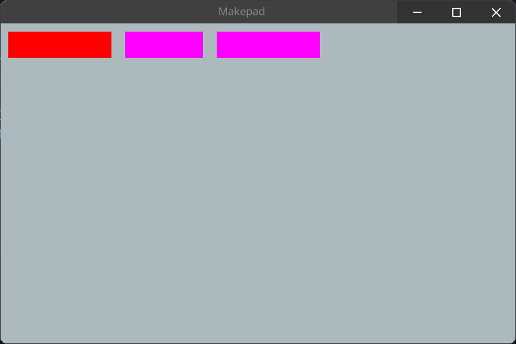
flow Down
flow Overlay
SolidView
SolidView是一个简单的View组件,它继承父组件的背景色,除此外并没有什么特别的
SolidView is a simple View component that inherits the background color of the parent component, without any special features
#![allow(unused)]
fn main() {
SolidView = <ViewBase> {
    show_bg: true,
    draw_bg: {
        fn get_color(self) -> vec4 {
            return self.color
        }

        fn pixel(self) -> vec4 {
            return Pal::premul(self.get_color())
        }
    }
}
}
Example
在例子中SolidView和View一样,都可以去设置需要的属性,我们也可以去覆盖draw_bg属性
In the example, SolidView and View can both set the required properties, and we can also override the draw_bg property
#![allow(unused)]
fn main() {
<SolidView>{
    height: 100,
    width: 100,
    draw_bg: {color: #FF0000},
}
}
ScrollView
ScrollXView
ScrollXView组件是一个带有横向ScrollBar的视图组件
The ScrollXView component is a view component with a horizontal ScrollBar
#![allow(unused)]
fn main() {
ScrollXView = <ViewBase> {
    scroll_bars: <ScrollBars> {show_scroll_x: true, show_scroll_y: false}
}
}
Example
#![allow(unused)]
fn main() {
<ScrollXView>{
    height: Fill,
    width: Fill,
    spacing: 10,
    <View>{
        height: 30,
        width: 120,
        show_bg: true,
        draw_bg: {color: #FF0000},
    }
    <View>{
        height: 30,
        width: 420,
        show_bg: true,
        draw_bg: {color: #FFFF00},
    }
    <View>{
        height: 80,
        width: 120,
        show_bg: true,
        draw_bg: {color: #FF00FF},
    }
}
}
ScrollYView
ScrollYView组件是一个带有纵向ScrollBar的视图组件
ScrollYView component is a view component with a vertical ScrollBar
#![allow(unused)]
fn main() {
ScrollYView = <ViewBase> {
    scroll_bars: <ScrollBars> {show_scroll_x: false, show_scroll_y: true}
}
}
Example
#![allow(unused)]
fn main() {
use makepad_widgets::*;

live_design!{
    import makepad_widgets::base::*;
    import makepad_widgets::theme_desktop_dark::*;

    SYViewExample = <ScrollYView>{
        height: 80,
        width: 300,
        flow: Down,
        <View>{
            height: 30,
            width: 120,
            show_bg: true,
            draw_bg: {color: #FF0000},
        }
        <View>{
            height: 30,
            width: 420,
            show_bg: true,
            draw_bg: {color: #FFFF00},
        }
        <View>{
            height: 80,
            width: 120,
            show_bg: true,
            draw_bg: {color: #FF00FF},
        }
    }
}
}
ScrollXYView
ScrollXYView组件是一个同时带有纵向和横向ScrollBar的视图组件
The ScrollXYView component is a view component with both a horizontal and a vertical ScrollBar
#![allow(unused)]
fn main() {
ScrollXYView = <ViewBase> {
    scroll_bars: <ScrollBars> {show_scroll_x: true,show_scroll_y: true}
}
}
Example
#![allow(unused)]
fn main() {
use makepad_widgets::*;

live_design!{
    import makepad_widgets::base::*;
    import makepad_widgets::theme_desktop_dark::*;

    SXYViewExample = <ScrollXYView>{
        height: 120,
        width: 200,
        spacing: 10,
        <View>{
            height: 30,
            width: 120,
            show_bg: true,
            draw_bg: {color: #FF0000},
        }
        <View>{
            height: 30,
            width: 420,
            show_bg: true,
            draw_bg: {color: #FFFF00},
        }
        <View>{
            height: 280,
            width: 120,
            show_bg: true,
            draw_bg: {color: #FF00FF},
        }
    }
}
}
ShapeView
带有形状的视图类型的组件
The View components with shape
RectView
一个直接显示颜色的矩形的视图
A Rectangle View which directly show background color
#![allow(unused)]
fn main() {
    RectView = <ViewBase> {
        show_bg: true,
        draw_bg: {
            instance border_width: 0.0
            instance border_color: #0000
            instance inset: vec4(0.0, 0.0, 0.0, 0.0)

            fn get_color(self) -> vec4 {
                return self.color
            }

            fn get_border_color(self) -> vec4 {
                return self.border_color
            }

            fn pixel(self) -> vec4 {
                let sdf = Sdf2d::viewport(self.pos * self.rect_size);
                sdf.rect(
                    self.inset.x + self.border_width,
                    self.inset.y + self.border_width,
                    self.rect_size.x - (self.inset.x + self.inset.z + self.border_width * 2.0),
                    self.rect_size.y - (self.inset.y + self.inset.w + self.border_width * 2.0)
                )
                sdf.fill_keep(self.get_color())
                if self.border_width > 0.0 {
                    sdf.stroke(self.get_border_color(), self.border_width)
                }
                return sdf.result
            }
        }
    }
}
Example
#![allow(unused)]
fn main() {
use makepad_widgets::*;

live_design!{
    import makepad_widgets::base::*;
    import makepad_widgets::theme_desktop_dark::*;

    App = {{App}} {
        ui: <Root>{
            main_window = <Window>{
                block_signal_event: true;
                window: {inner_size: vec2(400, 300)},
                pass: {clear_color: #1C2128},
                <SolidView>{
                    height: All,
                    flow: Down,
                    align: {x: 0.5, y: 0.5},
                    <RectView>{
                        height: 100,
                        width: 120,
                        draw_bg: {color: #FF0000},
                    }
                }
            }
        }
    }
}
}
RoundedView
一个带有2.5px圆角的视图(border-radius: 2.5px)
A view with rounded corners of 2.5px (border-radius: 2.5px)
#![allow(unused)]
fn main() {
    RoundedView = <ViewBase> {
        show_bg: true,
        draw_bg: {
            instance border_width: 0.0
            instance border_color: #0000
            instance inset: vec4(0.0, 0.0, 0.0, 0.0)
            instance radius: 2.5

            fn get_color(self) -> vec4 {
                return self.color
            }

            fn get_border_color(self) -> vec4 {
                return self.border_color
            }

            fn pixel(self) -> vec4 {
                let sdf = Sdf2d::viewport(self.pos * self.rect_size)
                sdf.box(
                    self.inset.x + self.border_width,
                    self.inset.y + self.border_width,
                    self.rect_size.x - (self.inset.x + self.inset.z + self.border_width * 2.0),
                    self.rect_size.y - (self.inset.y + self.inset.w + self.border_width * 2.0),
                    max(1.0, self.radius)
                )
                sdf.fill_keep(self.get_color())
                if self.border_width > 0.0 {
                    sdf.stroke(self.get_border_color(), self.border_width)
                }
                return sdf.result;
            }
        }
    }
}
Example
#![allow(unused)]
fn main() {
use makepad_widgets::*;

live_design!{
    import makepad_widgets::base::*;
    import makepad_widgets::theme_desktop_dark::*;

    App = {{App}} {
        ui: <Root>{
            main_window = <Window>{
                block_signal_event: true;
                window: {inner_size: vec2(400, 300)},
                pass: {clear_color: #1C2128},
                <SolidView>{
                    height: All,
                    flow: Down,
                    align: {x: 0.5, y: 0.5},
                    <RoundedView>{
                        height: 100,
                        width: 120,
                        draw_bg: {color: #00FF00},
                    }
                }
            }
        }
    }
}
}
RoundedXView|RoundedYView|RoundedAllView
- RoundedXView:
radius: {left: 2.5px, right: 2.5px} - RoundedYView:
radius: {top: 2.5px, bottom: 2.5px} - RoundedAllView:
radius: {top: 2.5px, right: 2.5px, bottom: 2.5px, left: 2.5px}
X, Y seems to have some issues and doesn't work as expected. This is a job that needs to be fixed (todo!)
CircleView | HexagonView
似乎有些问题,并没有像想象那样工作,这是个待修复的工作(todo!)seems to have some issues and doesn't work as expected. This is a job that needs to be fixed (todo!)
GradientView
下面展示GradientXView和GradientYView的示例
The following display example for GradientXView and GradientYView
Example
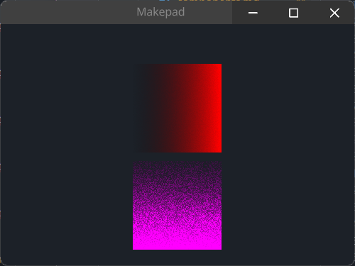
默认的渐变色是红色,若需要修改渐变色则需要修内部instance color2进行修改,See Example <GradientYView>
the default gradient color is red, if you want to change, you need to set instance color2, See Example <GradientYView>
#![allow(unused)]
fn main() {
use makepad_widgets::*;

live_design!{
    import makepad_widgets::base::*;
    import makepad_widgets::theme_desktop_dark::*;

    App = {{App}} {
        ui: <Root>{
            main_window = <Window>{
                block_signal_event: true;
                window: {inner_size: vec2(400, 300)},
                pass: {clear_color: #1C2128},
                <SolidView>{
                    height: All,
                    width: Fill,
                    flow: Down,
                    align: {x: 0.5, y: 0.5},
                    spacing: 10,
                    <GradientXView>{
                        height: 100,
                        width: 100,
                    }
                    <GradientYView>{
                        height: 100,
                        width: 100,
                        draw_bg: {
                            // 渐变颜色
                            // gradient color
                            instance color2: #f0f,
                            instance dither: 10.5
                        }
                    }
                }
            }
        }
    }
}
}
CachedView
Label
默认的Label带有自适应自身大小的高和宽,#888888的颜色以及超长自动换行
Default Label has Fit height and width, color is #888888 and Text auto wrap
#![allow(unused)]
fn main() {
Label = <LabelBase> {
    width: Fit
    height: Fit
    draw_text: {
        color: #8,
        text_style: <THEME_FONT_LABEL>{}
        wrap: Word
    }
}
}
Example
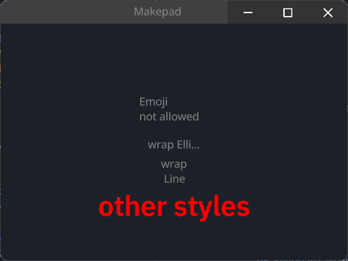
Easy Label
#![allow(unused)]
fn main() {
<Label>{
    height: 30,
    // if width is not set, it will be calculated based on the text length
    // if width < text length, text will be truncated
    // you can use `\n`... to format the text
    width: 80,
    margin: 10,
    text: "Emoji \nnot allowed",
}
}
Text Wrap
#![allow(unused)]
fn main() {
<Label>{
    width: 60,
    text: "wrap Ellipsis",
    draw_text: {
        wrap: Ellipsis,
    }
}
// if wrap is Word, text will be wrapped by word when text length > width
// if is Line, no wrap
<Label>{
    width: 30,
    height: 30,
    text: "wrap Line",
    draw_text: {
        wrap: Word,
    }
}
}
Other Styles
#![allow(unused)]
fn main() {
<Label>{
    draw_text: {
        wrap: Word,
        // real font size = font size * font scale
        font_scale: 1.5,
        text_style: {
            // so here font size = 16 * 1.5 = 24
            font_size: 16,
            font: {path: dep("crate://makepad-widgets/resources/IBMPlexSans-SemiBold.ttf")},
            // brightness > 1.0 will make the text brighter
            // < 1.0 will make the text darker
            brightness: 1.0,
        },
        color: #FF0000,
    }
    text: "other styles",
}
}
Button
按钮由文字,图标,形状组成
Button consist of text, icon and shape
- Label
- label_walk
- draw_text
- text
- Icon
- draw_icon
- icon_walk
- Shape
- draw_bg
- walk
- layout
Example
Easy
#![allow(unused)]
fn main() {
<Button>{text: "easy button",}
}
Icon Button
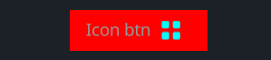
#![allow(unused)]
fn main() {
<Button>{
    text: "Icon btn",
    // override draw_bg
    draw_bg: {
        fn pixel() -> vec4 { return #FF0000 }
    },
    draw_icon: {
        svg_file: dep("crate://self/icons/all.svg"),
        fn get_color(self) -> vec4 {
            return #00FFFF
        }
    },
    icon_walk: {
        height: 16,
        width: 16,
        margin: {left: 10.0, right: 10.0},
    }
}
}
Other Styles Button
#![allow(unused)]
fn main() {
<Button>{
    text: "other styles",
    draw_text: {
        text_style: {
            font_size: 16.0,
            brightness: 0.8,
        },
        fn get_color(self) -> vec4 {
            // if !hover use #00FFFF else #fff
            // eq: !self.hover ? #00FFFF : #fff
            // return mix(
            //     #00FFFF,
            //     #fff,
            //     self.hover
            // )
            // !hover ? #FF0000 : (!pressed ? #00FFFF : #0000FF)
            return mix(
                FF0000,
                mix(
                    00FFFF,
                    0000FF,
                    self.pressed
                ),
                self.hover
            )
        }
    },
    padding: {left: 16.0, right: 16.0, top: 6.0, bottom: 6.0},
}
}
Default
#![allow(unused)]
fn main() {
    Button = <ButtonBase> {
        width: Fit,
        height: Fit,
        margin: {left: 1.0, right: 1.0, top: 1.0, bottom: 1.0}
        align: {x: 0.5, y: 0.5}
        padding: {left: 14.0, top: 10.0, right: 14.0, bottom: 10.0}

        label_walk: {
            width: Fit,
            height: Fit
        }

        draw_text: {
            instance hover: 0.0
            instance pressed: 0.0
            text_style: <THEME_FONT_LABEL>{
                font_size: 11.0
            }
            fn get_color(self) -> vec4 {
                return mix(
                    mix(
                        9,
                        c,
                        self.hover
                    ),
                    9,
                    self.pressed
                )
            }
        }

        draw_icon: {
            instance hover: 0.0
            instance pressed: 0.0
            fn get_color(self) -> vec4 {
                return mix(
                    mix(
                        9,
                        c,
                        self.hover
                    ),
                    9,
                    self.pressed
                )
            }
        }

        draw_bg: {
            instance hover: 0.0
            instance pressed: 0.0
            uniform border_radius: 3.0
            instance bodytop: #53
            instance bodybottom: #5c
            fn pixel(self) -> vec4 {
                let sdf = Sdf2d::viewport(self.pos * self.rect_size);
                let grad_top = 5.0;
                let grad_bot = 1.0;
                let body = mix(mix(self.bodytop, self.bodybottom, self.hover), #33, self.pressed);
                let body_transp = vec4(body.xyz, 0.0);
                let top_gradient = mix(body_transp, mix(#6d, #1f, self.pressed), max(0.0, grad_top - sdf.pos.y) / grad_top);
                let bot_gradient = mix(
                    mix(body_transp, #5c, self.pressed),
                    top_gradient,
                    clamp((self.rect_size.y - grad_bot - sdf.pos.y - 1.0) / grad_bot, 0.0, 1.0)
                );

                // the little drop shadow at the bottom
                let shift_inward = self.border_radius + 4.0;
                sdf.move_to(shift_inward, self.rect_size.y - self.border_radius);
                sdf.line_to(self.rect_size.x - shift_inward, self.rect_size.y - self.border_radius);
                sdf.stroke(
                    mix(mix(#2f, #1f, self.hover), #0000, self.pressed),
                    self.border_radius
                )

                sdf.box(
                    1.,
                    1.,
                    self.rect_size.x - 2.0,
                    self.rect_size.y - 2.0,
                    self.border_radius
                )
                sdf.fill_keep(body)

                sdf.stroke(
                    bot_gradient,
                    1.0
                )

                return sdf.result
            }
        }

        animator: {
            hover = {
                default: off,
                off = {
                    from: {all: Forward {duration: 0.1}}
                    apply: {
                        draw_bg: {pressed: 0.0, hover: 0.0}
                        draw_icon: {pressed: 0.0, hover: 0.0}
                        draw_text: {pressed: 0.0, hover: 0.0}
                    }
                }

                on = {
                    from: {
                        all: Forward {duration: 0.1}
                        pressed: Forward {duration: 0.01}
                    }
                    apply: {
                        draw_bg: {pressed: 0.0, hover: [{time: 0.0, value: 1.0}],}
                        draw_icon: {pressed: 0.0, hover: [{time: 0.0, value: 1.0}],}
                        draw_text: {pressed: 0.0, hover: [{time: 0.0, value: 1.0}],}
                    }
                }

                pressed = {
                    from: {all: Forward {duration: 0.2}}
                    apply: {
                        draw_bg: {pressed: [{time: 0.0, value: 1.0}], hover: 1.0,}
                        draw_icon: {pressed: [{time: 0.0, value: 1.0}], hover: 1.0,}
                        draw_text: {pressed: [{time: 0.0, value: 1.0}], hover: 1.0,}
                    }
                }
            }
        }
    }
}
LinkLabel
LinkLabel inherits Button, so you can set any properties like Button
Example
#![allow(unused)]
fn main() {
<LinkLabel>{
    text: "Link label inherits Button not Label!",
}
// you can add icon too
<LinkLabel>{
    text: "more styles!",
    draw_icon: {
        svg_file: dep("crate://self/icons/all.svg"),
        fn get_color(self) -> vec4 {
            return #00FFFF
        }
    },
    icon_walk: {
        height: 16,
        width: Fit,
        margin: {left: 10.0}
    },
    draw_text: {
        text_style: {
            font_size: 16,
        },
        fn get_color(self) -> vec4 {
            return #00FFFF
        }
    }
}
}
Default
#![allow(unused)]
fn main() {
LinkLabel = <LinkLabelBase> {
        width: Fit,
        height: Fit,
        margin: 0
        padding: 0
        align: {x: 0., y: 0.}

        label_walk: {
            width: Fit,
            height: Fit
        }

        draw_icon: {
            instance hover: 0.0
            instance pressed: 0.0
            fn get_color(self) -> vec4 {
                return mix(
                    mix(
                        9,
                        c,
                        self.hover
                    ),
                    9,
                    self.pressed
                )
            }
        }

        animator: {
            hover = {
                default: off,
                off = {
                    from: {all: Forward {duration: 0.1}}
                    apply: {
                        draw_bg: {pressed: 0.0, hover: 0.0}
                        draw_icon: {pressed: 0.0, hover: 0.0}
                        draw_text: {pressed: 0.0, hover: 0.0}
                    }
                }

                on = {
                    from: {
                        all: Forward {duration: 0.1}
                        pressed: Forward {duration: 0.01}
                    }
                    apply: {
                        draw_bg: {pressed: 0.0, hover: [{time: 0.0, value: 1.0}],}
                        draw_icon: {pressed: 0.0, hover: [{time: 0.0, value: 1.0}],}
                        draw_text: {pressed: 0.0, hover: [{time: 0.0, value: 1.0}],}
                    }
                }

                pressed = {
                    from: {all: Forward {duration: 0.2}}
                    apply: {
                        draw_bg: {pressed: [{time: 0.0, value: 1.0}], hover: 1.0,}
                        draw_icon: {pressed: [{time: 0.0, value: 1.0}], hover: 1.0,}
                        draw_text: {pressed: [{time: 0.0, value: 1.0}], hover: 1.0,}
                    }
                }
            }
        }


        draw_bg: {
            instance pressed: 0.0
            instance hover: 0.0
            fn pixel(self) -> vec4 {
                let sdf = Sdf2d::viewport(self.pos * self.rect_size);
                let offset_y = 1.0
                sdf.move_to(0., self.rect_size.y - offset_y);
                sdf.line_to(self.rect_size.x, self.rect_size.y - offset_y);
                return sdf.stroke(mix(
                    THEME_COLOR_TEXT_DEFAULT,
                    THEME_COLOR_TEXT_META,
                    self.pressed
                ), mix(0.0, 0.8, self.hover));
            }
        }

        draw_text: {
            wrap: Word
            instance pressed: 0.0
            instance hover: 0.0
            text_style: <THEME_FONT_LABEL>{}
            fn get_color(self) -> vec4 {
                return mix(
                    mix(
                        THEME_COLOR_TEXT_META,
                        THEME_COLOR_TEXT_DEFAULT,
                        self.hover
                    ),
                    THEME_COLOR_TEXT_META,
                    self.pressed
                )
            }
        }

    }
}
Icon
Icon是一个svg图标,它只允许您使用svg文件,如果您想使用其他图像类型,See Image
Icon is a svg icon, it only allow you use svg file, if you wanna use other image types, See Image
Example
#![allow(unused)]
fn main() {
<Icon>{
    draw_icon: {
        svg_file: dep("crate://self/icons/all.svg"),
    }
}

<Icon>{
    draw_icon: {
        svg_file: dep("crate://self/icons/all.svg"),
        brightness: 1.2,
        // same as: `color: #dddd00,`
        fn get_color(self)-> vec4{
            return #dddd00
        },
        // size 95% of the original
        scale: 0.95,
    },
    draw_bg: {
        fn pixel(self)-> vec4{
            return #FF00FF
        }
    },
    icon_walk:{
        height: 16,
        width: Fit,
    }
    height: 60,
    width: 66,
    margin: 16,
    padding: 8,
    // move icon to the container center
    align: {x:0.5, y:0.5},
}
}
Default
#![allow(unused)]
fn main() {
    Icon = <IconBase> {
        width: Fit,
        height: Fit,

        icon_walk: {
            margin: {left: 5.0},
            width: Fit,
            height: Fit,
        }

        draw_bg: {
            instance color: #0000,
            fn pixel(self) -> vec4 {
                return self.color;
            }
        }
    }
}
Image
当前图片组件支持jpg和png两种类型的文件,不允许使用svg,如果你要使用svg, See Icon
Current Image support jpg and png file, but it not allow svg, if you want use svg, See Icon
Example
#![allow(unused)]
fn main() {
<Image>{
    source: dep("crate://self/icons/github.png"),
}
<Image>{
    height: 60,
    width: Fit,
    source: dep("crate://self/icons/github.png"),
    fit: Vertical,
}
<Image>{
    height: 46,
    width: 146,
    source: dep("crate://self/icons/github.png"),
    // biggest make image size overflow
    fit: Biggest,
    // if you use draw_bg it will cover the image
    draw_bg: {
        fn pixel(self)-> vec4{
            return #FF0000
        },
    },
}
}
Default
#![allow(unused)]
fn main() {
    Image = <ImageBase> {
        width: 100
        height: 100

        draw_bg: {
            texture image: texture2d
            instance opacity: 1.0
            instance image_scale: vec2(1.0, 1.0)
            instance image_pan: vec2(0.0, 0.0)

            fn get_color_scale_pan(self, scale: vec2, pan: vec2) -> vec4 {
                return sample2d(self.image, self.pos * scale + pan).xyzw;
            }

            fn get_color(self) -> vec4 {
                return self.get_color_scale_pan(self.image_scale, self.image_pan)
            }

            fn pixel(self) -> vec4 {
                let color = self.get_color();
                return Pal::premul(vec4(color.xyz, color.w * self.opacity))
            }
        }
    }
}
RotatedImage
RotatedImage是一个可以旋转的图片,旋转的角度的计算如下:
RotatedImage is a rotatable image, and the calculation of the rotation angle is as follows:
rotation = X deg * PI(Π) / 180
- 90deg ≈ 1.57
- 45deg ≈ 0.785
- 360deg ≈ 6.283
计算机图形学中,通常使用弧度而不是度数来表示旋转角度
In computer graphics, rotation angles are usually expressed in radians rather than degrees
Example
#![allow(unused)]
fn main() {
<RotatedImage>{
    height: 100,
    width: 100,
    source: dep("crate://self/icons/github.png"),
    draw_bg: {
        // how to calc: 1.57 = 90 deg
        // rotation = 90 * PI / 180
        instance rotation: 1.0
    }
}
}
Default
#![allow(unused)]
fn main() {
    RotatedImage = <RotatedImageBase> {
        width: Fit
        height: Fit

        draw_bg: {
            texture image: texture2d

            instance rotation: 0.0
            instance opacity: 1.0
            instance scale: 1.0

            fn rotation_vertex_expansion(rotation: float, w: float, h: float) -> vec2 {
                let horizontal_expansion = (abs(cos(rotation)) * w + abs(sin(rotation)) * h) / w - 1.0;
                let vertical_expansion = (abs(sin(rotation)) * w + abs(cos(rotation)) * h) / h - 1.0;

                return vec2(horizontal_expansion, vertical_expansion);
            }

            fn rotate_2d_from_center(coord: vec2, a: float, size: vec2) -> vec2 {
                let cos_a = cos(-a);
                let sin_a = sin(-a);

                let centered_coord = coord - vec2(0.5, 0.5);

                // Denormalize the coordinates to use original proportions (between height and width)
                let denorm_coord = vec2(centered_coord.x, centered_coord.y * size.y / size.x);
                let demorm_rotated = vec2(denorm_coord.x * cos_a - denorm_coord.y * sin_a, denorm_coord.x * sin_a + denorm_coord.y * cos_a);

                // Restore the coordinates to use the texture coordinates proportions (between 0 and 1 in both axis)
                let rotated = vec2(demorm_rotated.x, demorm_rotated.y * size.x / size.y);

                return rotated + vec2(0.5, 0.5);
            }

            fn get_color(self) -> vec4 {
                let rot_padding = rotation_vertex_expansion(self.rotation, self.rect_size.x, self.rect_size.y) / 2.0;

                // Current position is a traslated one, so let's get the original position
                let current_pos = self.pos.xy - rot_padding;
                let original_pos = rotate_2d_from_center(current_pos, self.rotation, self.rect_size);

                // Scale the current position by the scale factor
                let scaled_pos = original_pos / self.scale;

                // Take pixel color from the original image
                let color = sample2d(self.image, scaled_pos).xyzw;

                let faded_color = color * vec4(1.0, 1.0, 1.0, self.opacity);
                return faded_color;
            }

            fn pixel(self) -> vec4 {
                let rot_expansion = rotation_vertex_expansion(self.rotation, self.rect_size.x, self.rect_size.y);

                // Debug
                // let line_width = 0.01;
                // if self.pos.x < line_width || self.pos.x > (self.scale + rot_expansion.x - line_width) || self.pos.y < line_width || self.pos.y > (self.scale + rot_expansion.y - line_width) {
                //     return #c86;
                // }

                let sdf = Sdf2d::viewport(self.pos * self.rect_size);

                let translation_offset = vec2(self.rect_size.x * rot_expansion.x / 2.0, self.rect_size.y * self.scale * rot_expansion.y / 2.0);
                sdf.translate(translation_offset.x, translation_offset.y);

                let center = self.rect_size * 0.5;
                sdf.rotate(self.rotation, center.x, center.y);

                let scaled_size = self.rect_size * self.scale;
                sdf.box(0.0, 0.0, scaled_size.x, scaled_size.y, 1);

                sdf.fill_premul(Pal::premul(self.get_color()));
                return sdf.result
            }

            fn vertex(self) -> vec4 {
                let rot_expansion = rotation_vertex_expansion(self.rotation, self.rect_size.x, self.rect_size.y);
                let adjusted_pos = vec2(
                    self.rect_pos.x - self.rect_size.x * rot_expansion.x / 2.0,
                    self.rect_pos.y - self.rect_size.y * rot_expansion.y / 2.0
                );

                let expanded_size = vec2(self.rect_size.x * (self.scale + rot_expansion.x), self.rect_size.y * (self.scale + rot_expansion.y));
                let clipped: vec2 = clamp(
                    self.geom_pos * expanded_size + adjusted_pos,
                    self.draw_clip.xy,
                    self.draw_clip.zw
                );

                self.pos = (clipped - adjusted_pos) / self.rect_size;
                return self.camera_projection * (self.camera_view * (
                    self.view_transform * vec4(clipped.x, clipped.y, self.draw_depth + self.draw_zbias, 1.)
                ));
            }

            shape: Solid,
            fill: Image
        }
    }
}
ImageBlend
它是一个用于将两个图像混合在一起的图像组件
It is an image component used to blend two images together
Example
Comming SoonDefault
draw_bg: 包含了一些关于图像的属性和方法,如纹理、透明度、混合模式等。
texture image0和texture image1: 分别表示两个要混合的图像。instance opacity: 表示混合后的图像的透明度,这里是1.0,即完全不透明。instance blend: 表示混合模式,这里是0.0,表示不进行混合。instance image_scale: 表示图像缩放比例,这里是(1.0, 1.0),表示不缩放。instance image_pan: 表示图像平移距离,这里是(0.0, 0.0),表示不平移。instance breathe: 表示呼吸效果,这里是0.0,表示没有呼吸效果。
draw_bg: Contains some attributes and methods related to images, such as texture, transparency, blend mode, etc.
texture image0 and texture image1: respectively represent two images to be mixed.instance opacity: represents the transparency of the mixed image, which is 1.0, which means it is completely opaque.instance blend: represents mixed mode, where 0.0 indicates no blending.instance image_scale: represents the image scaling ratio, where (1.0, 1.0) represents no scaling.instance image_pan: represents the translation distance of the image, where (0.0, 0.0) represents no translation.instance breathe: represents breathing effect, here it is 0.0, indicating no breathing effect.
#![allow(unused)]
fn main() {
    ImageBlend = <ImageBlendBase> {
        width: 100
        height: 100

        draw_bg: {
            texture image0: texture2d
            texture image1: texture2d
            instance opacity: 1.0
            instance blend: 0.0
            instance image_scale: vec2(1.0, 1.0)
            instance image_pan: vec2(0.0, 0.0)
            instance breathe: 0.0
            fn get_color_scale_pan(self, scale: vec2, pan: vec2) -> vec4 {
                let b = 1.0 - 0.1*self.breathe;
                let s = vec2(0.05*self.breathe);
                return mix(
                    sample2d(self.image0, self.pos * scale*b + pan+s).xyzw,
                    sample2d(self.image1, self.pos * scale*b + pan+s).xyzw,
                    self.blend
                )
            }

            fn get_color(self) -> vec4 {
                return self.get_color_scale_pan(self.image_scale, self.image_pan)
            }

            fn pixel(self) -> vec4 {
                let color = self.get_color();
                return Pal::premul(vec4(color.xyz, color.w * self.opacity))
            }
        }

        animator: {
            blend = {
                default: zero,
                zero = {
                    from: {all: Forward {duration: 0.1}}
                    apply: {
                        draw_bg: {blend: 0.0}
                    }
                }
                one = {
                    from: {
                        all: Forward {duration: 0.1}
                    }
                    apply: {
                        draw_bg: {blend: 1.0}
                    }
                }
            }
            breathe = {
                default: off,
                on = {
                    from: {all: BounceLoop {duration: 10., end:1.0}}
                    apply:{
                        draw_bg:{breathe:[{time: 0.0, value: 0.0}, {time:1.0,value:1.0}]}
                    }
                }
                off = {
                    from: {all: Forward {duration: 1}}
                    apply:{
                        draw_bg:{breathe:0.0}
                    }
                }
            }
        }
    }
}
CheckBox
Example
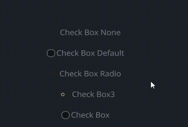
#![allow(unused)]
fn main() {
 // None
 <CheckBox>{
     text: "Check Box None",
     draw_check: {
         check_type: None,
     },
 }
 <CheckBox>{
     text: "Check Box Default",
 }
 // look like Radio, but it can be clicked multiple times
 // Radio only can be clicked once
 <CheckBox>{
     text: "Check Box Radio",
     draw_check: {
         check_type: Radio,
     },
 }
 // look like Switch
 <CheckBox>{
     text: "Check Box3",
     draw_check: {
         check_type: Toggle,
     },
     label_walk: {
         margin: {left: 32.0},
     },
 }
 <CheckBox>{
     text: "Check Box",
     draw_check: {
         check_type: Check,
     },
 }
}
Default
#![allow(unused)]
fn main() {
    CheckBox = <CheckBoxBase> {

        width: Fit,
        height: Fit

        label_walk: {
            margin: {left: 20.0, top: 8, bottom: 8, right: 10}
            width: Fit,
            height: Fit,
        }

        label_align: {
            y: 0.0
        }

        draw_check: {
            uniform size: 7.0;
            fn pixel(self) -> vec4 {
                let sdf = Sdf2d::viewport(self.pos * self.rect_size)
                match self.check_type {
                    CheckType::Check => {
                        let left = 3;
                        let sz = self.size;
                        let c = vec2(left + sz, self.rect_size.y * 0.5);
                        sdf.box(left, c.y - sz, sz * 2.0, sz * 2.0, 3.0); // rounding = 3rd value
                        sdf.fill_keep(mix(mix(#x00000077, #x00000044, pow(self.pos.y, 1.)), mix(#x000000AA, #x00000066, pow(self.pos.y, 1.0)), self.hover))
                        sdf.stroke(#x888, 1.0) // outline
                        let szs = sz * 0.5;
                        let dx = 1.0;
                        sdf.move_to(left + 4.0, c.y);
                        sdf.line_to(c.x, c.y + szs);
                        sdf.line_to(c.x + szs, c.y - szs);
                        sdf.stroke(mix(#fff0, #f, self.selected), 1.25);
                    }
                    CheckType::Radio => {
                        let sz = self.size;
                        let left = sz + 1.;
                        let c = vec2(left + sz, self.rect_size.y * 0.5);
                        sdf.circle(left, c.y, sz);
                        sdf.fill(#2);
                        let isz = sz * 0.5;
                        sdf.circle(left, c.y, isz);
                        sdf.fill(mix(#fff0, #f, self.selected));
                    }
                    CheckType::Toggle => {
                        let sz = self.size;
                        let left = sz + 1.;
                        let c = vec2(left + sz, self.rect_size.y * 0.5);
                        sdf.box(left, c.y - sz, sz * 3.0, sz * 2.0, 0.5 * sz);
                        sdf.fill(#2);
                        let isz = sz * 0.5;
                        sdf.circle(left + sz + self.selected * sz, c.y, isz);
                        sdf.circle(left + sz + self.selected * sz, c.y, 0.5 * isz);
                        sdf.subtract();
                        sdf.circle(left + sz + self.selected * sz, c.y, isz);
                        sdf.blend(self.selected)
                        sdf.fill(#f);
                    }
                    CheckType::None => {
                        return #0000
                    }
                }
                return sdf.result
            }
        }
        draw_text: {
            color: #9,
            instance focus: 0.0
            instance selected: 0.0
            instance hover: 0.0
            text_style: {
                font: {
                    //path: d"resources/IBMPlexSans-SemiBold.ttf"
                }
                font_size: 11.0
            }
            fn get_color(self) -> vec4 {
                return mix(
                    mix(
                        fff6,
                        fff6,
                        self.hover
                    ),
                    fff6,
                    self.selected
                )
            }
        }

        draw_icon: {
            instance focus: 0.0
            instance hover: 0.0
            instance selected: 0.0
            fn get_color(self) -> vec4 {
                return mix(
                    mix(
                        9,
                        c,
                        self.hover
                    ),
                    f,
                    self.selected
                )
            }
        }

        animator: {
            hover = {
                default: off
                off = {
                    from: {all: Forward {duration: 0.15}}
                    apply: {
                        draw_check: {hover: 0.0}
                        draw_text: {hover: 0.0}
                        draw_icon: {hover: 0.0}
                    }
                }
                on = {
                    from: {all: Snap}
                    apply: {
                        draw_check: {hover: 1.0}
                        draw_text: {hover: 1.0}
                        draw_icon: {hover: 1.0}
                    }
                }
            }
            focus = {
                default: off
                off = {
                    from: {all: Snap}
                    apply: {
                        draw_check: {focus: 0.0}
                        draw_text: {focus: 0.0}
                        draw_icon: {focus: 0.0}
                    }
                }
                on = {
                    from: {all: Snap}
                    apply: {
                        draw_check: {focus: 1.0}
                        draw_text: {focus: 1.0}
                        draw_icon: {focus: 1.0}
                    }
                }
            }
            selected = {
                default: off
                off = {
                    from: {all: Forward {duration: 0.1}}
                    apply: {
                        draw_check: {selected: 0.0},
                        draw_text: {selected: 0.0},
                        draw_icon: {selected: 0.0},
                    }
                }
                on = {
                    from: {all: Forward {duration: 0.0}}
                    apply: {
                        draw_check: {selected: 1.0}
                        draw_text: {selected: 1.0}
                        draw_icon: {selected: 1.0},
                    }
                }
            }
        }
    }
}
RadioButton
Example
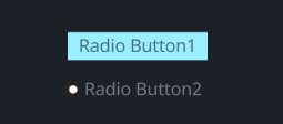
#![allow(unused)]
fn main() {
<RadioButton>{
    label: "Radio Button1",

    draw_radio: {
        radio_type: Tab,
    }
}
<RadioButton>{
    label: "Radio Button2",
    label_align: {x: 1.5, y: 0.5},
    label_walk: {
        margin: {left: 16.0}
    }
}
}
Default
#![allow(unused)]
fn main() {
    RadioButton = <RadioButtonBase> {

        draw_radio: {

            uniform size: 7.0;
            uniform color_active: #00000000
            uniform color_inactive: #x99EEFF

            fn pixel(self) -> vec4 {
                let sdf = Sdf2d::viewport(self.pos * self.rect_size)
                match self.radio_type {
                    RadioType::Round => {
                        let sz = self.size;
                        let left = sz + 1.;
                        let c = vec2(left + sz, self.rect_size.y * 0.5);
                        sdf.circle(left, c.y, sz);
                        sdf.fill(#2);
                        let isz = sz * 0.5;
                        sdf.circle(left, c.y, isz);
                        sdf.fill(mix(#fff0, #f, self.selected));
                    }
                    RadioType::Tab => {
                        let sz = self.size;
                        let left = 0.;
                        let c = vec2(left, self.rect_size.y);
                        sdf.rect(
                            -1.,
                            0.,
                            self.rect_size.x + 2.0,
                            self.rect_size.y
                        );
                        sdf.fill(mix(self.color_inactive, self.color_active, self.selected));
                    }
                }
                return sdf.result
            }
        }
        draw_text: {
            instance hover: 0.0
            instance focus: 0.0
            instance selected: 0.0

            uniform color_unselected: #x00000088
            uniform color_unselected_hover: #x000000CC
            uniform color_selected: #xFFFFFF66

            color: #9
            text_style: {
                font: {
                    //path: d"resources/ibmplexsans-semibold.ttf"
                }
                font_size: 9.5
            }
            fn get_color(self) -> vec4 {
                return mix(
                    mix(
                        self.color_unselected,
                        self.color_unselected_hover,
                        self.hover
                    ),
                    self.color_selected,
                    self.selected
                )
            }
        }

        draw_icon: {
            instance focus: 0.0
            instance hover: 0.0
            instance selected: 0.0
            fn get_color(self) -> vec4 {
                return mix(
                    mix(
                        9,
                        c,
                        self.hover
                    ),
                    9,
                    self.selected
                )
            }
        }

        width: Fit,
        height: Fit

        label_walk: {
            margin: {top: 4.5, bottom: 4.5, left: 8, right: 8}
            width: Fit,
            height: Fit,
        }

        label_align: {
            y: 0.0
        }

        animator: {
            hover = {
                default: off
                off = {
                    from: {all: Forward {duration: 0.15}}
                    apply: {
                        draw_radio: {hover: 0.0}
                        draw_text: {hover: 0.0}
                        draw_icon: {hover: 0.0}
                    }
                }
                on = {
                    from: {all: Snap}
                    apply: {
                        draw_radio: {hover: 1.0}
                        draw_text: {hover: 1.0}
                        draw_icon: {hover: 1.0}
                    }
                }
            }
            focus = {
                default: off
                off = {
                    from: {all: Forward {duration: 0.0}}
                    apply: {
                        draw_radio: {focus: 0.0}
                        draw_text: {focus: 0.0}
                        draw_icon: {focus: 0.0}
                    }
                }
                on = {
                    from: {all: Snap}
                    apply: {
                        draw_radio: {focus: 1.0}
                        draw_text: {focus: 1.0}
                        draw_icon: {focus: 1.0}
                    }
                }
            }
            selected = {
                default: off
                off = {
                    from: {all: Forward {duration: 0.0}}
                    apply: {
                        draw_radio: {selected: 0.0}
                        draw_icon: {selected: 0.0}
                        draw_text: {selected: 0.0}
                        draw_icon: {selected: 0.0}
                    }
                }
                on = {
                    cursor: Arrow,
                    from: {all: Forward {duration: 0.0}}
                    apply: {
                        draw_radio: {selected: 1.0}
                        draw_icon: {selected: 1.0}
                        draw_text: {selected: 1.0}
                        draw_icon: {selected: 1.0}
                    }
                }
            }
        }
    }
}
TextInput
Example
With Border
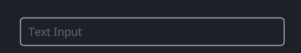
#![allow(unused)]
fn main() {
<TextInput> {
    width: 300,
    height: Fit,
    text: "Text Input",
    draw_bg: {
        border_width: 1.0
        border_color: #ddd
    }
}
}
With Background
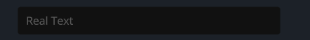
#![allow(unused)]
fn main() {
<TextInput>{
    text: "Real Text"
    width: 300,
    height: Fit
    draw_bg: {
        color: #1
    }
}
}
Secret Input
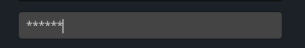
#![allow(unused)]
fn main() {
<TextInput> {
    height: Fit,
    width: 300,
    secret: true,
    empty_message: "Placeholder"
    draw_bg: {
        color:  #444
        border_width: 1.0
        border_color: #x00000044
    }
    ascii_only: true,
}
}
More Styles
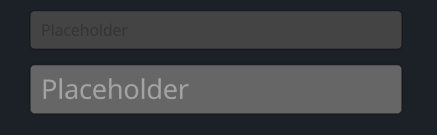
- empty_message is placeholder, if text is not set, show empty_message
- ascii_only is true can only input ascii (a~z, A~Z, 0~9)
#![allow(unused)]
fn main() {
<TextInput> {
    height: Fit,
    width: 300,
    empty_message: "Placeholder"
    draw_bg: {
        color:  #444
        border_width: 1.0
        border_color: #x00000044
    }
    ascii_only: true,
}
<TextInput> {
    height: Fit,
    width: 300,
    margin: {top: 0.0, left: 0.0, bottom: 0.0, right: 0.0},
    empty_message: "Placeholder"
    draw_bg: {
        color: #666,
        border_width: 1.0,
        border_color: #x00000044,
    }
    draw_text: {
        text_style: {font_size: 16.0}
        fn get_color(self) -> vec4 {
            return
            mix(
                mix(
                    mix(
                        xFFFFFF55,
                        xFFFFFF88,
                        self.hover
                    ),
                    xFFFFFFCC,
                    self.focus
                ),
                xFFFFFF66,
                self.is_empty
            )
        }
    }
}
}
Default
#![allow(unused)]
fn main() {
    TextInput = <TextInputBase> {
        draw_text: {
            instance hover: 0.0
            instance focus: 0.0
            wrap: Word,
            text_style: <THEME_FONT_LABEL> {}
            fn get_color(self) -> vec4 {
                return
                mix(
                    mix(
                        mix(
                            xFFFFFF55,
                            xFFFFFF88,
                            self.hover
                        ),
                        xFFFFFFCC,
                        self.focus
                    ),
                    3,
                    self.is_empty
                )
            }
        }

        draw_cursor: {
            instance focus: 0.0
            uniform border_radius: 0.5
            fn pixel(self) -> vec4 {
                let sdf = Sdf2d::viewport(self.pos * self.rect_size);
                sdf.box(
                    0.,
                    0.,
                    self.rect_size.x,
                    self.rect_size.y,
                    self.border_radius
                )
                sdf.fill(mix(#ccc0, #f, self.focus));
                return sdf.result
            }
        }

        draw_select: {
            instance hover: 0.0
            instance focus: 0.0
            uniform border_radius: 2.0
            fn pixel(self) -> vec4 {
                //return mix(#f00,#0f0,self.pos.y)
                let sdf = Sdf2d::viewport(self.pos * self.rect_size);
                sdf.box(
                    0.,
                    0.,
                    self.rect_size.x,
                    self.rect_size.y,
                    self.border_radius
                )
                sdf.fill(mix(#5550, #xFFFFFF40, self.focus)); // Pad color
                return sdf.result
            }
        }

        cursor_margin_bottom: 3.0,
        cursor_margin_top: 4.0,
        select_pad_edges: 3.0
        cursor_size: 2.0,
        numeric_only: false,
        on_focus_select_all: false,
        empty_message: "0",
        draw_bg: {
            instance radius: 2.0
            instance border_width: 0.0
            instance border_color: #3
            instance inset: vec4(0.0, 0.0, 0.0, 0.0)

            fn get_color(self) -> vec4 {
                return self.color
            }

            fn get_border_color(self) -> vec4 {
                return self.border_color
            }

            fn pixel(self) -> vec4 {
                let sdf = Sdf2d::viewport(self.pos * self.rect_size)
                sdf.box(
                    self.inset.x + self.border_width,
                    self.inset.y + self.border_width,
                    self.rect_size.x - (self.inset.x + self.inset.z + self.border_width * 2.0),
                    self.rect_size.y - (self.inset.y + self.inset.w + self.border_width * 2.0),
                    max(1.0, self.radius)
                )
                sdf.fill_keep(self.get_color())
                if self.border_width > 0.0 {
                    sdf.stroke(self.get_border_color(), self.border_width)
                }
                return sdf.result;
            }
        },
        clip_x: false,
        clip_y: false,
        padding: {left: 10, top: 11, right: 10, bottom: 10}
        label_align: {y: 0.}
        //margin: {top: 5, right: 5}
        width: Fit,
        height: Fit,

        /*label_walk: {
            width: Fit,
            height: Fit,
            //margin: 0//{left: 5.0, right: 5.0, top: 0.0, bottom: 2.0},
        }*/

        animator: {
            hover = {
                default: off
                off = {
                    from: {all: Forward {duration: 0.1}}
                    apply: {
                        draw_select: {hover: 0.0}
                        draw_text: {hover: 0.0}
                    }
                }
                on = {
                    from: {all: Snap}
                    apply: {
                        draw_select: {hover: 1.0}
                        draw_text: {hover: 1.0}
                    }
                }
            }
            focus = {
                default: off
                off = {
                    from: {all: Snap}
                    apply: {
                        draw_cursor: {focus: 0.0},
                        draw_select: {focus: 0.0}
                        draw_text: {focus: 0.0}
                    }
                }
                on = {
                    from: {all: Snap}
                    apply: {
                        draw_cursor: {focus: 1.0},
                        draw_select: {focus: 1.0}
                        draw_text: {focus: 1.0}
                    }
                }
            }
        }
    }
}
DesktopButton
DesktopButton用于构建软件控制栏
DesktopButton used to build software control bar
Example
#![allow(unused)]
fn main() {
<DesktopButton> {draw_bg: {button_type: Fullscreen}}
<DesktopButton> {draw_bg: {button_type: XRMode}}
<DesktopButton> {draw_bg: {button_type: WindowsMin}}
<DesktopButton> {draw_bg: {button_type: WindowsMax}}
<DesktopButton> {draw_bg: {button_type: WindowsClose}}
<DesktopButton> {draw_bg: {button_type: WindowsMaxToggled}}
}
Default
#![allow(unused)]
fn main() {
    DesktopButton = <DesktopButtonBase> {
        draw_bg: {
            fn pixel(self) -> vec4 {
                let sdf = Sdf2d::viewport(self.pos * self.rect_size);
                sdf.aa *= 3.0;
                let sz = 4.5;
                let c = self.rect_size * vec2(0.5, 0.5);

                // WindowsMin
                match self.button_type {
                    DesktopButtonType::WindowsMin => {
                        sdf.clear(mix(#3, mix(#6, #9, self.pressed), self.hover));
                        sdf.move_to(c.x - sz, c.y);
                        sdf.line_to(c.x + sz, c.y);
                        sdf.stroke(#f, 0.5 + 0.5 * self.dpi_dilate);
                        return sdf.result;
                    }
                    DesktopButtonType::WindowsMax => {
                        sdf.clear(mix(#3, mix(#6, #9, self.pressed), self.hover));
                        sdf.rect(c.x - sz, c.y - sz, 2. * sz, 2. * sz);
                        sdf.stroke(#f, 0.5 + 0.5 * self.dpi_dilate);
                        return sdf.result;
                    }
                    DesktopButtonType::WindowsMaxToggled => {
                        let clear = mix(#3, mix(#6, #9, self.pressed), self.hover);
                        sdf.clear(clear);
                        let sz = 3.5;
                        sdf.rect(c.x - sz + 1., c.y - sz - 1., 2. * sz, 2. * sz);
                        sdf.stroke(#f, 0.5 + 0.5 * self.dpi_dilate);
                        sdf.rect(c.x - sz - 1., c.y - sz + 1., 2. * sz, 2. * sz);
                        sdf.fill_keep(clear);
                        sdf.stroke(#f, 0.5 + 0.5 * self.dpi_dilate);
                        return sdf.result;
                    }
                    DesktopButtonType::WindowsClose => {
                        sdf.clear(mix(#3, mix(#e00, #c00, self.pressed), self.hover));
                        sdf.move_to(c.x - sz, c.y - sz);
                        sdf.line_to(c.x + sz, c.y + sz);
                        sdf.move_to(c.x - sz, c.y + sz);
                        sdf.line_to(c.x + sz, c.y - sz);
                        sdf.stroke(#f, 0.5 + 0.5 * self.dpi_dilate);
                        return sdf.result;
                    }
                    DesktopButtonType::XRMode => {
                        sdf.clear(mix(#3, mix(#0aa, #077, self.pressed), self.hover));
                        let w = 12.;
                        let h = 8.;
                        sdf.box(c.x - w, c.y - h, 2. * w, 2. * h, 2.);
                        // subtract 2 eyes
                        sdf.circle(c.x - 5.5, c.y, 3.5);
                        sdf.subtract();
                        sdf.circle(c.x + 5.5, c.y, 3.5);
                        sdf.subtract();
                        sdf.circle(c.x, c.y + h - 0.75, 2.5);
                        sdf.subtract();
                        sdf.fill(#8);

                        return sdf.result;
                    }
                    DesktopButtonType::Fullscreen => {
                        sz = 8.;
                        sdf.clear(mix(#3, mix(#6, #9, self.pressed), self.hover));
                        sdf.rect(c.x - sz, c.y - sz, 2. * sz, 2. * sz);
                        sdf.rect(c.x - sz + 1.5, c.y - sz + 1.5, 2. * (sz - 1.5), 2. * (sz - 1.5));
                        sdf.subtract();
                        sdf.rect(c.x - sz + 4., c.y - sz - 2., 2. * (sz - 4.), 2. * (sz + 2.));
                        sdf.subtract();
                        sdf.rect(c.x - sz - 2., c.y - sz + 4., 2. * (sz + 2.), 2. * (sz - 4.));
                        sdf.subtract();
                        sdf.fill(#f); //, 0.5 + 0.5 * dpi_dilate);

                        return sdf.result;
                    }
                }
                return #f00;
            }
        }
        animator: {
            hover = {
                default: off,
                off = {
                    from: {all: Forward {duration: 0.1}}
                    apply: {
                        draw_bg: {pressed: 0.0, hover: 0.0}
                    }
                }

                on = {
                    from: {
                        all: Forward {duration: 0.1}
                        state_down: Snap
                    }
                    apply: {
                        draw_bg: {
                            pressed: 0.0,
                            hover: 1.0,
                        }
                    }
                }

                pressed = {
                    from: {all: Snap}
                    apply: {
                        draw_bg: {
                            pressed: 1.0,
                            hover: 1.0,
                        }
                    }
                }
            }
        }
    }
}
FoldButton
FoldButton常使用在类似Collapse这些需要折叠操作的组件作为折叠触发的按钮
FoldButton is commonly used as a folding trigger button in components such as Collapse that require folding operations
Example
当前该组件的大小设置似乎存在问题,待修复
There seems to be an issue with the current size setting of this component, which needs to be fixed
#![allow(unused)]
fn main() {
<FoldButton>{
    animator: {open = {default: yes}},
    height: 25,
    width: 15,
    margin: {left: 5}
}
}
Default
#![allow(unused)]
fn main() {
    FoldButton = <FoldButtonBase> {
        draw_bg: {
            instance open: 0.0
            instance hover: 0.0

            uniform fade: 1.0

            fn pixel(self) -> vec4 {

                let sz = 3.;
                let c = vec2(5.0, 0.5 * self.rect_size.y);
                let sdf = Sdf2d::viewport(self.pos * self.rect_size);
                sdf.clear(vec4(0.));
                // we have 3 points, and need to rotate around its center
                sdf.rotate(self.open * 0.5 * PI + 0.5 * PI, c.x, c.y);
                sdf.move_to(c.x - sz, c.y + sz);
                sdf.line_to(c.x, c.y - sz);
                sdf.line_to(c.x + sz, c.y + sz);
                sdf.close_path();
                sdf.fill(mix(#a, #f, self.hover));
                return sdf.result * self.fade;
            }
        }

        abs_size: vec2(32, 12)
        abs_offset: vec2(4., 0.)
        width: 12,
        height: 12,

        animator: {

            hover = {
                default: off
                off = {
                    from: {all: Forward {duration: 0.1}}
                    apply: {draw_bg: {hover: 0.0}}
                }

                on = {
                    from: {all: Snap}
                    apply: {draw_bg: {hover: 1.0}}
                }
            }

            open = {
                default: yes
                no = {
                    from: {all: Forward {duration: 0.2}}
                    ease: ExpDecay {d1: 0.96, d2: 0.97}
                    redraw: true
                    apply: {
                        draw_bg: {open: [{time: 0.0, value: 1.0}, {time: 1.0, value: 0.0}]}
                    }
                }
                yes = {
                    from: {all: Forward {duration: 0.2}}
                    ease: ExpDecay {d1: 0.98, d2: 0.95}
                    redraw: true
                    apply: {
                        draw_bg: {open: [{time: 0.0, value: 0.0}, {time: 1.0, value: 1.0}]}
                    }
                }
            }
        }
    }
}
FoldHeader
FoldHeader由两个部分组成:
FoldHeader consist of two parts:
- header
- body
Example
在示例中就是你所需要的
It is what you really need in this example
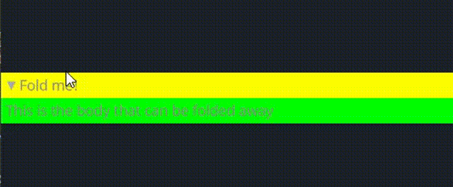
#![allow(unused)]
fn main() {
<FoldHeader>{
    header: <View>{
        show_bg: true,
        width: Fill
        height: Fit
        draw_bg: {
            fn pixel(self) -> vec4{
                return #FFFF00
            }
        }
        padding: 5,
        flow: Right,
        <FoldButton>{}
        <Label>{text: "Fold me!"}
    }
    body: <View>{
        show_bg: true,
        width: Fill
        height: Fit
        draw_bg: {
            fn pixel(self) -> vec4{
                return #00FF00
            }
        }
        padding: 5,
        <Label>{
            text:"This is the body that can be folded away"
        }
    }
}
}
Default
#![allow(unused)]
fn main() {
    FoldHeader = <FoldHeaderBase> {
        width: Fill,
        height: Fit
        body_walk: {
            width: Fill,
            height: Fit
        }

        flow: Down,

        animator: {
            open = {
                default: on
                off = {
                    from: {all: Forward {duration: 0.2}}
                    ease: ExpDecay {d1: 0.96, d2: 0.97}
                    redraw: true
                    apply: {
                        opened: [{time: 0.0, value: 1.0}, {time: 1.0, value: 0.0}]
                    }
                }
                on = {
                    from: {all: Forward {duration: 0.2}}
                    ease: ExpDecay {d1: 0.98, d2: 0.95}
                    redraw: true
                    apply: {
                        opened: [{time: 0.0, value: 0.0}, {time: 1.0, value: 1.0}]
                    }
                }
            }
        }
    }
}
DropDown
一个下拉菜单小部件,允许用户从列表中选择一个项目。下拉列表可以显示标签和相关值,其外观和行为由各种属性和动画控制。
在Makepad中DropDown就是我们使用的Select下拉选项框组件,它允许我们在一个选项组中选择需要的选项
A dropdown menu widget that allows users to select an item from a list. The dropdown can display labels and associated values, and its appearance and behavior are controlled by various properties and animations.
In Makepad, DropDown is the Select dropdown option box component we use, which allows us to select the desired options in a group of options
Example
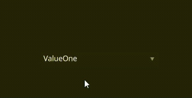
#![allow(unused)]
fn main() {
<DropDown>{
    draw_text: {
        fn get_color(self) -> vec4 {
            return #FFFFFF
        }
    },
    line_spacing: 1.5,
    height: 24,
    width: 200
    labels: ["ValueOne", "ValueTwo","Thrice","FourthValue","OptionE","Hexagons"],
    values: [ ValueOne,ValueTwo,Thrice,FourthValue,OptionE,Hexagons]
}
}
Default
#![allow(unused)]
fn main() {
    DropDown = <DropDownBase> {
        draw_text: {
            text_style: <THEME_FONT_DATA> {}

            fn get_color(self) -> vec4 {
                return mix(
                    mix(
                        mix(
                            9,
                            b,
                            self.focus
                        ),
                        c,
                        self.hover
                    ),
                    9,
                    self.pressed
                )
            }
        }

        draw_bg: {
            instance hover: 0.0
            instance pressed: 0.0
            instance focus: 0.0,
            instance open: 0.0,
            uniform border_radius: 0.5

            fn get_bg(self, inout sdf: Sdf2d) {
                sdf.box(
                    0.,
                    0.,
                    self.rect_size.x,
                    self.rect_size.y,
                    self.border_radius
                )
                sdf.fill(mix(#2, #3, self.hover));
            }

            fn pixel(self) -> vec4 {
                let sdf = Sdf2d::viewport(self.pos * self.rect_size);
                self.get_bg(sdf);
                // lets draw a little triangle in the corner
                let c = vec2(self.rect_size.x - 10.0, self.rect_size.y * 0.5)
                let sz = 2.5;

                sdf.move_to(c.x - sz, c.y - sz);
                sdf.line_to(c.x + sz, c.y - sz);
                sdf.line_to(c.x, c.y + sz * 0.75);
                sdf.close_path();

                sdf.fill(mix(#8, #c, self.hover));

                return sdf.result
            }
        }

        width: Fill,
        height: Fit,
        margin: {left: 1.0, right: 1.0, top: 1.0, bottom: 1.0}
        align: {x: 0., y: 0.}
        padding: {left: 5.0, top: 5.0, right: 4.0, bottom: 5.0}

        popup_menu: <PopupMenu> {}

        selected_item: 0
        animator: {
            hover = {
                default: off,
                off = {
                    from: {all: Forward {duration: 0.1}}
                    apply: {
                        draw_bg: {pressed: 0.0, hover: 0.0}
                        draw_text: {pressed: 0.0, hover: 0.0}
                    }
                }

                on = {
                    from: {
                        all: Forward {duration: 0.1}
                        pressed: Forward {duration: 0.01}
                    }
                    apply: {
                        draw_bg: {pressed: 0.0, hover: [{time: 0.0, value: 1.0}],}
                        draw_text: {pressed: 0.0, hover: [{time: 0.0, value: 1.0}],}
                    }
                }

                pressed = {
                    from: {all: Forward {duration: 0.2}}
                    apply: {
                        draw_bg: {pressed: [{time: 0.0, value: 1.0}], hover: 1.0,}
                        draw_text: {pressed: [{time: 0.0, value: 1.0}], hover: 1.0,}
                    }
                }
            }
            focus = {
                default: off
                off = {
                    from: {all: Snap}
                    apply: {
                        draw_bg: {focus: 0.0},
                        draw_text: {focus: 0.0}
                    }
                }
                on = {
                    from: {all: Snap}
                    apply: {
                        draw_bg: {focus: 1.0},
                        draw_text: {focus: 1.0}
                    }
                }
            }
        }
    }
}
Slider
Example
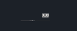
#![allow(unused)]
fn main() {
<Slider> {
    width: 100,
    height: 30,
    draw_slider:{
        slider_type: Horizontal
    },
}
}
Default
#![allow(unused)]
fn main() {
Slider = <SliderBase> {
        min: 0.0,
        max: 1.0,
        step: 0.0,

        draw_slider: {
            instance hover: float
            instance focus: float
            instance drag: float

            fn pixel(self) -> vec4 {
                let slider_height = 3;
                let nub_size = mix(3, 4, self.hover);
                let nubbg_size = 18

                let sdf = Sdf2d::viewport(self.pos * self.rect_size)

                let slider_bg_color = mix(#38, #30, self.focus);
                let slider_color = mix(mix(#5, #68, self.hover), #68, self.focus);
                let nub_color = mix(mix(#8, #f, self.hover), mix(#c, #f, self.drag), self.focus);
                let nubbg_color = mix(#eee0, #8, self.drag);

                match self.slider_type {
                    SliderType::Horizontal => {
                        sdf.rect(0, self.rect_size.y - slider_height, self.rect_size.x, slider_height)
                        sdf.fill(slider_bg_color);

                        sdf.rect(0, self.rect_size.y - slider_height, self.slide_pos * (self.rect_size.x - nub_size) + nub_size, slider_height)
                        sdf.fill(slider_color);

                        let nubbg_x = self.slide_pos * (self.rect_size.x - nub_size) - nubbg_size * 0.5 + 0.5 * nub_size;
                        sdf.rect(nubbg_x, self.rect_size.y - slider_height, nubbg_size, slider_height)
                        sdf.fill(nubbg_color);

                        // the nub
                        let nub_x = self.slide_pos * (self.rect_size.x - nub_size);
                        sdf.rect(nub_x, self.rect_size.y - slider_height, nub_size, slider_height)
                        sdf.fill(nub_color);
                    }
                    SliderType::Vertical => {

                    }
                    SliderType::Rotary => {

                    }
                }
                return sdf.result
            }
        }

        draw_text: {
            color: #9
        }

        label_walk: {
            margin: {left: 4.0, top: 3.0}
            width: Fill,
            height: Fill
        }

        label_align: {
            y: 0.0
        }

        precision: 2,

        text_input: <TextInput> {
            cursor_margin_bottom: 3.0,
            cursor_margin_top: 4.0,
            select_pad_edges: 3.0
            cursor_size: 2.0,
            empty_message: "0",
            numeric_only: true,
            draw_bg: {
                shape: None
                color: #5
                radius: 2.0
            },

            padding: 0,
            label_align: {y: 0.},
            margin: {top: 3, right: 3}
        }

        animator: {
            hover = {
                default: off
                off = {
                    from: {all: Forward {duration: 0.2}}
                    apply: {
                        draw_slider: {hover: 0.0}
                        //text_input: {animator: {hover = off}}
                    }
                }
                on = {
                    //cursor: Arrow,
                    from: {all: Snap}
                    apply: {
                        draw_slider: {hover: 1.0}
                        //text_input: {animator: {hover = on}}
                    }
                }
            }
            focus = {
                default: off
                off = {
                    from: {all: Forward {duration: 0.0}}
                    apply: {
                        draw_slider: {focus: 0.0}
                    }
                }
                on = {
                    from: {all: Snap}
                    apply: {
                        draw_slider: {focus: 1.0}
                    }
                }
            }
            drag = {
                default: off
                off = {
                    from: {all: Forward {duration: 0.1}}
                    apply: {draw_slider: {drag: 0.0}}
                }
                on = {
                    cursor: Arrow,
                    from: {all: Snap}
                    apply: {draw_slider: {drag: 1.0}}
                }
            }
        }
    }
}
Slide
SlidesView提供了可使用键盘方向切换视图的能力,通常来说它由多个Slide组合而成
实际上Slide就是一个视图,而SlideBody只是一个文字组件,因此你不必拘泥于此
SlidesView provides the ability to switch views using keyboard orientation, typically consisting of multiple combinations of slides
Actually, Slide is just a view, while SlideBody is just a text component, so you don't have to be limited to it
Example
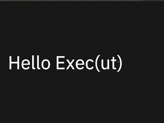
#![allow(unused)]
fn main() {
<SlidesView> {
    <Slide> {
        title = {text: " Hello Exec(ut)"},
        <SlideBody> {text: ""}
    }
    <Slide> {
        title = {text: "Playing with local AI"},
        <SlideBody> {text: "Rik Arends\n"}
    }
    <Slide> {
        title = {text:"Makepad"},
        <SlideBody> {text: "- Rebuilding VB/Delphi\n   in Rust"}
    }
    <Slide> {
        title = {text: "10 years is a long time"},
        <SlideBody> {text: "- Whole stack from scratch"}
    }
}
}
Default
SlidesView
#![allow(unused)]
fn main() {
SlidesView = <SlidesViewBase> {
        anim_speed: 0.9
    }
}
Slide
#![allow(unused)]
fn main() {
Slide = <RoundedView> {
        draw_bg: {color: #x1A, radius: 5.0}
        width: Fill,
        height: Fill
        align: {x: 0.0, y: 0.5} flow: Down, spacing: 10, padding: 50
        title = <Label> {
            draw_text: {
                color: #f
                text_style: {
                    line_spacing:1.0
                    font:{path: dep("crate://makepad-widgets/resources/IBMPlexSans-Text.ttf")}
                    font_size: 84
                }
            }
            text: "SlideTitle"
        }
    }
}
SlideBody
#![allow(unused)]
fn main() {
SlideBody = <Label> {
        margin:{top:20}
        draw_text: {
            color: #D
            text_style: {
                line_spacing:1.5
                font:{path: dep("crate://makepad-widgets/resources/IBMPlexSans-Text.ttf")}
                font_size: 35
            }
        }
        text: ""
    }
}
Splitter
一个可调节的分割器
an adjustable splitter
Example
Horizontal
#![allow(unused)]
fn main() {
<Splitter>{
    align: FromA(100),
    a: <View>{
        height: Fill,
        width: 200,
        show_bg: true,
        draw_bg: {color: #FF00F0},
    },
    b: <View>{
        height: Fill,
        width: 200,
        show_bg: true,
        draw_bg: {color: #FF0000},
    }
}
}
Vertical
#![allow(unused)]
fn main() {
<Splitter>{
    // align: FromB(100),
    // same as align: FromA(20% * a.width),
    align: Weighted(0.5),
    axis: Vertical,
    a: <View>{
        height: Fill,
        width: 200,
        show_bg: true,
        draw_bg: {color: #FF00F0},
    },
    b: <View>{
        height: Fill,
        width: 200,
        show_bg: true,
        draw_bg: {color: #FF0000},
    }
}
}
Default
#![allow(unused)]
fn main() {
    const THEME_TAB_HEIGHT = 26.0,
    const THEME_SPLITTER_SIZE = 5.0
    const THEME_SPLITTER_HORIZONTAL = 16.0,
    const THEME_SPLITTER_MIN_HORIZONTAL = (THEME_TAB_HEIGHT),
    const THEME_SPLITTER_MAX_HORIZONTAL = (THEME_TAB_HEIGHT + THEME_SPLITTER_SIZE),
    const THEME_SPLITTER_MIN_VERTICAL = (THEME_SPLITTER_HORIZONTAL),
    const THEME_SPLITTER_MAX_VERTICAL = (THEME_SPLITTER_HORIZONTAL + THEME_SPLITTER_SIZE),
    Splitter = <SplitterBase> {
        draw_splitter: {
            uniform border_radius: 1.0
            uniform splitter_pad: 1.0
            uniform splitter_grabber: 110.0

            instance pressed: 0.0
            instance hover: 0.0

            fn pixel(self) -> vec4 {
                let sdf = Sdf2d::viewport(self.pos * self.rect_size);
                sdf.clear(THEME_COLOR_BG_APP);

                if self.is_vertical > 0.5 {
                    sdf.box(
                        self.splitter_pad,
                        self.rect_size.y * 0.5 - self.splitter_grabber * 0.5,
                        self.rect_size.x - 2.0 * self.splitter_pad,
                        self.splitter_grabber,
                        self.border_radius
                    );
                }
                else {
                    sdf.box(
                        self.rect_size.x * 0.5 - self.splitter_grabber * 0.5,
                        self.splitter_pad,
                        self.splitter_grabber,
                        self.rect_size.y - 2.0 * self.splitter_pad,
                        self.border_radius
                    );
                }
                return sdf.fill_keep(mix(
                    THEME_COLOR_BG_APP,
                    mix(
                        THEME_COLOR_CONTROL_HOVER,
                        THEME_COLOR_CONTROL_PRESSED,
                        self.pressed
                    ),
                    self.hover
                ));
            }
        }
        split_bar_size: (THEME_SPLITTER_SIZE)
        min_horizontal: (THEME_SPLITTER_MIN_HORIZONTAL)
        max_horizontal: (THEME_SPLITTER_MAX_HORIZONTAL)
        min_vertical: (THEME_SPLITTER_MIN_VERTICAL)
        max_vertical: (THEME_SPLITTER_MAX_VERTICAL)

        animator: {
            hover = {
                default: off
                off = {
                    from: {all: Forward {duration: 0.1}}
                    apply: {
                        draw_splitter: {pressed: 0.0, hover: 0.0}
                    }
                }

                on = {
                    from: {
                        all: Forward {duration: 0.1}
                        state_down: Forward {duration: 0.01}
                    }
                    apply: {
                        draw_splitter: {
                            pressed: 0.0,
                            hover: [{time: 0.0, value: 1.0}],
                        }
                    }
                }

                pressed = {
                    from: {all: Forward {duration: 0.1}}
                    apply: {
                        draw_splitter: {
                            pressed: [{time: 0.0, value: 1.0}],
                            hover: 1.0,
                        }
                    }
                }
            }
        }
    }
}
ScrollBar(s)
ScrollBar和ScrollBars这两个组件并不是单独去使用的,它们常使用在构建一个可以滚动的视图中充当属性
The ScrollBar and ScrollBars components are not used separately and are often used as properties in building a scrollable view
Example
#![allow(unused)]
fn main() {
ScrollXView = <ViewBase> {
    scroll_bars: <ScrollBars> {show_scroll_x: true, show_scroll_y: false}
}

// in widget define struct
#[derive(Live, LiveRegisterWidget, WidgetRef, WidgetSet)]
pub struct View {
    #[live]
    scroll_bars: Option<LivePtr>,
    #[rust]
    scroll_bars_obj: Option<Box<ScrollBars>>,
}
}
Default
#![allow(unused)]
fn main() {
ScrollBar = <ScrollBarBase> {
        bar_size: 10.0,
        bar_side_margin: 3.0
        min_handle_size: 30.0
        draw_bar: {
            //draw_depth: 5.0
            uniform border_radius: 1.5
            instance bar_width: 6.0
            instance pressed: 0.0
            instance hover: 0.0

            fn pixel(self) -> vec4 {
                let sdf = Sdf2d::viewport(self.pos * self.rect_size);
                if self.is_vertical > 0.5 {
                    sdf.box(
                        1.,
                        self.rect_size.y * self.norm_scroll,
                        self.bar_width,
                        self.rect_size.y * self.norm_handle,
                        self.border_radius
                    );
                }
                else {
                    sdf.box(
                        self.rect_size.x * self.norm_scroll,
                        1.,
                        self.rect_size.x * self.norm_handle,
                        self.bar_width,
                        self.border_radius
                    );
                }
                return sdf.fill(mix(
                    THEME_COLOR_SCROLL_BAR_DEFAULT,
                    mix(
                        THEME_COLOR_CONTROL_HOVER,
                        THEME_COLOR_CONTROL_PRESSED,
                        self.pressed
                    ),
                    self.hover
                ));
            }
        }
        animator: {
            hover = {
                default: off
                off = {
                    from: {all: Forward {duration: 0.1}}
                    apply: {
                        draw_bar: {pressed: 0.0, hover: 0.0}
                    }
                }

                on = {
                    cursor: Default,
                    from: {
                        all: Forward {duration: 0.1}
                        pressed: Forward {duration: 0.01}
                    }
                    apply: {
                        draw_bar: {
                            pressed: 0.0,
                            hover: [{time: 0.0, value: 1.0}],
                        }
                    }
                }

                pressed = {
                    cursor: Default,
                    from: {all: Snap}
                    apply: {
                        draw_bar: {
                            pressed: 1.0,
                            hover: 1.0,
                        }
                    }
                }
            }
        }
    }

    ScrollBars = <ScrollBarsBase> {
        show_scroll_x: true,
        show_scroll_y: true,
        scroll_bar_x: <ScrollBar> {}
        scroll_bar_y: <ScrollBar> {}
    }
}
Dock
Example
#![allow(unused)]
fn main() {
<Dock> {
    height: 500., width: Fill

    tab_bar: {
        StandardTab = <Tab> {
            spacing: (THEME_SPACE_2)
            closeable: false
        }
        PermaTab = <Tab> {
            spacing: (THEME_SPACE_2)
            closeable: true
        }
     }

    root = Splitter {
        axis: Horizontal,
        align: FromA(300.0),
        a: tab_set_1,
        b: tab_set_2
    }

    tab_set_1 = Tabs {
        tabs: [tab_a, tab_b],
        selected: 0
    }

    tab_set_2 = Tabs {
        tabs: [tab_c, tab_d, tab_e, tab_f],
        selected: 0
    }

    tab_a = Tab {
        name: "Tab A"
        template: PermaTab,
        kind: Container_A
    }

    tab_b = Tab {
        name: "Tab B"
        template: PermaTab,
        kind: Container_B
    }

    tab_c = Tab {
        name: "Tab C"
        template: StandardTab,
        kind: Container_C
    }

    tab_d = Tab {
        name: "Tab D"
        template: StandardTab,
        kind: Container_D
    }

    tab_e = Tab {
        name: "Tab E"
        template: StandardTab,
        kind: Container_E
    }

    tab_f = Tab {
        name: "Tab F"
        template: StandardTab,
        kind: Container_F
    }

    Container_A = <RectView> {
        draw_bg: { color: (THEME_COLOR_U_1) }
        height: Fill, width: Fill
        padding: 10.,
        <Label> {text: "Hallo"}
    }

    Container_B = <RectView> {
        draw_bg: { color: (THEME_COLOR_U_1) }
        height: Fill, width: Fill
        padding: 10.,
        <Label> {text: "Kuckuck"}
    }

    Container_C = <RectView> {
        draw_bg: { color: (THEME_COLOR_U_1) }
        height: Fill, width: Fill
        padding: 10.,
        <Label> {text: "Ahoy"}
    }

    Container_D = <RectView> {
        draw_bg: { color: (THEME_COLOR_U_1) }
        height: Fill, width: Fill
        padding: 10.,
        <Label> {text: "Hi"}
    }

    Container_E = <RectView> {
        draw_bg: { color: (THEME_COLOR_U_1) }
        height: Fill, width: Fill
        padding: 10.,
        <Label> {text: "Ahoy"}
    }

    Container_F = <RectView> {
        draw_bg: { color: (THEME_COLOR_U_1) }
        height: Fill, width: Fill
        padding: 10.,
        <Label> {text: "Hi"}
    }
}
}
Effect
本章将向你展示如何编写一些复杂的属性来达成某些效果,例如:背景色、形状等
This chapter will show you how to write complex attributes to achieve certain effects, such as background color, shape, etc
Attention
当你需要编写需要Sdf2d辅助的效果时请引入import makepad_draw::shader::std::*;
When you need to write some special effects, you need to import
Sdf2dimport makepad_draw::shader::std::*;
background
本章会讲授如何编写draw_bg
this chapter will teach you how to write draw_bg
Easy
我们可以简单使用color并设置十六进制Hex颜色简单填充
#![allow(unused)]
fn main() {
draw_bg: {
    color: #fff,
},
}
Pixel
"signed distance field" (SDF) 的技术来绘制图形。这种方法允许你通过编写函数来定义图形和颜色,而不仅仅是使用预定义的颜色值
Example
#![allow(unused)]
fn main() {
<Icon> {
draw_bg: {
    fn pixel(self) -> vec4 {
        let sdf = Sdf2d::viewport(self.pos * self.rect_size)
        sdf.circle(5., 5., 4.);
        // #FFFFFF40
        sdf.fill(THEME_COLOR_TEXT_META);
        let sz = 1.;
        sdf.move_to(5., 5.);
        sdf.line_to(5., 5.);
        sdf.stroke(#a, 0.8);
        return sdf.result
    }
  }
}
}
- Sdf2d::viewport(self.pos * self.rect_size):
- 这行代码初始化了一个
Sdf2d对象,设置了视口的大小。self.pos * self.rect_size表示将当前坐标乘以矩形大小,以适应视口。
- 这行代码初始化了一个
- sdf.circle(5., 5., 4.):
- 这是在视口的 (5, 5) 位置绘制一个半径为 4 的圆。
- sdf.fill(THEME_COLOR_TEXT_META):
- 使用
THEME_COLOR_TEXT_META填充圆形。THEME_COLOR_TEXT_META是一个预定义的颜色变量。
- 使用
- sdf.move_to(5., 5.) 和 sdf.line_to(5., 5.):
- 这些方法用来定义从 (5, 5) 到 (5, 5) 的线条。这里的代码看起来有点奇怪,因为它实际上定义了一条长度为零的线条。
- sdf.stroke(#a, 0.8):
- 这行代码用
#a颜色和 0.8 的线条宽度描边。#a是一种特定的颜色表示法。
- 这行代码用
- return sdf.result:
- 返回生成的 SDF 结果。
Example vec4
以下是一个完整的示例,展示如何在 Makepad 中使用不同的方法定义和使用颜色:
#![allow(unused)]
fn main() {
log = <Icon> {
    draw_bg: {
        fn pixel(self) -> vec4 {
            let sdf = Sdf2d::viewport(self.pos * self.rect_size);
            sdf.circle(5., 5., 4.);

            // 使用预定义的颜色填充圆形
            sdf.fill(THEME_COLOR_TEXT_META);

            // 使用 vec4 定义颜色并描边
            let custom_color = vec4(1.0, 0.0, 0.0, 1.0); // 红色
            sdf.stroke(custom_color, 0.8);

            return sdf.result;
        }
    }
}
}
shape
Border-radius
- set radius, 2.5 is radius size:
instance radius: 2.5 - use sdf.box() and return max() to get radius
#![allow(unused)]
fn main() {
draw_bg: {
    instance border_width: 0.0
    instance border_color: #0000
    instance inset: vec4(0.0, 0.0, 0.0, 0.0)
    instance radius: 2.5

    fn get_color(self) -> vec4 {
        return self.color
    }

    fn get_border_color(self) -> vec4 {
        return self.border_color
    }

    fn pixel(self) -> vec4 {
        let sdf = Sdf2d::viewport(self.pos * self.rect_size)
        sdf.box(
            self.inset.x + self.border_width,
            self.inset.y + self.border_width,
            self.rect_size.x - (self.inset.x + self.inset.z + self.border_width * 2.0),
            self.rect_size.y - (self.inset.y + self.inset.w + self.border_width * 2.0),
            max(1.0, self.radius)
        )
        sdf.fill_keep(self.get_color())
        if self.border_width > 0.0 {
            sdf.stroke(self.get_border_color(), self.border_width)
        }
        return sdf.result;
    }
}
}
GLSL 中文手册
this GLSL card is from wshxbqq GLSL-Card Repo
基本类型:
| 类型 | 说明 |
|---|---|
| void | 空类型,即不返回任何值 |
| bool | 布尔类型 true,false |
| int | 带符号的整数 signed integer |
| float | 带符号的浮点数 floating scalar |
| vec2, vec3, vec4 | n维浮点数向量 n-component floating point vector |
| bvec2, bvec3, bvec4 | n维布尔向量 Boolean vector |
| ivec2, ivec3, ivec4 | n维整数向量 signed integer vector |
| mat2, mat3, mat4 | 2x2, 3x3, 4x4 浮点数矩阵 float matrix |
| sampler2D | 2D纹理 a 2D texture |
| samplerCube | 盒纹理 cube mapped texture |
基本结构和数组:
| 类型 | 说明 |
|---|---|
| 结构 | struct type-name{} 类似c语言中的 结构体 |
| 数组 | float foo[3] glsl只支持1维数组,数组可以是结构体的成员 |
向量的分量访问:
glsl中的向量(vec2,vec3,vec4)往往有特殊的含义,比如可能代表了一个空间坐标(x,y,z,w),或者代表了一个颜色(r,g,b,a),再或者代表一个纹理坐标(s,t,p,q) 所以glsl提供了一些更人性化的分量访问方式.
vector.xyzw 其中xyzw 可以任意组合
vector.rgba 其中rgba 可以任意组合
vector.stpq 其中rgba 可以任意组合
vec4 v=vec4(1.0,2.0,3.0,1.0);
float x = v.x; //1.0
float x1 = v.r; //1.0
float x2 = v[0]; //1.0

vec3 xyz = v.xyz; //vec3(1.0,2.0,3.0)
vec3 xyz1 = vec(v[0],v[1],v[2]); //vec3(1.0,2.0,3.0)
vec3 rgb = v.rgb; //vec3(1.0,2.0,3.0)

vec2 xyzw = v.xyzw; //vec4(1.0,2.0,3.0,1.0);
vec2 rgba = v.rgba; //vec4(1.0,2.0,3.0,1.0);
运算符:
| 优先级(越小越高) | 运算符 | 说明 | 结合性 |
|---|---|---|---|
| 1 | () | 聚组:a*(b+c) | N/A |
| 2 | [] () . ++ -- | 数组下标__[],方法参数__fun(arg1,arg2,arg3),属性访问__a.b__,自增/减后缀__a++ a--__ | L - R |
| 3 | ++ -- + - ! | 自增/减前缀__++a --a__,正负号(一般正号不写)a ,-a,取反__!false__ | R - L |
| 4 | * / | 乘除数学运算 | L - R |
| 5 | + - | 加减数学运算 | L - R |
| 7 | < > <= >= | 关系运算符 | L - R |
| 8 | == != | 相等性运算符 | L - R |
| 12 | && | 逻辑与 | L - R |
| 13 | ^^ | 逻辑排他或(用处基本等于!=) | L - R |
| 14 | || | 逻辑或 | L - R |
| 15 | ? : | 三目运算符 | L - R |
| 16 | = += -= *= /= | 赋值与复合赋值 | L - R |
| 17 | , | 顺序分配运算 | L - R |
ps 左值与右值:
左值:表示一个储存位置,可以是变量,也可以是表达式,但表达式最后的结果必须是一个储存位置.

右值:表示一个值, 可以是一个变量或者表达式再或者纯粹的值.

操作符的优先级:决定含有多个操作符的表达式的求值顺序,每个操作的优先级不同.

操作符的结合性:决定相同优先级的操作符是从左到右计算,还是从右到左计算。
基础类型间的运算:
glsl中,没有隐式类型转换,原则上glsl要求任何表达式左右两侧(l-value),(r-value)的类型必须一致 也就是说以下表达式都是错误的:
int a =2.0; //错误,r-value为float 而 lvalue 为int.
int a =1.0+2;
float a =2;
float a =2.0+1;
bool a = 0;
vec3 a = vec3(1.0, 2.0, 3.0) * 2;
下面来分别说说可能遇到的情况:
1.float 与 int:
float与float , int与int之间是可以直接运算的,但float与int不行.它们需要进行一次显示转换.即要么把float转成int: int(1.0) ,要么把int转成float: float(1) ,以下表达式都是正确的:
int a=int(2.0);
float a= float(2);

int a=int(2.0)*2 + 1;
float a= float(2)*6.0+2.3;
2.float 与 vec(向量) mat(矩阵):
vec,mat这些类型其实是由float复合而成的,当它们与float运算时,其实就是在每一个分量上分别与float进行运算,这就是所谓的逐分量运算.glsl里
大部分涉及vec,mat的运算都是逐分量运算,但也并不全是. 下文中就会讲到特例.
逐分量运算是线性的,这就是说 vec 与 float 的运算结果是还是 vec.
int 与 vec,mat之间是不可运算的, 因为vec和mat中的每一个分量都是 float 类型的. 无法与int进行逐分量计算.
下面枚举了几种 float 与 vec,mat 运算的情况
vec3 a = vec3(1.0, 2.0, 3.0);
mat3 m = mat3(1.0);
float s = 10.0;
vec3 b = s * a; // vec3(10.0, 20.0, 30.0)
vec3 c = a * s; // vec3(10.0, 20.0, 30.0)
mat3 m2 = s * m; // = mat3(10.0)
mat3 m3 = m * s; // = mat3(10.0)
3. vec(向量) 与 vec(向量):
两向量间的运算首先要保证操作数的阶数都相同.否则不能计算.例如: vec3*vec2 vec4+vec3 等等都是不行的.
它们的计算方式是两操作数在同位置上的分量分别进行运算,其本质还是逐分量进行的,这和上面所说的float类型的 逐分量运算可能有一点点差异,相同的是 vec 与 vec 运算结果还是 vec, 且阶数不变.
vec3 a = vec3(1.0, 2.0, 3.0);
vec3 b = vec3(0.1, 0.2, 0.3);
vec3 c = a + b; // = vec3(1.1, 2.2, 3.3)
vec3 d = a * b; // = vec3(0.1, 0.4, 0.9)
3. vec(向量) 与 mat(矩阵):
要保证操作数的阶数相同,且vec与mat间只存在乘法运算.
它们的计算方式和线性代数中的矩阵乘法相同,不是逐分量运算.
vec2 v = vec2(10., 20.);
mat2 m = mat2(1., 2.,  3., 4.);
vec2 w = m * v; // = vec2(1. * 10. + 3. * 20., 2. * 10. + 4. * 20.)
...

vec2 v = vec2(10., 20.);
mat2 m = mat2(1., 2.,  3., 4.);
vec2 w = v * m; // = vec2(1. * 10. + 2. * 20., 3. * 10. + 4. * 20.)
向量与矩阵的乘法规则如下:
4. mat(矩阵) 与 mat(矩阵):
要保证操作数的阶数相同.
在mat与mat的运算中, 除了乘法是线性代数中的矩阵乘法外.其余的运算任为逐分量运算.简单说就是只有乘法是特殊的,其余都和vec与vec运算类似.
mat2 a = mat2(1., 2.,  3., 4.);
mat2 b = mat2(10., 20.,  30., 40.);
mat2 c = a * b; //mat2(1.*10.+3.*20.,2.*10.+4.*20.,1.* 30.+3.*40.,2.* 30.+4.*40.);

mat2 d = a+b;//mat2(1.+10.,2.+20.,3.+30.,4.+40);
矩阵乘法规则如下:
变量限定符:
| 修饰符 | 说明 |
|---|---|
| none | (默认的可省略)本地变量,可读可写,函数的输入参数既是这种类型 |
| const | 声明变量或函数的参数为只读类型 |
| attribute | 只能存在于vertex shader中,一般用于保存顶点或法线数据,它可以在数据缓冲区中读取数据 |
| uniform | 在运行时shader无法改变uniform变量, 一般用来放置程序传递给shader的变换矩阵,材质,光照参数等等. |
| varying | 主要负责在vertex 和 fragment 之间传递变量 |
const:
和C语言类似,被const限定符修饰的变量初始化后不可变,除了局部变量,函数参数也可以使用const修饰符.但要注意的是结构变量可以用const修饰, 但结构中的字段不行.
const变量必须在声明时就初始化 const vec3 v3 = vec3(0.,0.,0.)
局部变量只能使用const限定符.
函数参数只能使用const限定符.
struct light {
        vec4 color;
        vec3 pos;
        //const vec3 pos1; //结构中的字段不可用const修饰会报错.
    };
const light lgt = light(vec4(1.0), vec3(0.0)); //结构变量可以用const修饰
attribute:
attribute变量是全局且只读的,它只能在vertex shader中使用,只能与浮点数,向量或矩阵变量组合,
一般attribute变量用来放置程序传递来的模型顶点,法线,颜色,纹理等数据它可以访问数据缓冲区
(还记得__gl.vertexAttribPointer__这个函数吧)
attribute vec4 a_Position;
uniform:
uniform变量是全局且只读的,在整个shader执行完毕前其值不会改变,他可以和任意基本类型变量组合,
一般我们使用uniform变量来放置外部程序传递来的环境数据(如点光源位置,模型的变换矩阵等等)
这些数据在运行中显然是不需要被改变的.
uniform vec4 lightPosition;
varying:
varying类型变量是 vertex shader 与 fragment shader 之间的信使,一般我们在 vertex shader 中修改它然后在fragment shader使用它,但不能在 fragment shader中修改它.
//顶点着色器
varying vec4 v_Color;
void main(){
    ...
    v_Color = vec4(1.,1.,1.,1);
}

//片元着色器
...
varying vec4 v_Color;
void main() {
  gl_FragColor = v_Color;
}
...
要注意全局变量限制符只能为 const、attribute、uniform和varying中的一个.不可复合.
函数参数限定符:
函数的参数默认是以拷贝的形式传递的,也就是值传递,任何传递给函数参数的变量,其值都会被复制一份,然后再交给函数内部进行处理. 我们可以为参数添加限定符来达到传递引用的目的,glsl中提供的参数限定符如下:
| 限定符 | 说明 |
|---|---|
| < none: default > | 默认使用 in 限定符 |
| in | 复制到函数中在函数中可读写 |
| out | 返回时从函数中复制出来 |
| inout | 复制到函数中并在返回时复制出来 |
in 是函数参数的默认限定符,最终真正传入函数形参的其实是实参的一份拷贝.在函数中,修改in修饰的形参不会影响到实参变量本身.
out 它的作用是向函数外部传递新值,out模式下传递进来的参数是write-only的(可写不可读).就像是一个"坑位",坑位中的值需要函数给他赋予.
在函数中,修改out修饰的形参会影响到实参本身.
inout inout下,形参可以被理解为是一个带值的"坑位",及可读也可写,在函数中,修改inout修饰的形参会影响到实参本身.
glsl的函数:
glsl允许在程序的最外部声明函数.函数不能嵌套,不能递归调用,且必须声明返回值类型(无返回值时声明为void) 在其他方面glsl函数与c函数非常类似.
vec4 getPosition(){
vec4 v4 = vec4(0.,0.,0.,1.);
return v4;
}
void doubleSize(inout float size){
size= size*2.0 ;
}
void main() {
float psize= 10.0;
doubleSize(psize);
gl_Position = getPosition();
gl_PointSize = psize;
}
构造函数:
glsl中变量可以在声明的时候初始化,float pSize = 10.0 也可以先声明然后等需要的时候在进行赋值.
聚合类型对象如(向量,矩阵,数组,结构) 需要使用其构造函数来进行初始化. vec4 color = vec4(0.0, 1.0, 0.0, 1.0);
//一般类型
float pSize = 10.0;
float pSize1;
pSize1=10.0;
...
//复合类型
vec4 color = vec4(0.0, 1.0, 0.0, 1.0);
vec4 color1;
color1 =vec4(0.0, 1.0, 0.0, 1.0);
...
//结构
struct light {
float intensity;
vec3 position;
};
light lightVar = light(3.0, vec3(1.0, 2.0, 3.0));
//数组
const float c[3] = float[3](5.0, 7.2, 1.1);
类型转换:
glsl可以使用构造函数进行显式类型转换,各值如下:
bool t= true;
bool f = false;
int a = int(t); //true转换为1或1.0
int a1 = int(f);//false转换为0或0.0
float b = float(t);
float b1 = float(f);
bool c = bool(0);//0或0.0转换为false
bool c1 = bool(1);//非0转换为true
bool d = bool(0.0);
bool d1 = bool(1.0);
精度限定:
glsl在进行光栅化着色的时候,会产生大量的浮点数运算,这些运算可能是当前设备所不能承受的,所以glsl提供了3种浮点数精度,我们可以根据不同的设备来使用合适的精度.
在变量前面加上 highp mediump lowp 即可完成对该变量的精度声明.
lowp float color;
varying mediump vec2 Coord;
lowp ivec2 foo(lowp mat3);
highp mat4 m;
我们一般在片元着色器(fragment shader)最开始的地方加上 precision mediump float; 便设定了默认的精度.这样所有没有显式表明精度的变量
都会按照设定好的默认精度来处理.
如何确定精度:
变量的精度首先是由精度限定符决定的,如果没有精度限定符,则要寻找其右侧表达式中,已经确定精度的变量,一旦找到,那么整个表达式都将在该精度下运行.如果找到多个, 则选择精度较高的那种,如果一个都找不到,则使用默认或更大的精度类型.
uniform highp float h1;
highp float h2 = 2.3 * 4.7; //运算过程和结果都 是高精度
mediump float m;
m = 3.7 * h1 * h2; //运算过程 是高精度
h2 = m * h1; //运算过程 是高精度
m = h2 – h1; //运算过程 是高精度
h2 = m + m; //运算过程和结果都 是中等精度
void f(highp float p); // 形参 p 是高精度
f(3.3); //传入的 3.3是高精度
invariant关键字:
由于shader在编译时会进行一些内部优化,可能会导致同样的运算在不同shader里结果不一定精确相等.这会引起一些问题,尤其是vertx shader向fragmeng shader传值的时候.
所以我们需要使用invariant 关键字来显式要求计算结果必须精确一致. 当然我们也可使用 #pragma STDGL invariant(all)来命令所有输出变量必须精确一致,
但这样会限制编译器优化程度,降低性能.
#pragma STDGL invariant(all) //所有输出变量为 invariant
invariant varying texCoord; //varying在传递数据的时候声明为invariant
限定符的顺序:
当需要用到多个限定符的时候要遵循以下顺序:
1.在一般变量中: invariant > storage > precision
2.在参数中: storage > parameter > precision
我们来举例说明:
invariant varying lowp float color; // invariant > storage > precision
void doubleSize(const in lowp float s){ //storage > parameter > precision
float s1=s;
}
预编译指令:
以 # 开头的是预编译指令,常用的有:
#define #undef #if #ifdef #ifndef #else
#elif #endif #error #pragma #extension #version #line
比如 #version 100 他的意思是规定当前shader使用 GLSL ES 1.00标准进行编译,如果使用这条预编译指令,则他必须出现在程序的最开始位置.
内置的宏:
__LINE__ : 当前源码中的行号.
__VERSION__ : 一个整数,指示当前的glsl版本 比如 100 ps: 100 = v1.00
GL_ES : 如果当前是在 OPGL ES 环境中运行则 GL_ES 被设置成1,一般用来检查当前环境是不是 OPENGL ES.
GL_FRAGMENT_PRECISION_HIGH : 如果当前系统glsl的片元着色器支持高浮点精度,则设置为1.一般用于检查着色器精度.
实例:
1.如何通过判断系统环境,来选择合适的精度:
#ifdef GL_ES //
#ifdef GL_FRAGMENT_PRECISION_HIGH
precision highp float;
#else
precision mediump float;
#endif
#endif
2.自定义宏:
#define NUM 100
#if NUM==100
#endif
内置的特殊变量
glsl程序使用一些特殊的内置变量与硬件进行沟通.他们大致分成两种 一种是 input类型,他负责向硬件(渲染管线)发送数据.
另一种是output类型,负责向程序回传数据,以便编程时需要.
在 vertex Shader 中:
output 类型的内置变量:
| 变量 | 说明 | 单位 |
|---|---|---|
highp vec4 gl_Position; | gl_Position 放置顶点坐标信息 | vec4 |
mediump float gl_PointSize; | gl_PointSize 需要绘制点的大小,(只在gl.POINTS模式下有效) | float |
在 fragment Shader 中:
input 类型的内置变量:
| 变量 | 说明 | 单位 |
|---|---|---|
mediump vec4 gl_FragCoord; | 片元在framebuffer画面的相对位置 | vec4 |
bool gl_FrontFacing; | 标志当前图元是不是正面图元的一部分 | bool |
mediump vec2 gl_PointCoord; | 经过插值计算后的纹理坐标,点的范围是0.0到1.0 | vec2 |
output 类型的内置变量:
| 变量 | 说明 | 单位 |
|---|---|---|
mediump vec4 gl_FragColor; | 设置当前片点的颜色 | vec4 RGBA color |
mediump vec4 gl_FragData[n] | 设置当前片点的颜色,使用glDrawBuffers数据数组 | vec4 RGBA color |
内置的常量
glsl提供了一些内置的常量,用来说明当前系统的一些特性. 有时我们需要针对这些特性,对shader程序进行优化,让程序兼容度更好.
在 vertex Shader 中:
1.const mediump int gl_MaxVertexAttribs>=8
gl_MaxVertexAttribs 表示在vertex shader(顶点着色器)中可用的最大attributes数.这个值的大小取决于 OpenGL ES 在某设备上的具体实现, 不过最低不能小于 8 个.
2.const mediump int gl_MaxVertexUniformVectors >= 128
gl_MaxVertexUniformVectors 表示在vertex shader(顶点着色器)中可用的最大uniform vectors数. 这个值的大小取决于 OpenGL ES 在某设备上的具体实现, 不过最低不能小于 128 个.
3.const mediump int gl_MaxVaryingVectors >= 8
gl_MaxVaryingVectors 表示在vertex shader(顶点着色器)中可用的最大varying vectors数. 这个值的大小取决于 OpenGL ES 在某设备上的具体实现, 不过最低不能小于 8 个.
4.const mediump int gl_MaxVertexTextureImageUnits >= 0
gl_MaxVaryingVectors 表示在vertex shader(顶点着色器)中可用的最大纹理单元数(贴图). 这个值的大小取决于 OpenGL ES 在某设备上的具体实现, 甚至可以一个都没有(无法获取顶点纹理)
5.const mediump int gl_MaxCombinedTextureImageUnits >= 8
gl_MaxVaryingVectors 表示在 vertex Shader和fragment Shader总共最多支持多少个纹理单元. 这个值的大小取决于 OpenGL ES 在某设备上的具体实现, 不过最低不能小于 8 个.
在 fragment Shader 中:
1.const mediump int gl_MaxTextureImageUnits >= 8
gl_MaxVaryingVectors 表示在 fragment Shader(片元着色器)中能访问的最大纹理单元数,这个值的大小取决于 OpenGL ES 在某设备上的具体实现, 不过最低不能小于 8 个.
2.const mediump int gl_MaxFragmentUniformVectors >= 16
gl_MaxFragmentUniformVectors 表示在 fragment Shader(片元着色器)中可用的最大uniform vectors数,这个值的大小取决于 OpenGL ES 在某设备上的具体实现, 不过最低不能小于 16 个.
3.const mediump int gl_MaxDrawBuffers = 1
gl_MaxDrawBuffers 表示可用的drawBuffers数,在OpenGL ES 2.0中这个值为1, 在将来的版本可能会有所变化.
glsl中还有一种内置的uniform状态变量, gl_DepthRange 它用来表明全局深度范围.
结构如下:
struct gl_DepthRangeParameters {
highp float near; // n
highp float far; // f
highp float diff; // f - n
};
uniform gl_DepthRangeParameters gl_DepthRange;
除了 gl_DepthRange 外的所有uniform状态常量都已在glsl 1.30 中废弃.
流控制
glsl的流控制和c语言非常相似,这里不必再做过多说明,唯一不同的是片段着色器中有一种特殊的控制流discard.
使用discard会退出片段着色器,不执行后面的片段着色操作。片段也不会写入帧缓冲区。
for (l = 0; l < numLights; l++)
{
if (!lightExists[l]);
continue;
color += light[l];
}
...
while (i < num)
{
sum += color[i];
i++;
}
...
do{
color += light[lightNum];
lightNum--;
}while (lightNum > 0)
...
if (true)
discard;
内置函数库
glsl提供了非常丰富的函数库,供我们使用,这些功能都是非常有用且会经常用到的. 这些函数按功能区分大改可以分成7类:
通用函数:
下文中的 类型 T可以是 float, vec2, vec3, vec4,且可以逐分量操作.
| 方法 | 说明 |
|---|---|
| T abs(T x) | 返回x的绝对值 |
| T sign(T x) | 比较x与0的值,大于,等于,小于 分别返回 1.0 ,0.0,-1.0 |
| T floor(T x) | 返回<=x的最大整数 |
| T ceil(T x) | 返回>=等于x的最小整数 |
| T fract(T x) | 获取x的小数部分 |
| T mod(T x, T y) T mod(T x, float y) | 取x,y的余数 |
| T min(T x, T y) T min(T x, float y) | 取x,y的最小值 |
| T max(T x, T y) T max(T x, float y) | 取x,y的最大值 |
| T clamp(T x, T minVal, T maxVal) T clamp(T x, float minVal,float maxVal) | min(max(x, minVal), maxVal),返回值被限定在 minVal,maxVal之间 |
| T mix(T x, T y, T a) T mix(T x, T y, float a) | 取x,y的线性混合,x*(1-a)+y*a |
| T step(T edge, T x) T step(float edge, T x) | 如果 x<edge 返回 0.0 否则返回1.0 |
| T smoothstep(T edge0, T edge1, T x) T smoothstep(float edge0,float edge1, T x) | 如果x<edge0 返回 0.0 如果x>edge1返回1.0, 否则返回Hermite插值 |
角度&三角函数:
下文中的 类型 T可以是 float, vec2, vec3, vec4,且可以逐分量操作.
| 方法 | 说明 |
|---|---|
| T radians(T degrees) | 角度转弧度 |
| T degrees(T radians) | 弧度转角度 |
| T sin(T angle) | 正弦函数,角度是弧度 |
| T cos(T angle) | 余弦函数,角度是弧度 |
| T tan(T angle) | 正切函数,角度是弧度 |
| T asin(T x) | 反正弦函数,返回值是弧度 |
| T acos(T x) | 反余弦函数,返回值是弧度 |
| T atan(T y, T x) T atan(T y_over_x) | 反正切函数,返回值是弧度 |
指数函数:
下文中的 类型 T可以是 float, vec2, vec3, vec4,且可以逐分量操作.
| 方法 | 说明 |
|---|---|
| T pow(T x, T y) | 返回x的y次幂 xy |
| T exp(T x) | 返回x的自然指数幂 ex |
| T log(T x) | 返回x的自然对数 ln |
| T exp2(T x) | 返回2的x次幂 2x |
| T log2(T x) | 返回2为底的对数 log2 |
| T sqrt(T x) | 开根号 √x |
| T inversesqrt(T x) | 先开根号,在取倒数,就是 1/√x |
几何函数:
下文中的 类型 T可以是 float, vec2, vec3, vec4,且可以逐分量操作.
| 方法 | 说明 |
|---|---|
| float length(T x) | 返回矢量x的长度 |
| float distance(T p0, T p1) | 返回p0 p1两点的距离 |
| float dot(T x, T y) | 返回x y的点积 |
| vec3 cross(vec3 x, vec3 y) | 返回x y的叉积 |
| T normalize(T x) | 对x进行归一化,保持向量方向不变但长度变为1 |
| T faceforward(T N, T I, T Nref) | 根据 矢量 N 与Nref 调整法向量 |
| T reflect(T I, T N) | 返回 I - 2 * dot(N,I) * N, 结果是入射矢量 I 关于法向量N的 镜面反射矢量 |
| T refract(T I, T N, float eta) | 返回入射矢量I关于法向量N的折射矢量,折射率为eta |
矩阵函数:
mat可以为任意类型矩阵.
| 方法 | 说明 |
|---|---|
| mat matrixCompMult(mat x, mat y) | 将矩阵 x 和 y的元素逐分量相乘 |
向量函数:
下文中的 类型 T可以是 vec2, vec3, vec4, 且可以逐分量操作.
bvec指的是由bool类型组成的一个向量:
vec3 v3= vec3(0.,0.,0.);
vec3 v3_1= vec3(1.,1.,1.);
bvec3 aa= lessThan(v3,v3_1); //bvec3(true,true,true)
| 方法 | 说明 |
|---|---|
| bvec lessThan(T x, T y) | 逐分量比较x < y,将结果写入bvec对应位置 |
| bvec lessThanEqual(T x, T y) | 逐分量比较 x <= y,将结果写入bvec对应位置 |
| bvec greaterThan(T x, T y) | 逐分量比较 x > y,将结果写入bvec对应位置 |
| bvec greaterThanEqual(T x, T y) | 逐分量比较 x >= y,将结果写入bvec对应位置 |
| bvec equal(T x, T y) bvec equal(bvec x, bvec y) | 逐分量比较 x == y,将结果写入bvec对应位置 |
| bvec notEqual(T x, T y) bvec notEqual(bvec x, bvec y) | 逐分量比较 x!= y,将结果写入bvec对应位置 |
| bool any(bvec x) | 如果x的任意一个分量是true,则结果为true |
| bool all(bvec x) | 如果x的所有分量是true,则结果为true |
| bvec not(bvec x) | bool矢量的逐分量取反 |
纹理查询函数:
图像纹理有两种 一种是平面2d纹理,另一种是盒纹理,针对不同的纹理类型有不同访问方法.
纹理查询的最终目的是从sampler中提取指定坐标的颜色信息. 函数中带有Cube字样的是指 需要传入盒状纹理. 带有Proj字样的是指带投影的版本.
以下函数只在vertex shader中可用:
vec4 texture2DLod(sampler2D sampler, vec2 coord, float lod);
vec4 texture2DProjLod(sampler2D sampler, vec3 coord, float lod);
vec4 texture2DProjLod(sampler2D sampler, vec4 coord, float lod);
vec4 textureCubeLod(samplerCube sampler, vec3 coord, float lod);
以下函数只在fragment shader中可用:
vec4 texture2D(sampler2D sampler, vec2 coord, float bias);
vec4 texture2DProj(sampler2D sampler, vec3 coord, float bias);
vec4 texture2DProj(sampler2D sampler, vec4 coord, float bias);
vec4 textureCube(samplerCube sampler, vec3 coord, float bias);
在 vertex shader 与 fragment shader 中都可用:
vec4 texture2D(sampler2D sampler, vec2 coord);
vec4 texture2DProj(sampler2D sampler, vec3 coord);
vec4 texture2DProj(sampler2D sampler, vec4 coord);
vec4 textureCube(samplerCube sampler, vec3 coord);
官方的shader范例:
下面的shader如果你可以一眼看懂,说明你已经对glsl语言基本掌握了.
Vertex Shader:
uniform mat4 mvp_matrix; //透视矩阵 * 视图矩阵 * 模型变换矩阵
uniform mat3 normal_matrix; //法线变换矩阵(用于物体变换后法线跟着变换)
uniform vec3 ec_light_dir; //光照方向
attribute vec4 a_vertex; // 顶点坐标
attribute vec3 a_normal; //顶点法线
attribute vec2 a_texcoord; //纹理坐标
varying float v_diffuse; //法线与入射光的夹角
varying vec2 v_texcoord; //2d纹理坐标
void main(void)
{
//归一化法线
vec3 ec_normal = normalize(normal_matrix * a_normal);
//v_diffuse 是法线与光照的夹角.根据向量点乘法则,当两向量长度为1是 乘积即cosθ值
v_diffuse = max(dot(ec_light_dir, ec_normal), 0.0);
v_texcoord = a_texcoord;
gl_Position = mvp_matrix * a_vertex;
}
Fragment Shader:
precision mediump float;
uniform sampler2D t_reflectance;
uniform vec4 i_ambient;
varying float v_diffuse;
varying vec2 v_texcoord;
void main (void)
{
vec4 color = texture2D(t_reflectance, v_texcoord);
//这里分解开来是 color*vec3(1,1,1)*v_diffuse + color*i_ambient
//色*光*夹角cos + 色*环境光
gl_FragColor = color*(vec4(v_diffuse) + i_ambient);
}
Sdf2d
Sdf2d is a std lib in Makepad use GLSL(glsl|glslang)
#![allow(unused)] fn main() { /// Sdf2d结构体使用glsl /// Sdf2d struct use glsl Sdf2d = struct { // Fields of the Sdf2d struct field pos: vec2 // Current position 当前位置 field result: vec4 // Result color 最终的颜色 field last_pos: vec2 // Last position in path 路径中的最后一个位置 field start_pos: vec2 // Start position in path 路径中的初始的位置 field shape: float // Shape distance 形状 field clip: float // Clipping distance 裁剪长度 field has_clip: float // Clip flag 是否被裁剪(0.0 is false) field old_shape: float // Previous shape distance 上一个形状 field blur: float // Blur amount 模糊量 field aa: float // Anti-aliasing factor 抗锯齿因子 field scale_factor: float // Scaling factor 比例因子 field dist: float // Distance to shape 到形状的距离 // Calculate anti-aliasing factor based on the derivative of the position // 根据位置的导数计算抗锯齿因子 fn antialias(p: vec2) -> float { return 1.0 / length(vec2(length(dFdx(p)), length(dFdy(p)))); } // Initialize a new Sdf2d struct with the given position // 使用给定位置初始化新的Sdf2d结构 fn viewport(pos: vec2) -> Self { return Self { pos: pos result: vec4(0.) last_pos: vec2(0.) start_pos: vec2(0.) shape: 1e+20 clip: -1e+20 has_clip: 0.0 old_shape: 1e+20 blur: 0.00001 aa: antialias(pos) scale_factor: 1.0 dist: 0.0 }; } // Translate the current position by (x, y) // 将当前位置平移(x,y) fn translate(inout self, x: float, y: float) -> vec2 { self.pos -= vec2(x, y); return self.pos; } // Rotate the current position around (x, y) by angle a // 将当前位置绕(x,y)旋转角度a fn rotate(inout self, a: float, x: float, y: float) { let ca = cos(-a); let sa = sin(-a); let p = self.pos - vec2(x, y); self.pos = vec2(p.x * ca - p.y * sa, p.x * sa + p.y * ca) + vec2(x, y); } // Scale the current position relative to (x, y) by factor f // 按因子f相对于(x,y)缩放当前位置 fn scale(inout self, f: float, x: float, y: float) { self.scale_factor *= f; self.pos = (self.pos - vec2(x, y)) * f + vec2(x, y); } // Clear the result color with the given color // 使用给定的颜色清除结果颜色 fn clear(inout self, color: vec4) { self.result = vec4(color.rgb * color.a + self.result.rgb * (1.0 - color.a), color.a); } // Calculate blur based on width w // 根据宽度w计算模糊 fn calc_blur(inout self, w: float) -> float { let wa = clamp(-w * self.aa, 0.0, 1.0); let wb = 1.0; if self.blur > 0.001 { wb = clamp(-w / self.blur, 0.0, 1.0); } return wa * wb; } // Fill the current shape with premultiplied alpha, keeping the previous fill // 使用预乘的alpha填充当前形状,保持先前的填充 fn fill_keep_premul(inout self, source: vec4) -> vec4 { let f = self.calc_blur(self.shape); self.result = source * f + self.result * (1. - source.a * f); if self.has_clip > 0.5 { let f2 = 1.0 - self.calc_blur(-self.clip); self.result = source * f2 + self.result * (1. - source.a * f2); } return self.result; } // Fill the current shape with premultiplied alpha and reset the shape // 用预乘的alpha填充当前形状并重置形状 fn fill_premul(inout self, color: vec4) -> vec4 { self.fill_keep_premul(color); self.old_shape = self.shape = 1e+20; self.clip = -1e+20; self.has_clip = 0.; return self.result; } // Fill the current shape, keeping the previous fill // 填充当前形状,保留以前的填充 fn fill_keep(inout self, color: vec4) -> vec4 { return self.fill_keep_premul(vec4(color.rgb * color.a, color.a)); } // Fill the current shape and reset the shape // 填充当前形状并重置形状 fn fill(inout self, color: vec4) -> vec4 { return self.fill_premul(vec4(color.rgb * color.a, color.a)); } // Stroke the current shape, keeping the previous stroke // 笔划当前形状,保持上一个笔划 fn stroke_keep(inout self, color: vec4, width: float) -> vec4 { let f = self.calc_blur(abs(self.shape) - width / self.scale_factor); let source = vec4(color.rgb * color.a, color.a); let dest = self.result; self.result = source * f + dest * (1.0 - source.a * f); return self.result; } // Stroke the current shape and reset the shape // 笔划当前形状并重置形状 fn stroke(inout self, color: vec4, width: float) -> vec4 { self.stroke_keep(color, width); self.old_shape = self.shape = 1e+20; self.clip = -1e+20; self.has_clip = 0.; return self.result; } // Glow the current shape, keeping the previous glow fn glow_keep(inout self, color: vec4, width: float) -> vec4 { let f = self.calc_blur(abs(self.shape) - width / self.scale_factor); let source = vec4(color.rgb * color.a, color.a); let dest = self.result; self.result = vec4(source.rgb * f, 0.) + dest; return self.result; } // Glow the current shape and reset the shape fn glow(inout self, color: vec4, width: float) -> vec4 { self.glow_keep(color, width); self.old_shape = self.shape = 1e+20; self.clip = -1e+20; self.has_clip = 0.; return self.result; } // Union the current shape with the previous shape // 将当前形状与上一个形状合并 fn union(inout self) { self.old_shape = self.shape = min(self.dist, self.old_shape); } // Intersect the current shape with the previous shape fn intersect(inout self) { self.old_shape = self.shape = max(self.dist, self.old_shape); } // Subtract the current shape from the previous shape fn subtract(inout self) { self.old_shape = self.shape = max(-self.dist, self.old_shape); } // Apply a gloop effect to the current shape with factor k fn gloop(inout self, k: float) { let h = clamp(0.5 + 0.5 * (self.old_shape - self.dist) / k, 0.0, 1.0); self.old_shape = self.shape = mix(self.old_shape, self.dist, h) - k * h * (1.0 - h); } // Blend the current shape with the previous shape using factor k fn blend(inout self, k: float) { self.old_shape = self.shape = mix(self.old_shape, self.dist, k); } // Draw a circle at (x, y) with radius r fn circle(inout self, x: float, y: float, r: float) { let c = self.pos - vec2(x, y); let len = sqrt(c.x * c.x + c.y * c.y); self.dist = (len - r) / self.scale_factor; self.old_shape = self.shape; self.shape = min(self.shape, self.dist); } // Draw an arc at (x, y) with radius r from angle s to e fn arc2(inout self, x: float, y: float, r: float, s: float, e: float) -> vec4 { let c = self.pos - vec2(x, y); let pi = 3.141592653589793; // PI constant // Calculate angle let ang = (atan(c.y, c.x) + pi) / (2.0 * pi); let ces = (e - s) * 0.5; let ang2 = 1.0 - abs(ang - ces) + ces; return mix(vec4(0., 0., 0., 1.0), vec4(1.0), ang2); } // Draw a horizontal line at y with half height h fn hline(inout self, y: float, h: float) { let c = self.pos.y - y; self.dist = -h + abs(c) / self.scale_factor; self.old_shape = self.shape; self.shape = min(self.shape, self.dist); } // Draw a rounded box at (x, y) with width w, height h, and radius r // 在(x,y)处绘制一个宽度为w、高度为h、半径为r的圆角框 fn box(inout self, x: float, y: float, w: float, h: float, r: float) { let p = self.pos - vec2(x, y); let size = vec2(0.5 * w, 0.5 * h); let bp = max(abs(p - size.xy) - (size.xy - vec2(2. * r, 2. * r).xy), vec2(0., 0.)); self.dist = (length(bp) - 2. * r) / self.scale_factor; self.old_shape = self.shape; self.shape = min(self.shape, self.dist); } // Draw a box with different radii for top and bottom corners fn box_y(inout self, x: float, y: float, w: float, h: float, r_top: float, r_bottom: float) { let size = vec2(0.5 * w, 0.5 * h); let p_r = self.pos - vec2(x, y); let p = abs(p_r - size.xy) - size.xy; let bp_top = max(p + vec2(2. * r_top, 2. * r_top).xy, vec2(0., 0.)); let bp_bottom = max(p + vec2(2. * r_bottom, 2. * r_bottom).xy, vec2(0., 0.)); self.dist = mix( (length(bp_top) - 2. * r_top), (length(bp_bottom) - 2. * r_bottom), step(0.5 * h, p_r.y) ) / self.scale_factor; self.old_shape = self.shape; self.shape = min(self.shape, self.dist); } // Draw a box with different radii for left and right corners fn box_x(inout self, x: float, y: float, w: float, h: float, r_left: float, r_right: float) { let size = vec2(0.5 * w, 0.5 * h); let p_r = self.pos - vec2(x, y); let p = abs(p_r - size.xy) - size.xy; let bp_left = max(p + vec2(2. * r_left, 2. * r_left).xy, vec2(0., 0.)); let bp_right = max(p + vec2(2. * r_right, 2. * r_right).xy, vec2(0., 0.)); self.dist = mix( (length(bp_left) - 2. * r_left), (length(bp_right) - 2. * r_right), step(0.5 * w, p_r.x) ) / self.scale_factor; self.old_shape = self.shape; self.shape = min(self.shape, self.dist); } // Draw a box with different radii for each corner fn box_all( inout self, x: float, y: float, w: float, h: float, r_left_top: float, r_right_top: float, r_right_bottom: float, r_left_bottom: float ) { let size = vec2(0.5 * w, 0.5 * h); let p_r = self.pos - vec2(x, y); let p = abs(p_r - size.xy) - size.xy; let bp_lt = max(p + vec2(2. * r_left_top, 2. * r_left_top).xy, vec2(0., 0.)); let bp_rt = max(p + vec2(2. * r_right_top, 2. * r_right_top).xy, vec2(0., 0.)); let bp_rb = max(p + vec2(2. * r_right_bottom, 2. * r_right_bottom).xy, vec2(0., 0.)); let bp_lb = max(p + vec2(2. * r_left_bottom, 2. * r_left_bottom).xy, vec2(0., 0.)); self.dist = mix( mix( (length(bp_lt) - 2. * r_left_top), (length(bp_lb) - 2. * r_left_bottom), step(0.5 * h, p_r.y) ), mix( (length(bp_rt) - 2. * r_right_top), (length(bp_rb) - 2. * r_right_bottom), step(0.5 * h, p_r.y) ), step(0.5 * w, p_r.x) ) / self.scale_factor; self.old_shape = self.shape; self.shape = min(self.shape, self.dist); } // Draw a rectangle at (x, y) with width w and height h fn rect(inout self, x: float, y: float, w: float, h: float) { let s = vec2(w, h) * 0.5; let d = abs(vec2(x, y) - self.pos + s) - s; let dm = min(d, vec2(0., 0.)); self.dist = max(dm.x, dm.y) + length(max(d, vec2(0., 0.))); self.old_shape = self.shape; self.shape = min(self.shape, self.dist); } // Draw a hexagon at (x, y) with radius r fn hexagon(inout self, x: float, y: float, r: float) { let dx = abs(x - self.pos.x) * 1.15; let dy = abs(y - self.pos.y); self.dist = max(dy + cos(60.0 * TORAD) * dx - r, dx - r); self.old_shape = self.shape; self.shape = min(self.shape, self.dist); } // Move to position (x, y) without drawing fn move_to(inout self, x: float, y: float) { self.last_pos = self.start_pos = vec2(x, y); } // Draw a line to position (x, y) fn line_to(inout self, x: float, y: float) { let p = vec2(x, y); let pa = self.pos - self.last_pos; let ba = p - self.last_pos; let h = clamp(dot(pa, ba) / dot(ba, ba), 0.0, 1.0); let s = sign(pa.x * ba.y - pa.y * ba.x); self.dist = length(pa - ba * h) / self.scale_factor; self.old_shape = self.shape; self.shape = min(self.shape, self.dist); self.clip = max(self.clip, self.dist * s); self.has_clip = 1.0; self.last_pos = p; } // Close the current path fn close_path(inout self) { self.line_to(self.start_pos.x, self.start_pos.y); } } }
Animation
[] 表示可选
#![allow(unused)] fn main() { animator:{ $event_name = { default: on | off // open or close you can define yourself // action when close off = { from: {$event_name|all: $play} [ease]: $ease // default: Linear [redraw]: true|false apply: { $draw_name: {$event_name: 0.0|1.0, ...} // 1.0 is true 0.0 is false } } // action when open on = { // ... } } } }
Example
#![allow(unused)] fn main() { animator: { hover = { default: off, off = { from: {all: Forward {duration: 0.1}} apply: { draw_bg: {pressed: 0.0, hover: 0.0} draw_icon: {pressed: 0.0, hover: 0.0} draw_text: {pressed: 0.0, hover: 0.0} } } on = { from: { all: Forward {duration: 0.1} pressed: Forward {duration: 0.01} } apply: { draw_bg: {pressed: 0.0, hover: [{time: 0.0, value: 1.0}],} draw_icon: {pressed: 0.0, hover: [{time: 0.0, value: 1.0}],} draw_text: {pressed: 0.0, hover: [{time: 0.0, value: 1.0}],} } } pressed = { from: {all: Forward {duration: 0.2}} apply: { draw_bg: {pressed: [{time: 0.0, value: 1.0}], hover: 1.0,} draw_icon: {pressed: [{time: 0.0, value: 1.0}], hover: 1.0,} draw_text: {pressed: [{time: 0.0, value: 1.0}], hover: 1.0,} } } } } }
$play
在 Makepad 中,Play 枚举用于定义动画的播放模式。
- duration: 动画播放的持续时间,以秒为单位,默认1.0秒
| 类型 | 参数 | 示例 | 说明 |
|---|---|---|---|
| Snap | None | from: {all: Snap} | 动画瞬间跳转到结束点,没有播放过程。这种模式下没有持续时间参数,因为动画是瞬时完成的。 |
| Forward | duration: f64 | from: {all: Forward{duration: 0.2}} | 动画从开始点播放到结束点 |
| Reverse | duration: f64end: f64 | from: {all: Reverse{duration: 0.5}} | 动画从结束点向开始点反向播放。 |
| Loop | duration: f64end: f64 | `` | 动画从开始点播放到结束点,然后重新开始,循环播放 |
| ReverseLoop | duration: f64end: f64 | `` | 动画从开始点播放到结束点,然后反向播放回开始点,反复循环 |
| BounceLoop | duration: f64 end: f64 | 动画从开始点播放到结束点,然后反向播放回开始点,反复循环,就像在两点之间反弹 |
$ease
Ease 每个枚举变体及其参数定义了不同的缓动行为,可以用于实现各种复杂的动画效果
| 类型 | 参数 | 示例 | 说明 |
|---|---|---|---|
Linear | None | Linear | 线性插值 |
None | None | None | 无缓动效果 |
Constant | f64 | Constant(1.0) | 常量值缓动 |
InQuad | None | InQuad | 二次方缓动(加速) |
OutQuad | None | OutQuad | 二次方缓动(减速) |
InOutQuad | None | InOutQuad | 二次方缓动(加速减速) |
InCubic | None | InCubic | 三次方缓动(加速) |
OutCubic | None | OutCubic | 三次方缓动(减速) |
InOutCubic | None | InOutCubic | 三次方缓动(加速减速) |
InQuart | None | InQuart | 四次方缓动(加速) |
OutQuart | None | OutQuart | 四次方缓动(减速) |
InOutQuart | None | InOutQuart | 四次方缓动(加速减速) |
InQuint | None | InQuint | 五次方缓动(加速) |
OutQuint | None | OutQuint | 五次方缓动(减速) |
InOutQuint | None | InOutQuint | 五次方缓动(加速减速) |
InSine | None | InSine | 正弦缓动(加速) |
OutSine | None | OutSine | 正弦缓动(减速) |
InOutSine | None | InOutSine | 正弦缓动(加速减速) |
InExp | None | InExp | 指数缓动(加速) |
OutExp | None | OutExp | 指数缓动(减速) |
InOutExp | None | InOutExp | 指数缓动(加速减速) |
InCirc | None | InCirc | 圆形缓动(加速) |
OutCirc | None | OutCirc | 圆形缓动(减速) |
InOutCirc | None | InOutCirc | 圆形缓动(加速减速) |
InElastic | None | InElastic | 弹性缓动(加速) |
OutElastic | None | OutElastic | 弹性缓动(减速) |
InOutElastic | None | InOutElastic | 弹性缓动(加速减速) |
InBack | None | InBack | 回退缓动(加速) |
OutBack | None | OutBack | 回退缓动(减速) |
InOutBack | None | InOutBack | 回退缓动(加速减速) |
InBounce | None | InBounce | 跳跃缓动(加速) |
OutBounce | None | OutBounce | 跳跃缓动(减速) |
InOutBounce | None | InOutBounce | 跳跃缓动(加速减速) |
ExpDecay | d1: f64, d2: f64, max: usize | ExpDecay {d1: 0.82, d2: 0.97, max: 100} | 指数衰减缓动,具有初始和最终的衰减因子,以及最大迭代次数 |
Pow | begin: f64, end: f64 | Pow {begin: 0.0, end: 1.0} | 幂次方缓动,具有起始和结束位置参数 |
Bezier | cp0: f64, cp1: f64, cp2: f64, cp3: f64 | Bezier {cp0: 0.0, cp1: 0.0, cp2: 1.0, cp3: 1.0} | 贝塞尔曲线缓动,具有四个控制点参数 |
$draw_name
draw_name is a struct which can use glsl code
example
#![allow(unused)] fn main() { #[derive(Live, LiveRegister)] #[repr(C)] pub struct DrawText { #[rust] pub many_instances: Option<ManyInstances>, #[live] pub geometry: GeometryQuad2D, #[live] pub text_style: TextStyle, #[live] pub wrap: TextWrap, #[live] pub ignore_newlines: bool, #[live] pub combine_spaces: bool, #[live(1.0)] pub font_scale: f64, #[live(1.0)] pub draw_depth: f32, #[deref] pub draw_vars: DrawVars, // these values are all generated #[live] pub color: Vec4, #[calc] pub font_t1: Vec2, #[calc] pub font_t2: Vec2, #[calc] pub rect_pos: Vec2, #[calc] pub rect_size: Vec2, #[calc] pub draw_clip: Vec4, #[calc] pub char_depth: f32, #[calc] pub delta: Vec2, #[calc] pub shader_font_size: f32, #[calc] pub advance: f32, } }
Syntax
global
constant
Global constants can be used anywhere, but it is important to note the corresponding props' type
#![allow(unused)] fn main() { live_design!{ // global font size GLOBAL_FONT_SIZE = 16.0 COLOR_BG = #xfff8ee // ...others // use GLOBAL_BG ui: <Window>{ draw_bg: {color: COLOR_BG}, } } }
Resources such as fonts and images also belong to global constants, see import.md
Import
This section details how to incorporate external resources such as images and fonts into your Makepad projects. Makepad supports various formats, allowing you to enhance the visual aspect of your applications.
widgets:
importfont, images, ...other static resources:
dep()
Import Widgets
use keyword: import can import widget in live_design!
#![allow(unused)] fn main() { live_design!{ import you_crate_name::widget_mod::widget_name; } // example live_design!{ import hello::header::Header; } //import all live_design!{ import hello::header::*; } }
Import Images
Makepad allows the importation of various image formats to enrich your user interface. Supported formats include:
png👍jpg👍svg👍- and more...
Directory Structure
To organize your project and its resources effectively, follow a structured directory format. For example:
─┬─── MyProject # Root directory of your project
│
├─┬──── statics # A directory for static resources like images and fonts
│ │
│ └─────── img1.png # An example image file within the statics directory
│
└────── src # The source directory where your Rust code lives
Image Importation
To import an image into your project, refer to it using a path that starts with self, indicating the current project. This makes your project references clear and organized.
#![allow(unused)] fn main() { live_design!{ /// Import statement IMG1 = dep("crate://self/statics/img1.png") // Using dep() function to import an image from the statics directory } }
Import Fonts
Importing fonts in Makepad is very similar to importing images. Makepad supports various font formats to allow you to customize the typography of your application. Supported font formats include:
ttf👍otf- and more...
Example
To use a font in your project, you first name the font and then specify its path in the font field of your live design. This example demonstrates how to define and use a custom font style:
- First, assign a name to your font for reference.
- Use the
pathfield within thefontproperty to specify the font's location.
#![allow(unused)] fn main() { live_design!{ /// Import statement TEXT_SUB = { font_size: 16.0, // Define the font size font: {path: dep("crate://makepad-widgets/resources/GoNotoKurrent-Regular.ttf")} // Specify the font's path } } }
By following these guidelines, you can effectively manage and utilize external resources such as images and fonts in your Makepad projects, enhancing the visual appeal and user experience of your applications.
Macro
Macro in Live Widget
you should focus four kinds of macros:
#[derive(Live)]#[derive(LiveHook)]#[live]#[rust]
#[derive(Live)]
这个宏用于为结构体生成实现LiveTrait的代码。LiveTrait是Makepad中用于处理动态数据的一种方式。当你在一个结构体上使用这个宏,它会自动生成一些方法,这些方法可以让你的结构体在运行时动态地改变其值。
这对于需要在运行时改变状态的UI组件来说非常有用
LiveTrait主要关注如何改变数据
#[derive(LiveHook)]
这个宏用于为结构体生成实现LiveHookTrait的代码。LiveHookTrait是Makepad中用于处理动态数据变化的一种方式。当你在一个结构体上使用这个宏,它会自动生成一些方法,这些方法可以让你的结构体在其值发生变化时执行一些操作。
对于需要在数据变化时执行特定操作的UI组件来说非常有用,例如,当一个按钮被点击时,你可能希望执行一些操作。
LiveHookTrait主要关注数据改变时应该执行什么操作
#[live]:
这个宏用于标记结构体中的字段,这些字段的值可以在运行时动态地改变。当你在一个字段上使用这个宏,Makepad会自动生成一些代码,这些代码可以让这个字段的值在运行时动态地改变。
#[rust]
这个宏用于标记结构体中的字段,这些字段的值不能在运行时动态地改变。当你在一个字段上使用这个宏,Makepad会自动生成一些代码,这些代码可以确保这个字段的值在运行时不会动态地改变。
Redrawing Mechanism
Understanding the correct strategies for redrawing is crucial for optimizing application performance and user experience in UI development. Here are two commonly used methods for redrawing and their appropriate scenarios.
Immediate Redraw
The apply_over_and_redraw method allows for the immediate redrawing of the target component. This means that as soon as this method is executed, the specified component will be updated and redrawn right away.
Applicable Scenario: This method is suitable when immediate reflection of user interactions or data changes on the UI is required. It ensures the interface responds instantly.
Example Code:
#![allow(unused)] fn main() { impl MatchEvent for App { fn handle_actions(&mut self, cx: &mut Cx, actions: &Actions) { if self.ui.button(id!(btn1)).clicked(&actions) { self.counter += 1; let label = self.ui.label(id!(t_label)); label.apply_over_and_redraw(cx, live! { text: (format!("Click Number: {}", self.counter)), }); } } } }
Batch Redraw
Another method involves using apply_over to update the data first, followed by a unified call to redraw for redrawing. This method allows for batching changes to multiple components or data, followed by a one-time UI update, reducing the number of renders.
Applicable Scenario: When updating multiple components or making multiple data changes, using batch updates followed by a one-time redraw can improve performance by avoiding unnecessary rendering overhead.
Example Code:
#![allow(unused)] fn main() { impl MatchEvent for App { fn handle_actions(&mut self, cx: &mut Cx, actions: &Actions) { if self.ui.button(id!(btn1)).clicked(&actions) { self.counter += 1; let label = self.ui.label(id!(t_label)); label.apply_over(cx, live! { text: (format!("Click Number: {}", self.counter)), }); label.redraw(cx); } } } }
Considerations
- Using
apply_over_and_redrawwithin a redraw function may lead to continuous redraws, which should be avoided in such contexts. - Generally, it's recommended to use
apply_overto update data where possible and then callredrawto redraw collectively, for optimizing application performance.
By carefully choosing the appropriate redraw strategy, you can ensure a good user experience while optimizing the application's performance.
MatchEvent Trait
The MatchEvent trait provides a framework for handling a wide array of events, encompassing application lifecycle, user interactions, network responses, and more.
Whenever there's a need to handle events for widgets, you should opt to implement this trait rather than crafting your own implementation.
MatchEvent Functions
The MatchEvent trait encapsulates various event handling functions:
handle_startup: Initializes event handling.handle_shutdown: Handles shutdown events.handle_foreground: Manages app foreground entry events.handle_background: Manages app background entry events.handle_pause: Manages app pause events.handle_resume: Manages app resume events.handle_app_got_focus: Handles app focus acquisition events.handle_app_lost_focus: Handles app focus loss events.handle_next_frame: Prepares for the next frame events.handle_action: Handles individual action events.handle_actions: Handles multiple action events.handle_signal: Manages signal events (may be used for custom events or messaging).handle_audio_devices: Manages audio device events.handle_midi_ports: Manages MIDI port events.handle_video_inputs: Manages video input events.handle_http_response: Handles HTTP response events.handle_http_request_error: Handles HTTP request error events.handle_http_progress: Manages HTTP progress events.handle_network_responses: Handles network response events, calling corresponding handlers based on response type.handle_draw: Manages drawing events.handle_timer: Manages timer events.handle_draw_2d: Manages 2D drawing events.handle_key_down: Handles key press events.handle_key_up: Handles key release events.handle_back_pressed: Manages back button events (commonly used in mobile devices).match_event: Matches and processes incoming events, calling corresponding handlers based on the event type.match_event_with_draw_2d: Specialized event matching and handling logic for drawing events, using Cx2d as context.
Implementing MatchEvent
#![allow(unused)] fn main() { /// Struct requiring implementation #[derive(Live, LiveHook)] pub struct App { #[live] ui: WidgetRef, } /// Implementing the MatchEvent trait impl MatchEvent for App { // Implementation of handle_actions fn handle_actions(&mut self, cx: &mut Cx, actions:&Actions) { // Handling button click events // Use id! macro to access button: btn1 if self.ui.button(id!(btn1)).clicked(&actions) { self.counter += 1; let label = self.ui.label(id!(t_label)); // Setting text label.set_text(&format!("Click Number: {}", self.counter)); // Redrawing label label.redraw(cx); } } } impl AppMain for App { fn handle_event(&mut self, cx: &mut Cx, event: &Event) { // Registering match event for it to work self.match_event(cx, event); self.ui.handle_event(cx, event, &mut Scope::empty()); } } }
Complete Example
#![allow(unused)] fn main() { use makepad_widgets::*; live_design! { import makepad_widgets::base::*; import makepad_widgets::theme_desktop_dark::*; App = {{App}} { ui: <Window> { show_bg: true, draw_bg: { color: #1C2630 }, width: Fill, height: Fill, body = <View> { flow: Down, align: {x: 0.5, y: 0.5}, btn1 = <Button> { text: "Click Me!" } t_label = <Label> { margin: {top: 16.0}, text: "Click Number: 0", draw_text: { color: #f, text_style: { font: {path: dep("crate://makepad-widgets/resources/IBMPlexSans-SemiBold.ttf")}, } } } } } } } #[derive(Live, LiveHook)] pub struct App { #[live] ui: WidgetRef, #[rust] counter: usize, } impl LiveRegister for App { fn live_register(cx: &mut Cx) { crate::makepad_widgets::live_design(cx); } } impl MatchEvent for App { fn handle_actions(&mut self, cx: &mut Cx, actions:&Actions) { if self.ui.button(id!(btn1)).clicked(&actions) { self.counter += 1; let label = self.ui.label(id!(t_label)); label.set_text(&format!("Click Number: {}", self.counter)); label.redraw(cx); } } } impl AppMain for App { fn handle_event(&mut self, cx: &mut Cx, event: &Event) { self.match_event(cx, event); self.ui.handle_event(cx, event, &mut Scope::empty()); } } app_main!(App); }
LiveHook
LiveHook 是一个 trait,用于在 Makepad 的 live design 系统中处理和应用 live 属性更新。每个方法的用途如下:
apply_value_unknown
#![allow(unused)] fn main() { fn apply_value_unknown(&mut self, cx: &mut Cx, _apply: &mut Apply, index: usize, nodes: &[LiveNode]) -> usize }
- 用途:当一个属性更新到达时,如果该属性未在该对象上找到,
apply_value_unknown被调用。 - 典型实现:如果节点没有前缀,则生成一个错误并跳过该节点。
- 参数:
cx: 上下文对象,用于处理各种操作。_apply: 当前的应用状态。index: 当前处理节点的索引。nodes: 节点数组。
apply_value_instance
#![allow(unused)] fn main() { fn apply_value_instance(&mut self, _cx: &mut Cx, _apply: &mut Apply, index: usize, nodes: &[LiveNode]) -> usize }
- 用途:处理实例属性的应用。
- 典型实现:通常跳过该节点。
- 参数:
_cx: 上下文对象。_apply: 当前的应用状态。index: 当前处理节点的索引。nodes: 节点数组。
skip_apply
#![allow(unused)] fn main() { fn skip_apply(&mut self, _cx: &mut Cx, _apply: &mut Apply, _index: usize, _nodes: &[LiveNode]) -> Option<usize> }
- 用途:在应用属性更新之前调用,以确定是否应跳过应用。
- 返回值:
Option<usize>指定要跳过的节点索引,如果不跳过则返回None。 - 参数:
_cx: 上下文对象。_apply: 当前的应用状态。_index: 当前处理节点的索引。_nodes: 节点数组。
before_apply
#![allow(unused)] fn main() { fn before_apply(&mut self, _cx: &mut Cx, _apply: &mut Apply, _index: usize, _nodes: &[LiveNode]) }
- 用途:在应用属性更新之前调用。
- 典型实现:在应用属性更新之前执行一些准备工作。
- 参数:
_cx: 上下文对象。_apply: 当前的应用状态。_index: 当前处理节点的索引。_nodes: 节点数组。
after_apply
#![allow(unused)] fn main() { fn after_apply(&mut self, _cx: &mut Cx, _apply: &mut Apply, _index: usize, _nodes: &[LiveNode]) }
- 用途:在应用属性更新之后调用。
- 典型实现:在应用属性更新之后执行一些清理或后续操作。
- 参数:
_cx: 上下文对象。_apply: 当前的应用状态。_index: 当前处理节点的索引。_nodes: 节点数组。
after_apply_from
#![allow(unused)] fn main() { fn after_apply_from(&mut self, cx: &mut Cx, apply: &mut Apply) }
- 用途:在
apply的特定来源完成后调用。 - 典型实现:根据应用的来源,调用相应的后续操作方法。
- 参数:
cx: 上下文对象。apply: 当前的应用状态。
after_new_from_doc
#![allow(unused)] fn main() { fn after_new_from_doc(&mut self, _cx: &mut Cx) }
- 用途:在文档中创建新的实例后调用。
- 典型实现:在从文档创建新实例后执行初始化操作。
- 参数:
_cx: 上下文对象。
after_update_from_doc
#![allow(unused)] fn main() { fn after_update_from_doc(&mut self, _cx: &mut Cx) }
- 用途:在文档更新后调用。
- 典型实现:在从文档更新实例后执行更新操作。
- 参数:
_cx: 上下文对象。
after_apply_from_doc
#![allow(unused)] fn main() { fn after_apply_from_doc(&mut self, _cx: &mut Cx) }
- 用途:在应用任何文档更新后调用。
- 典型实现:在任何文档更新应用之后执行操作。
- 参数:
_cx: 上下文对象。
after_new_before_apply
#![allow(unused)] fn main() { fn after_new_before_apply(&mut self, _cx: &mut Cx) }
- 用途:在应用新文档更新之前调用。
- 典型实现:在应用新文档更新之前执行一些初始化操作。
- 参数:
_cx: 上下文对象。
这些方法提供了一个钩子系统,使开发者可以在特定的生命周期阶段处理属性更新,以便灵活地控制和扩展 live 属性的行为。
Issues
- RoundedXView
- RoundedYView