GInput
The GInput widget is a versatile text input field with various visual and interactive properties. It supports themes, customization of colors, borders, text properties, cursor styles, and more.
Example
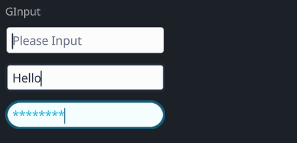
#![allow(unused)]
fn main() {
use makepad_widgets::*;

live_design! {
    import makepad_widgets::base::*;
    import makepad_widgets::theme_desktop_dark::*;
    import gen_components::components::*;

    GInputExample = <ScrollYView>{
        height: 160.0,
        width: Fill,
        spacing: 10.0,
        flow:Down,
        <Label>{
            text: "GInput"
        }
        <GInput>{
            theme: Dark,
        }
        <GInput>{
            theme: Dark,
            border_width: 2.0,
            // border_radius: 4.0,
            value: "Hello",
            placeholder: "please",

        }
        <GInput>{
            border_radius: 8.0,
            border_width: 2.0,
            input_type: Pwd,
        }
    }
}
}
Props
| decorate | name | type | description |
|---|---|---|---|
| live | theme | Themes | The theme of the input field. |
| live | color | Option<Vec4> | The color of the text. |
| live | background_color | Option<Vec4> | The background color of the input field. |
| live | hover_color | Option<Vec4> | The color when the input field is hovered over. |
| live | pressed_color | Option<Vec4> | The color when the input field is pressed. |
| live | border_color | Option<Vec4> | The color of the border. |
| live | border_width | f32 | The width of the border. |
| live | border_radius | f32 | The radius of the border's corners. |
| live | round | bool | Whether the border is rounded. |
| live | value | String | The current value of the input field. |
| live | placeholder | String | The placeholder text for the input field. |
| live | input_type | GInputType | The type of input (e.g., text, password). |
| live | disabled | bool | Whether the input field is disabled. |
| live | font_size | f64 | The size of the font. |
| live | brightness | f32 | The brightness of the text. |
| live | curve | f32 | The curve property for text rendering. |
| live | top_drop | f64 | The top drop property for text positioning. |
| live | height_factor | f64 | The height factor for text rendering. |
| live | wrap | TextWrap | The text wrapping mode. |
| live | font_family | LiveDependency | The font family used for the text. |
| live | cursor_width | f64 | The width of the cursor. |
| live | cursor_border_radius | f64 | The border radius of the cursor. |
| live | cursor_margin_bottom | f64 | The bottom margin of the cursor. |
| live | cursor_margin_top | f64 | The top margin of the cursor. |
| live | on_focus_select_all | bool | Whether to select all text on focus. |
| rust | cursor_tail | usize | The tail position of the cursor. |
| rust | cursor_head | usize | The head position of the cursor. |
| redraw | draw_input | DrawCard | The component used for drawing the input field. |
| live | draw_select | DrawCard | The component used for drawing the selection. |
| live | draw_cursor | DrawCard | The component used for drawing the cursor. |
| live | draw_text | DrawGText | The component used for drawing the text. |
| rust | undo_id | u64 | The ID for the undo action. |
| rust | last_undo | Option<UndoItem> | The last undo item. |
| rust | undo_stack | Vec<UndoItem> | The stack of undo actions. |
| rust | redo_stack | Vec<UndoItem> | The stack of redo actions. |
| rust | double_tap_start | Option<(usize, usize)> | The start positions for a double tap. |
| walk | walk | Walk | The positioning properties for the input field. |
| layout | layout | Layout | The layout properties for the input field. |
| animator | animator | Animator | The animator for handling animations. |
Event
| name | description |
|---|---|
| Changed | Triggered when the text changes. |
| Return | Triggered when the return key is pressed. |
| Escape | Triggered when the escape key is pressed. |
| KeyFocus | Triggered when the input field gains focus. |
| KeyFocusLost | Triggered when the input field loses focus. |