Designer
Makepad中的Designer组件可用于各种场景,主要用于Makepad框架内的UI开发和设计。以下是使用Designer部件有益的一些特定情况:
-
初始UI开发:
- 启动新项目时,
设计器组件有助于设置应用程序的初始布局和结构。 - 您可以使用可视化界面快速创建和组织应用程序的主要组件和布局。
- 启动新项目时,
-
组件设计与定制:
- 在设计自定义UI组件时,
设计器允许交互式编辑和即时反馈。 - 它可用于微调单个组件的外观和行为,动态调整大小、颜色和布局等特性。
- 在设计自定义UI组件时,
-
原型和实验:
Designer组件非常适合制作新的UI想法的原型并尝试不同的布局和样式。- 您可以快速迭代设计思想,进行更改并立即看到结果,而无需编写大量代码。
-
UI优化:
- 对于现有项目,
设计器可用于细化和优化UI。 - 使用可视化编辑器可以更容易地调整视觉元素、改善用户体验和确保整个应用程序的一致性。
- 对于现有项目,
-
学习与探索:
- 对于Makepad框架的新用户,
Designer组件提供了一种直观的方式来学习和探索Makepad小部件和布局的功能。 - 它有助于理解不同的属性和组件如何在Makepad环境中相互作用。
- 对于Makepad框架的新用户,
-
协同设计:
- 在团队环境中,
设计器可用于协作设计会话。 - 设计人员和开发人员可以一起调整UI,共享想法,并实时实现更改
- 在团队环境中,
The Designer component in Makepad can be used in various scenarios, primarily focused on UI development and design within the Makepad framework. Here are some specific situations where using the Designer component is beneficial:
-
Initial UI Development:
- When starting a new project, the
Designercomponent helps set up the initial layout and structure of the application. - You can quickly create and organize the main components and layout of your application using the visual interface.
- When starting a new project, the
-
Component Design and Customization:
- When designing custom UI components, the
Designerallows for interactive editing and immediate feedback. - It’s useful for fine-tuning the appearance and behavior of individual components, adjusting properties like size, color, and layout dynamically.
- When designing custom UI components, the
-
Prototyping and Experimentation:
- The
Designercomponent is excellent for prototyping new UI ideas and experimenting with different layouts and styles. - You can rapidly iterate on design ideas, making changes and seeing results instantly without writing extensive code.
- The
-
UI Refinement and Optimization:
- For existing projects, the
Designercan be used to refine and optimize the UI. - Adjustments to the visual elements, improving the user experience, and ensuring consistency across the application are made easier with the visual editor.
- For existing projects, the
-
Learning and Exploration:
- For new users of the Makepad framework, the
Designercomponent provides an intuitive way to learn and explore the capabilities of Makepad widgets and layouts. - It helps in understanding how different properties and components interact within the Makepad environment.
- For new users of the Makepad framework, the
-
Collaborative Design:
- In a team setting, the
Designercan be used for collaborative design sessions. - Designers and developers can work together to adjust the UI, share ideas, and implement changes in real-time.
- In a team setting, the
Example
#![allow(unused)]
fn main() {
use makepad_widgets::*;

live_design!{
    import makepad_widgets::base::*;
    import makepad_widgets::theme_desktop_dark::*;

    App = {{App}} {
        ui: <Root>{
            main_window = <Window>{
                block_signal_event: true;
                window: {inner_size: vec2(600, 400)},
                pass: {clear_color: #1C2128},
                <Designer>{}
            }
        }
    }
}
}
Default
#![allow(unused)]
fn main() {
Designer = <DesignerBase>{
        flow: Right
        <Splitter> {
            align: FromA(300),
            a: <View> {
                designer_outline = <DesignerOutline> {
                    outline_tree = <OutlineTree>{

                    }
                }
            },
            b: <View> {
                dpi_factor: 1.5
                draw_bg: {color: #4}
                width: Fill, height: Fill
                flow: Down
                designer_view = <DesignerView> {

                }
            },
        }
    }
}
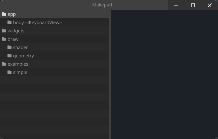
DesignerView
DesignerView作为Designer内部的一个容器视图存在
DesignerView exists as an inner container view within Designer
#![allow(unused)]
fn main() {
DesignerView = <DesignerViewBase>{
    draw_bg: {
        texture image: texture2d
        varying scale: vec2
        varying shift: vec2
        fn vertex(self) -> vec4 {
            let dpi = self.dpi_factor;
            let ceil_size = ceil(self.rect_size * dpi) / dpi
            let floor_pos = floor(self.rect_pos * dpi) / dpi
            self.scale = self.rect_size / ceil_size;
            self.shift = (self.rect_pos - floor_pos) / ceil_size;
            return self.clip_and_transform_vertex(self.rect_pos, self.rect_size)
        }
        fn pixel(self) -> vec4 {
            return sample2d_rt(self.image, self.pos * self.scale + self.shift);
        }
    }
}
}