GLabel
A custom label widget with various configurable properties such as color, font size, brightness, line spacing, and more.
Example
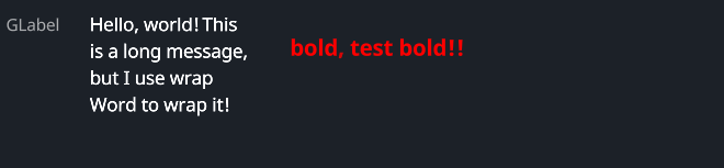
#![allow(unused)]
fn main() {
use makepad_widgets::*;

live_design! {
    import makepad_widgets::base::*;
    import makepad_widgets::theme_desktop_dark::*;
    import gen_components::components::*;

    GLabelExample = <ScrollYView>{
        height: 100.0,
        width: Fill,
        spacing: 10.0,
        <Label>{
            text: "GLabel"
        }
        <GLabel>{
            text: "Hello, world! This is a long message, but I use wrap Word to wrap it!",
            height: 48.0,
            width: 120.0,
            wrap: Word,
            brightness: 1.5,
            margin: {left: 12.0},
        }
        <GLabel>{
            text: "bold, test bold!!",
            font_size: 12.0,
            padding: 16.0,
            color: #FF0000,
            font_family: dep("E:/Rust/try/makepad/Gen-UI/examples/gen_widget_example/resources/GoNotoKurrent-Bold.ttf"),
        }
    }
}
}
Props
| decorate | name | type | description |
|---|---|---|---|
| live | color | Vec4 | The color of the label. |
| live | font_size | f64 | The size of the font used in the label. |
| live | brightness | f32 | The brightness level of the text. |
| live | curve | f32 | The curve factor of the text. |
| live | line_spacing | f64 | The line spacing of the text. |
| live | top_drop | f64 | The top drop of the text. |
| live | height_factor | f64 | The height factor of the text. |
| live | wrap | TextWrap | The text wrapping mode. |
| live | font_family | LiveDependency | The font family of the text. |
| live | visible | bool | Whether the label is visible. |
| deref | draw_text | DrawText | The DrawText component used for drawing the text. |
| walk | walk | Walk | The Walk component for positioning. |
| live | align | Align | The alignment of the text. |
| live | padding | Padding | The padding around the text. |
| live | text | RcStringMut | The content of the label. |
Event
| name | description |
|---|---|
| None | No events are specified for this widget. |