GIcon
A customizable icon widget that supports various visual properties and animation states.
Example
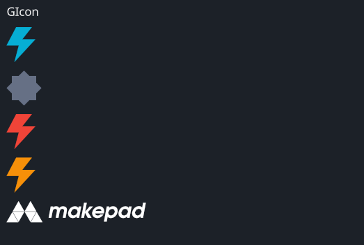
#![allow(unused)]
fn main() {
use makepad_widgets::*;

live_design! {
    import makepad_widgets::base::*;
    import makepad_widgets::theme_desktop_dark::*;
    import gen_components::components::*;

    GIconExample = <ScrollYView>{
        height: 200.0,
        width: Fill,
        spacing: 10.0,
        flow: Down,
        <GLabel>{
            text: "GIcon",
        }
        <GIcon>{
            cursor: Help,
            src: dep("crate://self/resources/lightning.svg"),
        }
        <GIcon>{
            theme: Dark,
            src: dep("crate://self/resources/config.svg"),
        }
        <GIcon>{
            theme: Error,
            src: dep("crate://self/resources/lightning.svg"),
        }
        <GIcon>{
            theme: Warning,
            src: dep("crate://self/resources/lightning.svg"),
        }
        <GIcon>{
            height: 60,
            width: 160,
            cursor: Help,
            color: #fff,
            src: dep("crate://self/resources/logo_makepad.svg"),
        }

    }
}
}
Props
| decorate | name | type | description |
|---|---|---|---|
| live | theme | Themes | The theme applied to the icon. |
| live | brightness | f32 | The brightness of the icon. |
| live | curve | f32 | The curve effect applied to the icon. |
| live | linearize | f32 | The linearization factor of the icon. |
| live | src | LiveDependency | The source dependency for the icon's image. |
| live | command | Option<String> | The SVG path command (TODO). |
| live | scale | f64 | The scale of the icon. |
| live | color | Option<Vec4> | The color of the icon. |
| live | draw_depth | f32 | The drawing depth of the icon. |
| live | hover_color | Option<Vec4> | The color of the icon when hovered. |
| live | cursor | Option<MouseCursor> | The cursor type when hovering over the icon. |
| live | visible | bool | Visibility of the icon. |
| animator | animator | Animator | The animation properties for the icon. |
| redraw | draw_icon | DrawGIcon | The component used for drawing the icon. |
| walk | walk | Walk | The positioning properties for the icon. |
| layout | layout | Layout | The layout properties for the icon. |
Event
| name | description |
|---|---|
| Clicked | Triggered when the icon is clicked. |
| Hover | Triggered when the icon is hovered. |
Note: Events with None are omitted.