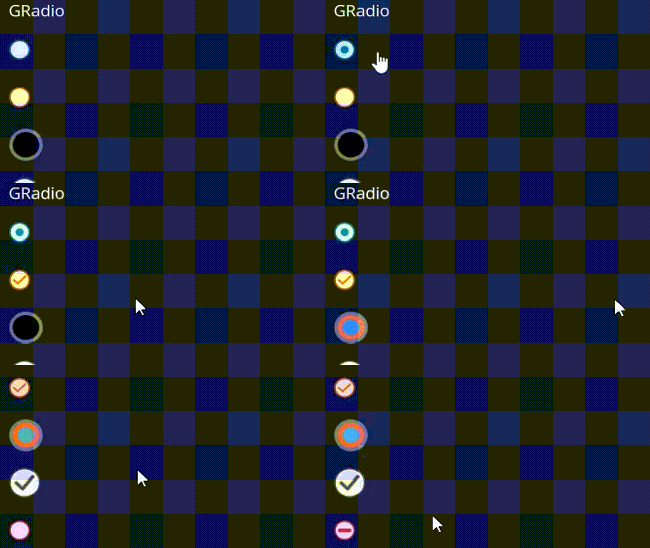
GRadio
A radio button widget with customizable colors, cursor behavior, and animations for hover and selection states.
Example

#![allow(unused)]
fn main() {
use makepad_widgets::*;

live_design! {
    import makepad_widgets::base::*;
    import makepad_widgets::theme_desktop_dark::*;
    import gen_components::components::*;

    GRadioExample = <ScrollYView>{
        height: 150.0,
        width: Fill,
        spacing: 10.0,
        flow: Down,
        <GLabel>{
            text: "GRadio"
        }
        <GRadio>{
            height: 30.0,
            width: 60.0,
        }
        <GRadio>{
            theme: Warning,
            height: 30.0,
            width: 60.0,
            radio_type: Tick,
        }
        <GRadio>{
            theme: Success,
            height: 30.0,
            width: 60.0,
            size: 12.0,
            scale: 0.6,
            border_width: 2.0,
            radio_type: Round,
            background_color: #000,
            selected_color: #42A5F5,
            hover_color: #FF7043,
            border_color: #76828F,
        }
        <GRadio>{
            theme: Dark,
            height: 30.0,
            width: 60.0,
            size: 12.0,
            radio_type: Tick,
        }
        <GRadio>{
            theme: Error,
            height: 30.0,
            width: 60.0,

            radio_type: Cross,
        }
    }
}
}
Props
| decorate | name | type | description |
|---|---|---|---|
| live | theme | Themes | The theme applied to the radio button. |
| live | size | f32 | The size of the radio button. |
| live | background_color | Option<Vec4> | The background color of the radio button. |
| live | hover_color | Option<Vec4> | The color of the radio button when hovered. |
| live | focus_color | Option<Vec4> | The color of the radio button when focused. |
| live | selected_color | Option<Vec4> | The color of the radio button when selected. |
| live | border_color | Option<Vec4> | The border color of the radio button. |
| live | border_width | f32 | The width of the radio button's border. |
| live | scale | f32 | The scale of the radio button. |
| live | cursor | Option<MouseCursor> | The cursor type when hovering over the radio button. |
| live | value | String | The value associated with the radio button. |
| live | radio_type | GChooseType | The type of the radio button. |
| redraw | draw_radio | DrawGRadio | The component used for drawing the radio button. |
| walk | walk | Walk | The positioning properties for the radio button. |
| layout | layout | Layout | The layout properties for the radio button. |
| animator | animator | Animator | The animation properties for the radio button. |
Event
| name | description |
|---|---|
| Clicked | Triggered when the radio button is clicked, carrying the associated value. |
| Hover | Triggered when the radio button is hovered. |
Note: Events with None are omitted.