Card
A customizable card widget with hover and press animations, configurable colors, cursor behavior, and optional scroll bars.
Example
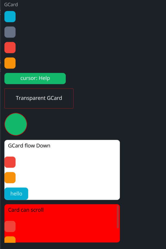
#![allow(unused)]
fn main() {
use makepad_widgets::*;

live_design! {
    import makepad_widgets::base::*;
    import makepad_widgets::theme_desktop_dark::*;
    import gen_components::components::*;

    GCardExample = <ScrollYView>{
        height: 660.0,
        width: Fill,
        flow: Down,
        spacing: 10.0,
        <Label>{
            text: "GCard",
        }
        <GCard>{
            height: 30.0,
            width: 30.0,
        }
        <GCard>{
            theme: Dark,
            height: 30.0,
            width: 30.0,
        }
        <GCard>{
            theme: Error,
            height: 30.0,
            width: 30.0,
        }
        <GCard>{
            theme: Warning,
            height: 30.0,
            width: 30.0,
            animator_key: true,
        }
        <GCard>{
            theme: Success,
            height: 30.0,
            width: 160.0,
            cursor: Help,
            align: {x: 0.5, y: 0.5},
            <GLabel>{
                text: "cursor: Help",
            }
        }
        <GCard>{
            theme: Error,
            height: Fit,
            width: 180.0,
            transparent: true,
            border_width: 1.0,
            border_radius: 0.0,
            align: {x: 0.5, y: 0.5},
            <GLabel>{
                margin: 20.0,
                text: "Transparent GCard",
            }
        }
        <GCard>{
            theme: Success,
            height: 60.0,
            width: 60.0,
            border_color: #FF0000,
            border_width: 1.0,
            border_radius: 15.0,
        }
        <GCard>{
            height: Fit,
            width: 300,
            flow: Down,
            background_color: #FFFFFF,
            spacing: 10.0,
            <GLabel>{
                text: "GCard flow Down",
                color: #0,
                margin: 10.0,
            }
            <GCard>{
                theme: Error,
                height: 30.0,
                width: 30.0,
            }
            <GCard>{
                theme: Warning,
                height: 30.0,
                width: 30.0,
            }
            <GButton>{
                text: "hello"
            }
        }

        <GCard>{
            height: 100.0,
            width: 300,
            flow: Down,
            background_color: #FF0000,
            spacing: 10.0,
            // transparent: true,
            scroll_bars: <GScrollBars> {}
            <GLabel>{
                text: "Card can scroll",
                color: #0,
                margin: 10.0,
            }
            <GCard>{
                theme: Error,
                height: 30.0,
                width: 30.0,
            }
            <GCard>{
                theme: Warning,
                height: 30.0,
                width: 30.0,
            }
            <GButton>{
                text: "hello"
            }
        }
    }
}
}
Props
| decorate | name | type | description |
|---|---|---|---|
| live | theme | Themes | The theme applied to the card. |
| live | background_color | Option<Vec4> | The background color of the card. |
| live | hover_color | Option<Vec4> | The color of the card when hovered. |
| live | pressed_color | Option<Vec4> | The color of the card when pressed. |
| live | border_color | Option<Vec4> | The border color of the card. |
| live | border_width | f32 | The width of the card's border. |
| live | border_radius | f32 | The radius of the card's border. |
| live | visible | bool | Whether the card is visible. |
| live | transparent | bool | Whether the card background is transparent. |
| live | cursor | Option<MouseCursor> | The cursor type when hovering over the card. |
| live | animator_key | bool | Whether the card uses an animation key. |
| live | scroll_bars | Option<LivePtr> | The optional scroll bars for the card. |
| rust | scroll_bars_obj | Option<Box<ScrollBars>> | The scroll bars object. |
| live | grab_key_focus | bool | Whether the card grabs key focus when clicked. |
| live | block_signal_event | bool | Whether the card blocks signal events. |
| live | draw_card | DrawCard | The component used for drawing the card. |
| walk | walk | Walk | The positioning properties for the card. |
| layout | layout | Layout | The layout properties for the card. |
| rust | draw_state | DrawStateWrap<DrawState> | The draw state of the card. |
| rust | children | ComponentMap<LiveId, WidgetRef> | The children components of the card. |
| rust | draw_order | Vec<LiveId> | The draw order of the card's children. |
| live | event_order | EventOrder | The event order for the card. |
| rust | defer_walks | Vec<(LiveId, DeferWalk)> | The deferred walks for the card. |
| animator | animator | Animator | The animation properties for the card. |
Event
| name | description |
|---|---|
| KeyDown | Triggered when a key is pressed down. |
| KeyUp | Triggered when a key is released. |
| FingerDown | Triggered when a finger touches the card. |
| FingerMove | Triggered when a finger moves over the card. |
| FingerHoverIn | Triggered when a finger hovers over the card. |
| FingerHoverOver | Triggered when a finger moves while hovering over the card. |
| FingerHoverOut | Triggered when a finger stops hovering over the card. |
| FingerUp | Triggered when a finger is lifted from the card. |